Journal / Editorial Design / Digital
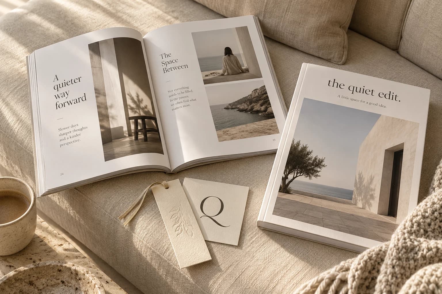
The Quiet Edit
Ein Journal fürs genauere Hinsehen und weniger Scrollen. Ein grosszügiges Gestaltungsraster, ein ausdrucksstarkes Q und Platz für gute Geschichten.
- Editorial design
- Magazin
- Cover-System
- Website
- Plakat an der Bushaltestelle
- Stofftasche und Lesezeichen
- Newsletter
- Editorial-Shooting
Notes on a slower kind of living.
the quiet edit.
More noticing.
Eine kleine Sammlung grosser Gedanken. Über Räume, Menschen und die Dinge, die wir behalten möchten.
Flip through
Paper you
want to keep.
The first issue, page by page. Turn it like the real thing.
 the quiet edit.Issue 01 / The art of noticing
- Room for a little wonder
- The things we keep
- A slower kind of scroll
- Notes on light

Some stories deserve space.
Ein Journal über Dinge, die wir behalten wollen. Und Momente, die wir fast übersehen.
Three covers
One grid.
Endless issues.
A cover system that changes with every season and still feels like home.
 the quiet edit.Issue 01The art of noticing
 the quiet edit.Issue 02Things we keep
 the quiet edit.Issue 03On rooms and light
From paper to pixels
A slower kind
of scroll.
A working glimpse of the journal’s digital home.
Room for
a little wonder.

ISSUE 01 / THE ART OF NOTICING
Some stories
deserve space.
Ein Journal über Dinge, die wir behalten wollen. Und Momente, die wir fast übersehen.

A pause.
A fresh page.
Less noise. More noticing.
On the street
Less noise.
Even outside.
Ein Leuchtplakat für die Bushaltestelle. Wenig Text, viel Raum – und gerade deshalb kaum zu übersehen.
 Less noise.
More noticing.the quiet edit. / Issue 01, out now
To carry around
Read slowly.
Anywhere.
Eine Stofftasche, ein Lesezeichen zu jeder Ausgabe und ein Sonntagsbrief fürs Postfach.
slowly.the quiet edit.

A pause.
A fresh page.
Three things worth noticing this week. And one worth doing nothing about.
Read the letterEditorial-Shooting
Soft light,
slow pages.


Typografie mit Charakter / Instrument Serif
Aa.A little space for a good idea.
Aa Bb Cc Dd Ee Ff Gg Hh Ii Jj Kk Ll Mm
0123456789 · !?&
Die Farbwelt