Build a useful brand moodboard through three creative routes, a focused editing process and feedback that moves the project forward.
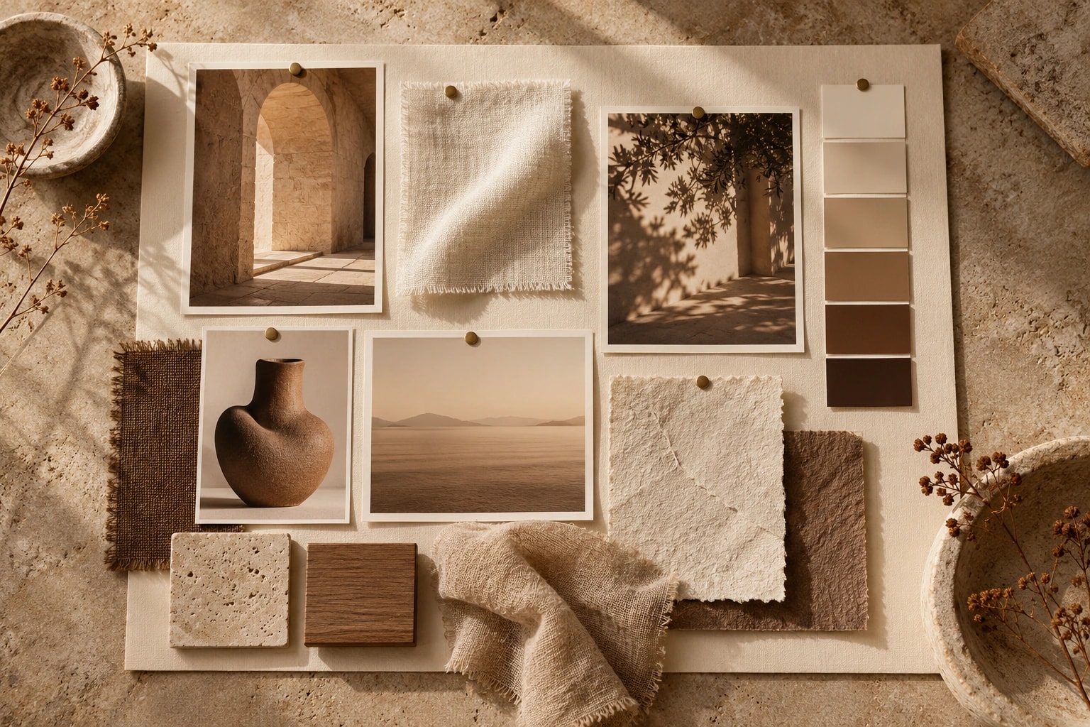
Connect your brand brief to a visual idea. Gather broadly, build distinct routes and choose through purpose and intended effect, rather than preference alone.
Twelve beautiful pictures do not necessarily make a direction. They might suggest twelve different ones. A moodboard becomes useful when it helps you make a reasoned choice between possibilities. Before investing in logos, website layouts or a shoot, it gives everyone something concrete to discuss. The pictures start the conversation. The idea connecting them is the real work.
The brief: begin with three useful words
Start with a situation. An imaginary new consultancy might need to feel experienced without becoming distant. “Professional” contributes little on its own because almost every business wants that quality. “Calm, approachable, precise” gives you more specific criteria. Add what the brand should never feel like, so the direction has boundaries as well as ambitions.
Translate each word into a visible possibility. Approachable might suggest natural perspectives, straightforward language and real working situations. Precise might lead to organised layouts and careful detail. These are potential interpretations rather than universal design rules. The important thing is being able to explain the relationship between the word and the choice.
Round 1: collect widely without promising to keep everything
Look at light, materials, typography, crops, packaging and spaces. A sentence or a piece of paper can communicate a direction too. Avoid collecting only direct competitors. If every reference is another consultancy website, the eventual result can feel familiar before anyone has designed it.
Record the source of external material and identify what you are studying. You may be interested in a photograph’s lighting rather than its subject, or a layout’s pace rather than its typeface. A reference is not a finished design. Including an image in a discussion board does not give you permission to publish it on the eventual website.
Round 2: make three routes, not one large collection
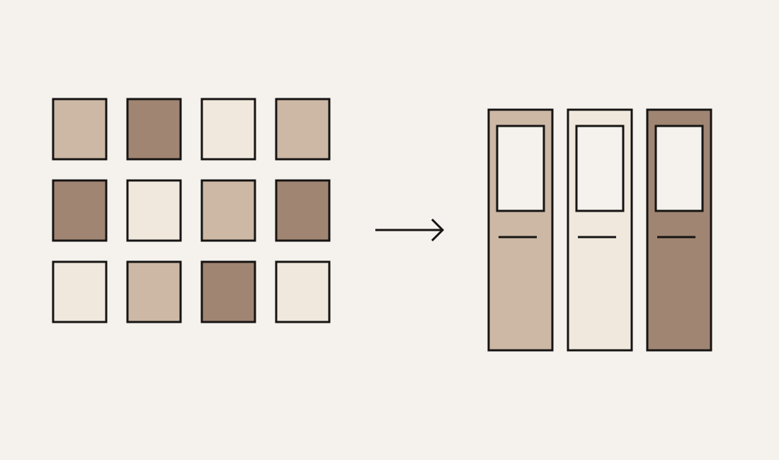
Group references around distinct ideas. For our imaginary consultancy, these might be Editorial clarity, Warm atelier and Precise movement. Give each route a central thought, a few expressive references and a sentence explaining how it could support the brief. Three almost identical neutral palettes do not represent three meaningfully different directions.
The preview below makes these differences visible through abstract compositions inside our own colour world. Switch between routes to see how arrangement can support a different effect. These are illustrative studies, rather than proposals for a real client. A client’s own colours, typography and imagery would follow their brief, instead of inheriting our identity.
The best picture in the folder is not necessarily the right picture for the direction.
Three routes, one decision
Round 3: edit until the idea becomes visible
Compare every element with the brief. Remove references that are merely attractive, repeat an existing point or confuse the direction. A moodboard should reveal meaningful differences. A collection containing every possibility may look generous while offering very little help with a decision.
Try covering half the board. Does the idea still make sense? If so, there may be room to simplify. If it falls apart, the collection may need a clearer thought or better anchors. Do not automatically add more references. First describe what the existing selection is meant to hold together.
Give feedback that supports the work
“I like it” is an honest starting point. Useful feedback also explains why. Relate your response to the audience, offer and intended experience. “These distant crops feel too impersonal for our advisory service” gives the team something specific to investigate. “That image feels wrong” leaves the problem open to many interpretations.
- What supports the brief, and which detail creates that effect?
- What feels inappropriate: material, colour, imagery, typography or composition?
- Which direction can work at the touchpoints the business actually needs?
- Which reference appeals to your personal taste without necessarily fitting the brand?
Avoid automatically combining everyone’s favourite piece from every route. Sometimes elements can work together, but the central idea can also disappear through compromise. Choose a direction first, then identify two or three adjustments it needs. That creates a clearer next step than another large, undecided collection.
Move from a moodboard to a real application
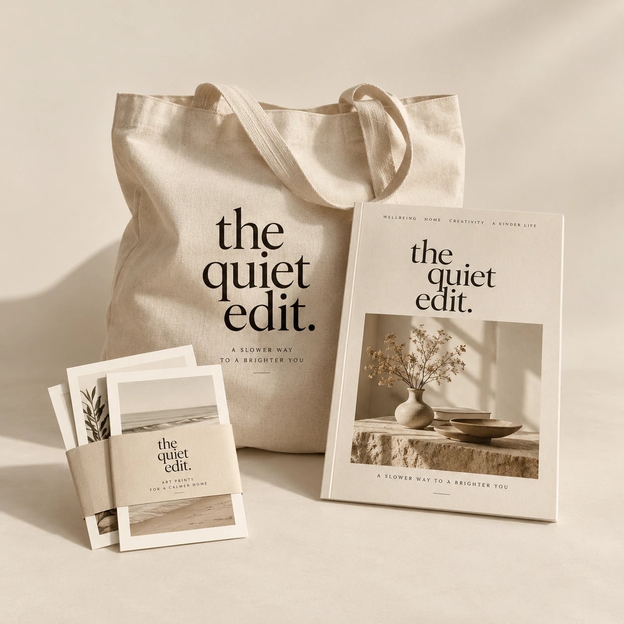
Apply the chosen direction to a mobile homepage, a social post or a packaging panel. This reveals whether it can accommodate real words, create hierarchy and work across formats. An atmospheric reference collection cannot answer every question that arises when a design must function.
Record the decision: the route name, central principles, deliberate exclusions and remaining questions. Keep it available when new ideas appear later in the project. It becomes a useful basis for working internally or briefing a studio. “We want it to feel different somehow” can then become a direction people can describe, challenge and develop together.