Understand branding, corporate design and logo design. Includes a brand self-check, a worked example and a practical briefing checklist.
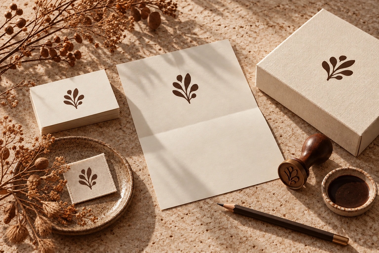
A logo helps people recognise you. Branding clarifies what you stand for. Review your offer, audience and key touchpoints before deciding what needs redesigning.
Imagine replacing the front door because the house no longer feels like yours. It might make a lovely entrance. The rooms remain unchanged. A new logo can face the same problem: it is expected to fix an unclear offer, inconsistent language and a disconnected customer experience. Before commissioning a new symbol, ask a more useful question: what do people currently misunderstand about your business?
Branding, corporate design and logo design explained
Branding shapes who your business is for, what it offers and how people experience it. Positioning, language, visual identity and the way you work all contribute. Corporate design turns the visual direction into a usable system of typography, colour, imagery and layouts. Your logo is a distinctive element within that system. It has an important role without carrying the whole business on its shoulders.
This distinction matters when you write a brief. “We need a logo” may describe a contained design task. “People keep confusing us with a cheaper alternative” calls for a closer look at positioning and communication first. Treating these as the same assignment can produce a polished answer to the wrong question.
A worked example: the same business, a clearer story
Consider an imaginary ceramics studio. Its Instagram shows quiet, tactile objects. Its website talks vaguely about innovation. Its quotation looks like an office-supplies invoice. The products may be carefully made, but each encounter creates a different expectation. Changing the logo would leave most of those contradictions in place.
A useful direction might be everyday objects for people who prefer fewer, considered possessions. That suggests honest material photography, clear descriptions of making and care, and a warm, straightforward voice. The website, packaging and order confirmation can then tell a connected story. This is an illustrative scenario, rather than a wild & co. client project or a claim about results.
A logo is a signature. The brand is the whole handwriting.
A brand self-check you can do today
Open your homepage, a recent social post and a customer proposal side by side. Set personal taste aside for a moment. Look for a consistent offer, attitude and way of addressing people. The comparison below shows how a generic message can become more specific without relying on a new logo.
- Can someone unfamiliar with your business describe what you offer and who it is for?
- Do your words explain a useful difference through concrete situations?
- Do the photographs, colours and typography belong together without a logo attached?
- Does working with your business feel like the experience your marketing promises?
- Can your team create everyday materials without inventing new rules each time?
If the offer itself is unclear, start with positioning. If the direction is sound but every channel looks different, a practical design system may help. If only one application is weak, a focused improvement may be enough. This is a conversation aid, not a validated brand score.
The brand comparison
Brand refresh or a deeper rebrand?
A refresh develops an identity people already recognise. It might improve readability, introduce a clearer photographic direction or replace inconsistent templates. A rebrand can involve a more fundamental change to positioning, name or identity. The decision should follow a business change or a specific problem, rather than a new preference in the team.
List what already works before replacing anything. What do customers recognise? Which messages explain the offer well? Which assets are difficult to use? Separate problems of direction from problems of execution. This makes it easier to preserve useful recognition and spend time where change will matter.
What belongs in a branding brief?
A useful brief supports decisions. Describe the business, your intended customers and the reason for the project. Bring existing materials and explain what feels appropriate or out of place. “Too distant for a personal advisory service” gives a designer more to work with than “make it modern”. Include the situations in which the identity must function, from a mobile website to a printed label.
- Objective: what should people understand or be able to do more easily?
- Scope: which strategy, design and application work is actually required?
- Everyday use: who will create posts, presentations and documents afterwards?
- Handover: which files, templates, image permissions and font licences are needed?
- Decisions: who approves the work, how does feedback happen and which dates matter?
What affects branding costs?
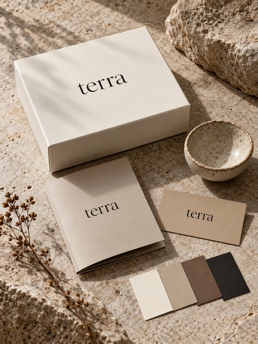
A useful quotation follows a defined scope. Positioning, logo development, a design system and implementation across a website or packaging are separate pieces of work. Compare proposals against the same deliverables and clarify revision rounds and external costs. A headline price alone cannot tell you whether the proposals solve the same problem.
Test the proposed identity in real situations before signing off: a mobile service page, a quotation and a social format are a helpful starting set. Can people understand the offer? Can your team use the system? Does the presentation match the service itself? These checks turn a promising design into something useful. If you would like us involved, bring those three existing applications to the first conversation. They give us a concrete place to begin.