A feed concept is more than a pretty grid. It decides what a brand wants to show and how you recognise every single post. Here is how to develop several directions, compare them honestly and give each one a role in the end.
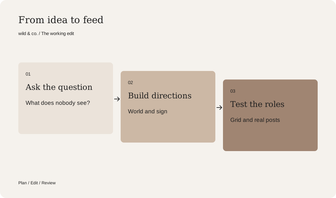
An Instagram feed concept starts with a question, not a template. It leads to two or three visual worlds, each with its own mood, colour and a recurring sign. One becomes the core, the others get clear roles. You test with a grid view and a few real posts before switching over.
For well-known brands the feed is often the first thing younger people see of them. Even so, it frequently looks like a mosaic of campaigns, notices and promotions. To show how a feed concept can change that, we made issue three of our series Social Media, Reimagined. We took on Swiss Post, whose yellow everyone in Switzerland knows, and asked what happens behind it: at night, in the sorting halls, in the moment a letter changes hands. One thing first: this is an unofficial concept study, not affiliated with or commissioned by the brand. It was made by wild & co.; the images were created with AI and show no real locations, vehicles or employees. Trademarks belong to their respective owners.
What a feed concept is, and what it is not
A feed concept is not a colour preset or a grid you set up once and then fill. It is a decision about which story a brand tells on Instagram and how you recognise that story in every single post. It includes a visual world, a leading colour, a recurring sign and a tone for the captions. The strategy behind it, meaning goals, topics and rhythm, is a separate step, and our guide to building a social media strategy covers it. The feed concept turns that strategy into pictures.
Start with a question, not a grid
The best directions grow out of a simple question. For Swiss Post it was: everyone knows the yellow, but who sees what moves behind it? We developed three answers to that question, each with its own mood. The same works for your brand. Do not ask which colours look good in a grid; ask what people do not yet know or see about you. The rest follows.
- What does everyone know about your brand, and what does almost nobody know?
- Which moment shows best why you exist?
- Which element could run through every post as a recurring sign?
- Which feeling should stay with someone after they leave your profile?
Your feed concept
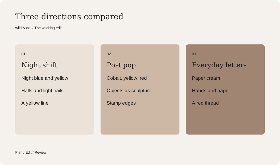
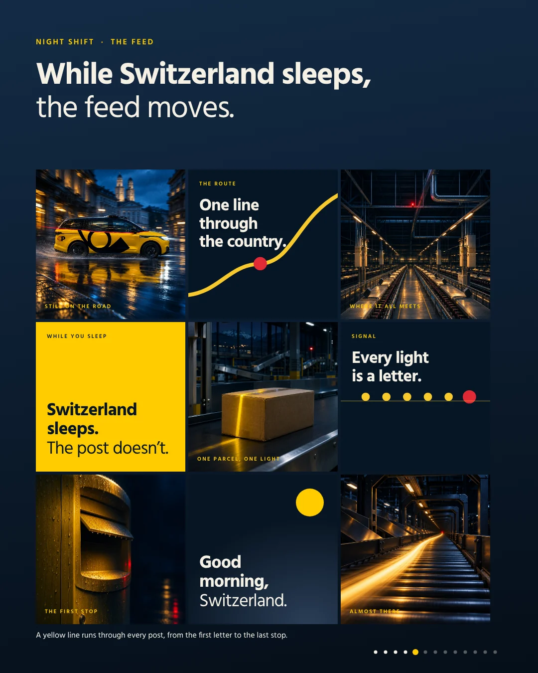
Night shift: one line through every post
The first direction shows the post as the country's quiet energy. While cities sleep, letters, people and machines keep moving. The hero is not the parcel but the choreography behind it. The pictures show wet streets, empty halls, conveyor belts and light trails, all in deep night blue. A yellow line runs through every post, from the first letter to the last stop. That recurring sign is the heart of the direction: you recognise the feed even when no logo is visible. Short lines such as ‘Switzerland sleeps. The post doesn’t.’ set the rhythm.

Post pop: icons out of scale
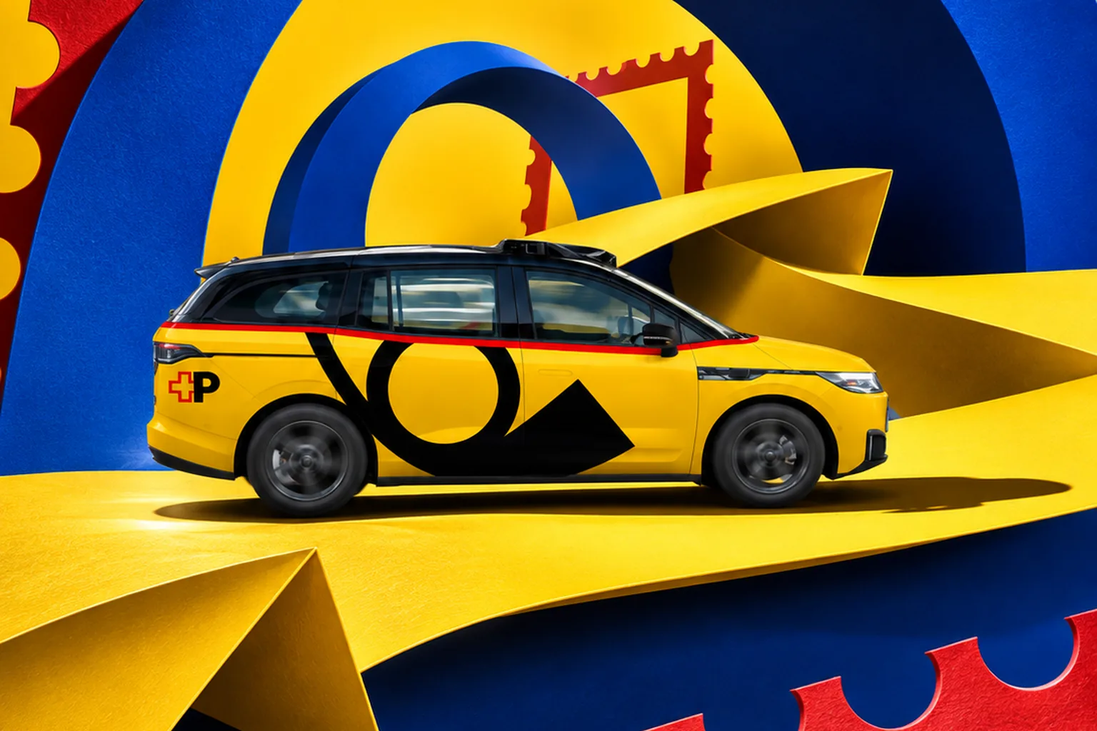
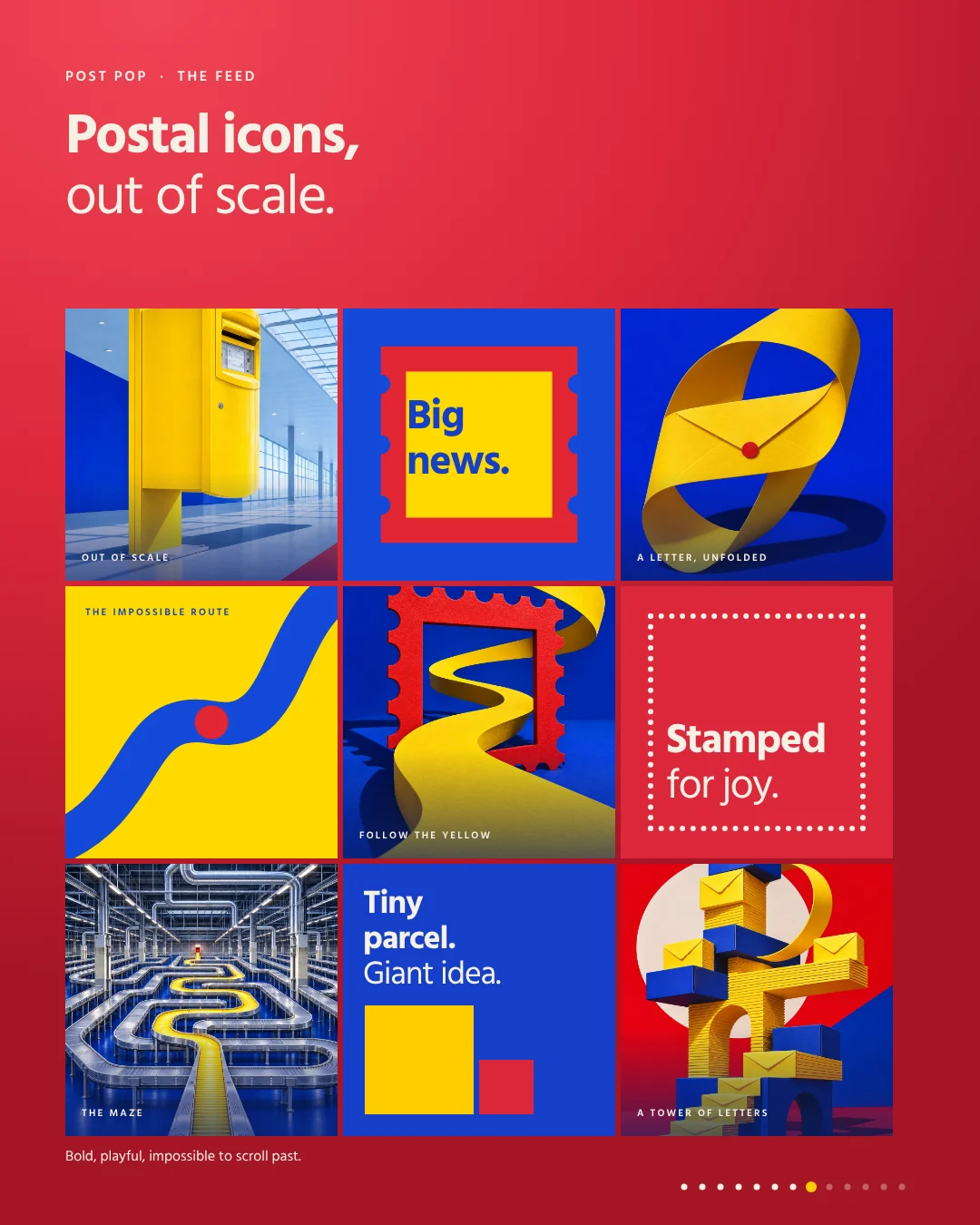
The second direction is deliberately surreal and loud. Familiar postal objects become sculptures: a mailbox as a monument, an envelope as architecture, a route as a yellow ribbon through a cobalt world, a tower of letters. Tiles with stamp edges and short lines such as ‘Big news.’ or ‘Stamped for joy.’ complete it. This direction stops the thumb, but in the long run it would be exhausting. It suits a campaign or one big moment a year, not every week.
Everyday letters: the red thread
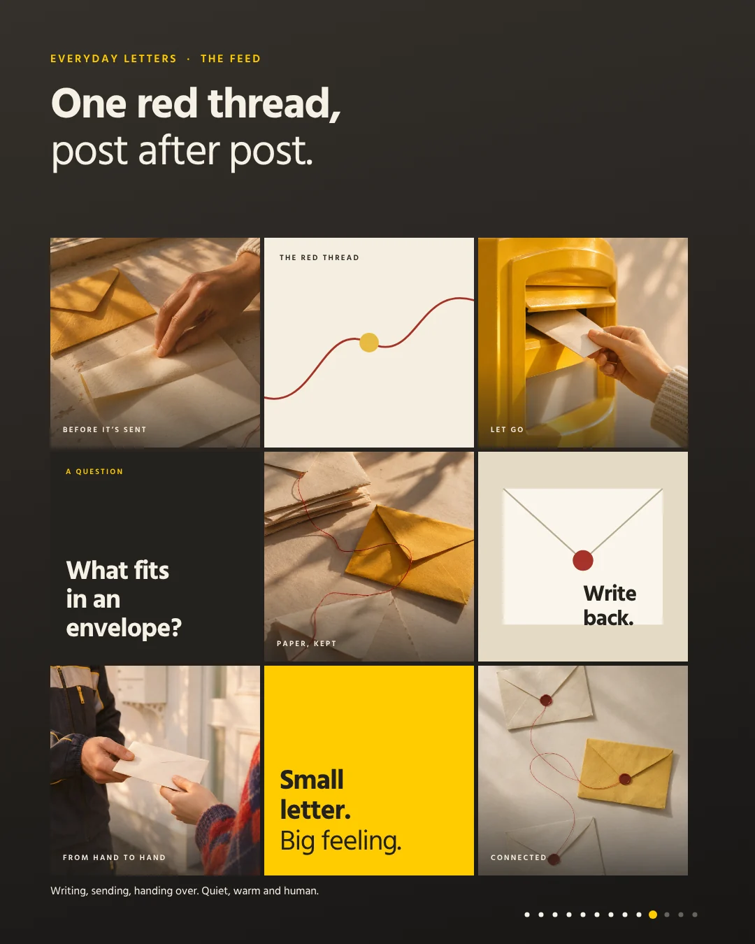
The third direction is the warmest. Hands, paper, sunlight and a thin red thread tell why anyone sends a letter at all: the moment before it is sent, the drop into the box, a handover at the front door. The red thread runs through the pictures as a signature and connects them. Instead of facts, this direction asks questions such as ‘What fits in an envelope?’ It shows the human side of a brand most people associate with logistics.

One direction as the core, two as roles
Posting all three directions at once would be the surest way back to the mosaic. So each one gets a role. Our suggestion: Night shift as the weekly core, Post pop for the big campaign moment and Everyday letters for the warm side in between. No new logo and no new yellow are needed. It is simply a clearer story. The same principle works for your brand:
- The core carries the recurring sign and appears most often.
- The campaign direction appears rarely, and then at full strength.
- The third direction gives the brand a face without diluting the core.
- Type, colours and tone stay the same across all three roles.
How to test your feed concept
Before switching your feed over, run a simple test. Build a nine-tile grid view for each direction and put it next to your current feed. You will see at once which direction stands out, which looks like you and which just looks like a template. Then make a few real posts and stories to check whether the direction works day to day. AI helps at this stage: concept images for several directions come together quickly, and you see early which one carries. The real feed then adds your own photos, videos and graphics. Our post on social media for hotels shows how a whole feed can grow from rooms a brand already has.
Developing your feed concept
With the worksheet above you can find, in half an hour, your question, your recurring sign and the roles of your directions. After that, an outside view helps. At wild & co. in Zurich we develop social media from strategy and feed concept to visual world and individual posts, for brands across Switzerland, in person or remotely. More studies with invented brands are in the wild lab.