Bzztwild lab · From brief to beautiful
From brief to brand: identity for a drinks brand
Brief. Decision. Brand.
Most portfolios only show the shiny final result. In From brief to beautiful we show everything behind it: from the first brief through strategy, names and moodboards to the decisions and the finished brand. Client, name and product are invented and the visuals made with AI. The process is exactly how we work.
Invented brand, made with AI. Concept, branding and art direction by wild & co.
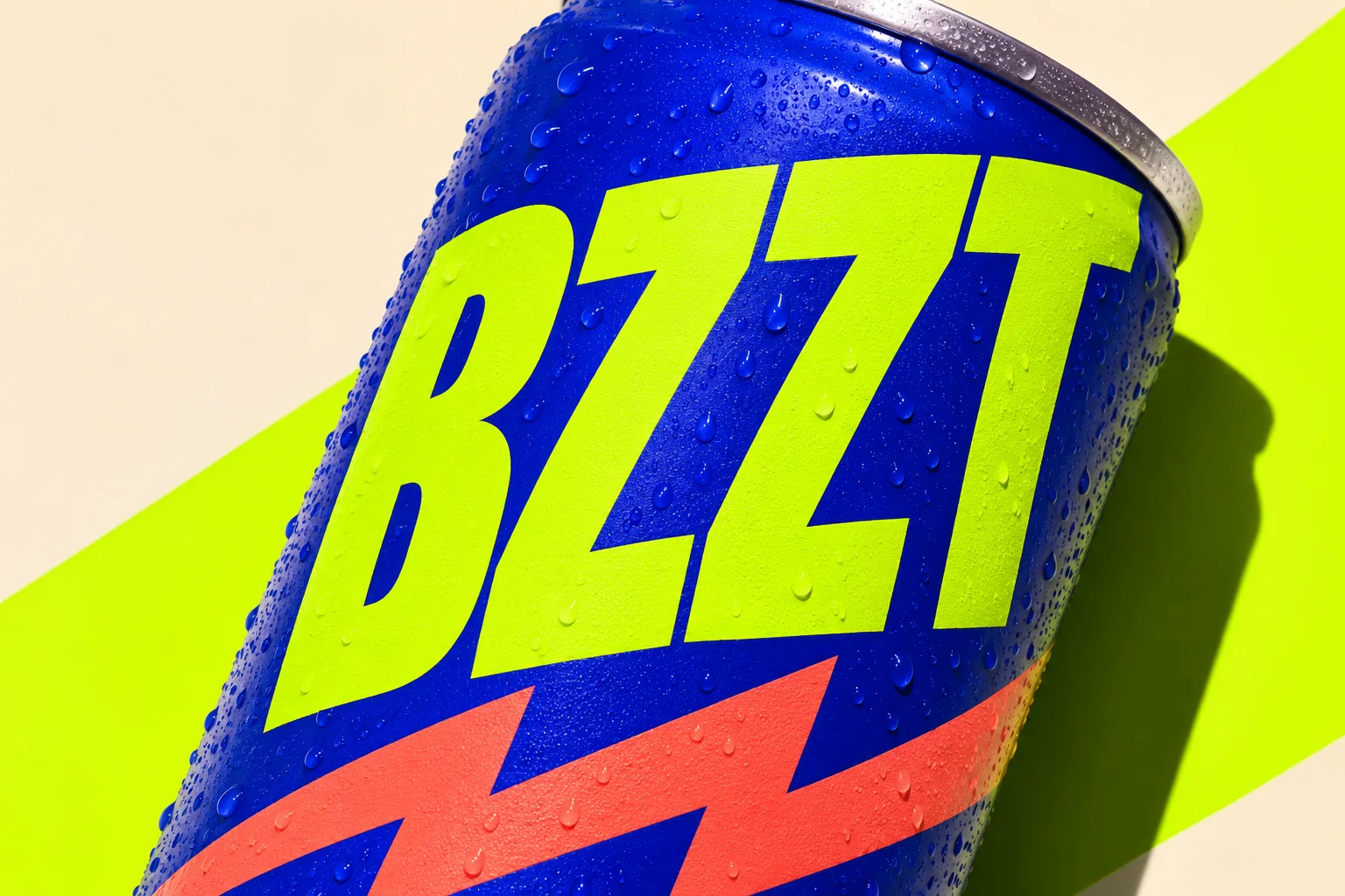
Project 01Brief → brand
The process · thirteen steps, one brief
From brief to can
The route in 13 steps from the first ask to the finished can, with the 9 slides in Bzzt's own colours. As you scroll, the brief fills in, gets crossed out, ticked off and finally turns into the brand.
- 01 · From brief to beautiful
A new series: not just the finished design, but the whole way there.
- 02 · The brief
A small team brews fermented botanical drinks, is loved in cafés and wants to move into restaurants and selected shops. The ask: positioning, naming, identity, flavour system, labels and imagery.
- 03 · Three tests
The drink has to stand out next to forty other bottles on the shelf, feel credible on a drinks menu and stay recognisable across every flavour.
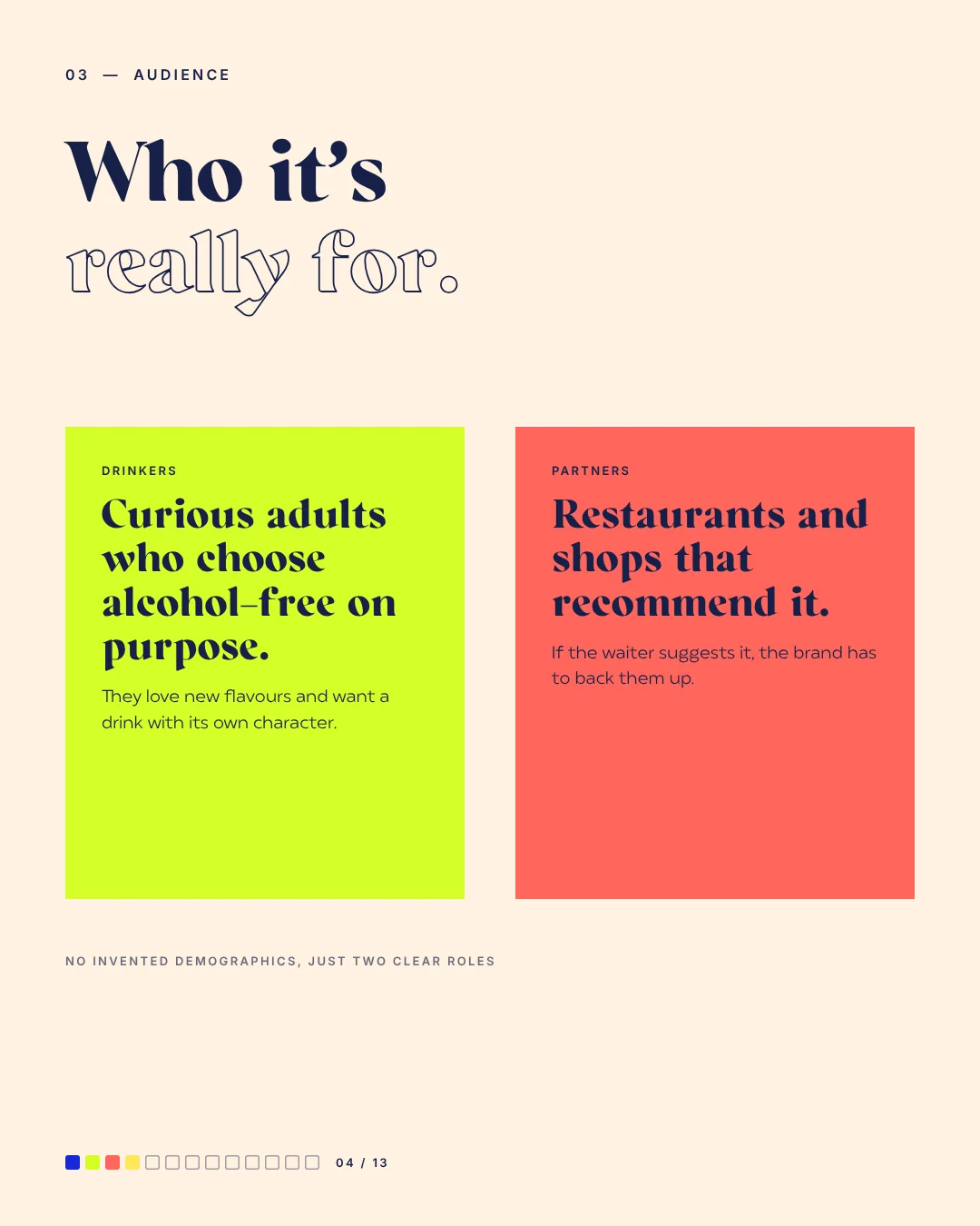
- 04 · Audience
No invented demographics, just two clear roles: people who choose alcohol-free on purpose, and hosts who should recommend Bzzt.
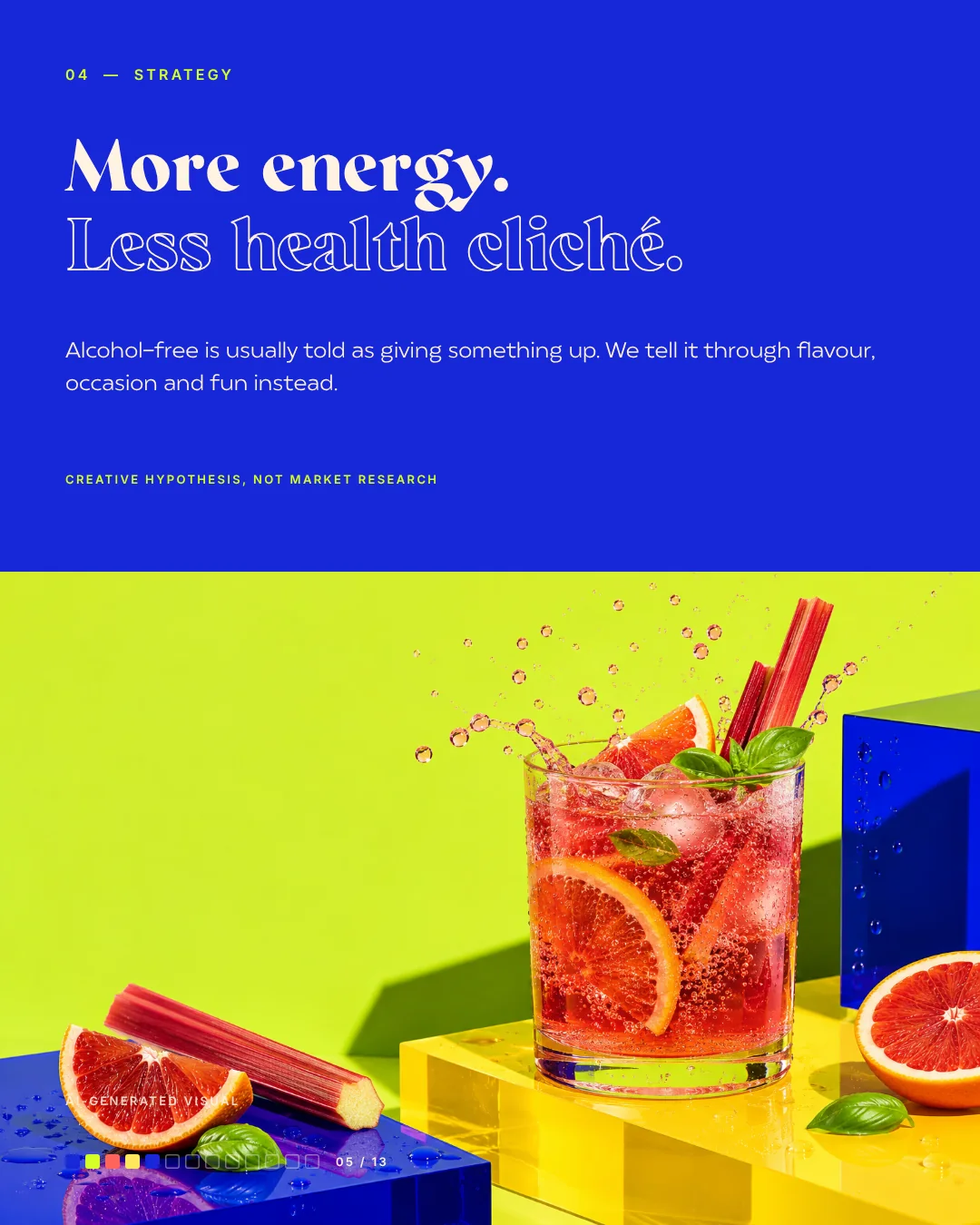
- 05 · Strategy
More energy, less health cliché. We tell alcohol-free through flavour, occasion and fun instead of giving something up.
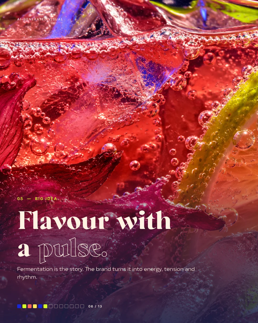
- 06 · Big idea
Flavour with a pulse. Fermentation is the story; the brand turns it into energy, tension and rhythm.
- 07 · Naming
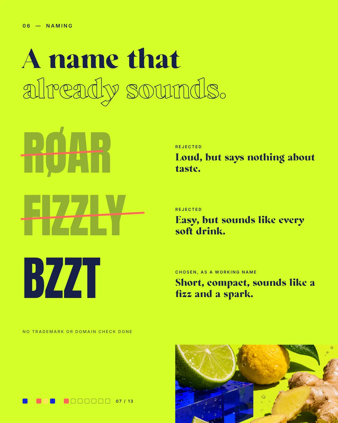
Røar is loud but says nothing about taste. Fizzly sounds like every soft drink. Bzzt is short, compact and sounds like a fizz and a spark.
- 08 · Moodboards
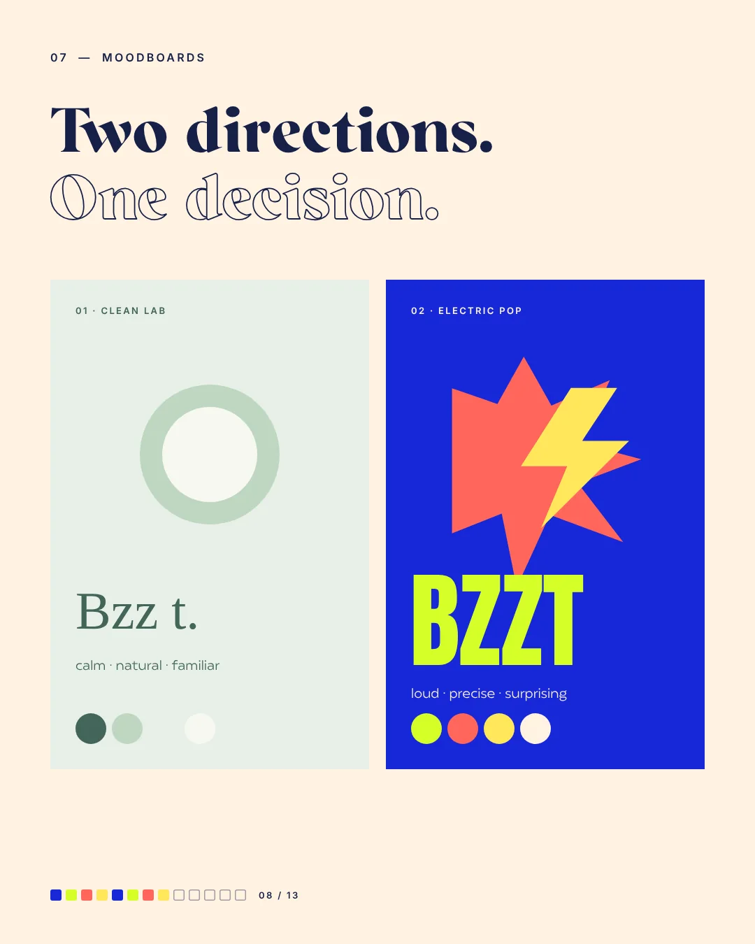
Two directions: Clean Lab, calm, natural and familiar, against Electric Pop, loud, precise and surprising.
- 09 · Decision
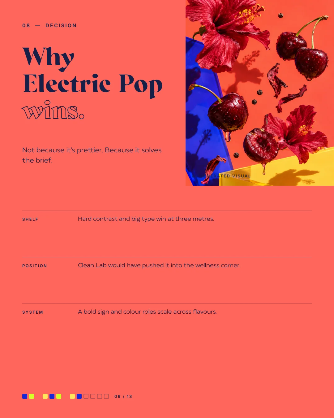
Electric Pop wins, not because it's prettier, but because it solves the brief. Hard contrast and big type still work from three metres away.
- 10 · Identity
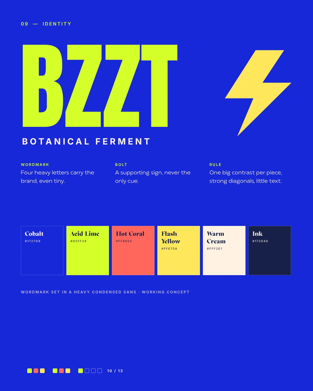
Four heavy letters carry the brand, even tiny. The bolt supports but is never the only cue. One big contrast per piece.
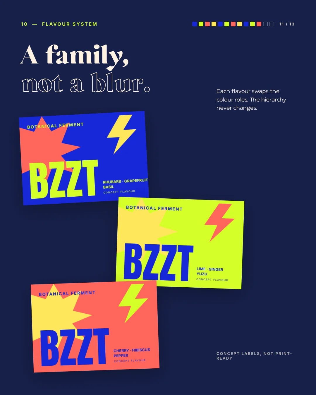
- 11 · Flavour system
Each flavour swaps the colour roles; the hierarchy never changes. A family, not a blur.
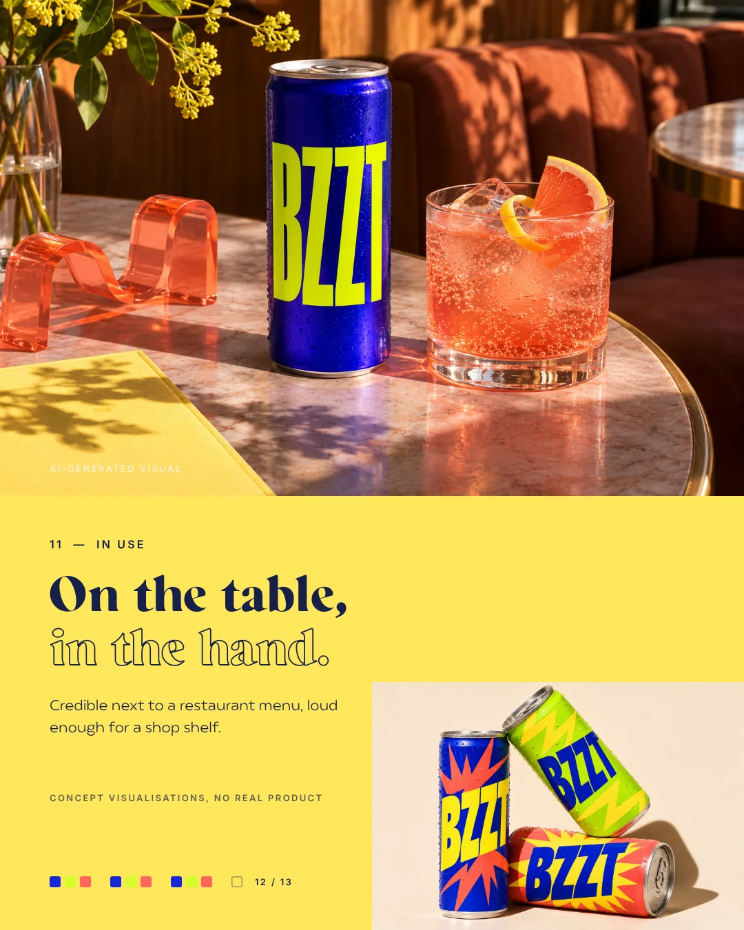
- 12 · In use
Credible next to a restaurant menu and loud enough for a shop shelf.
- 13 · Brief. Decision. Brand.
A café favourite needed shelf power. One strategic choice, Electric Pop, made it a brand.
The test bench · three tests from the brief
Three tests, one honest decision
The brief came with three tests: stand out next to forty other bottles, feel credible on a drinks menu and stay recognisable across every flavour. Three names were on the table, two moodboards faced each other. Electric Pop won, not because it's prettier, but because it solves the brief.
Stand out next to forty bottles.
SolvedHard contrast and big type still work from three metres. Among forty neutral bottles, Bzzt is the one you see first.See post 09
Credible on a drinks menu.
SolvedOn the menu, Bzzt sits calmly next to house lemonade and sparkling water and still reads as a brand of its own, then at the table next to the good glassware.See post 12
Recognisable across every flavour.
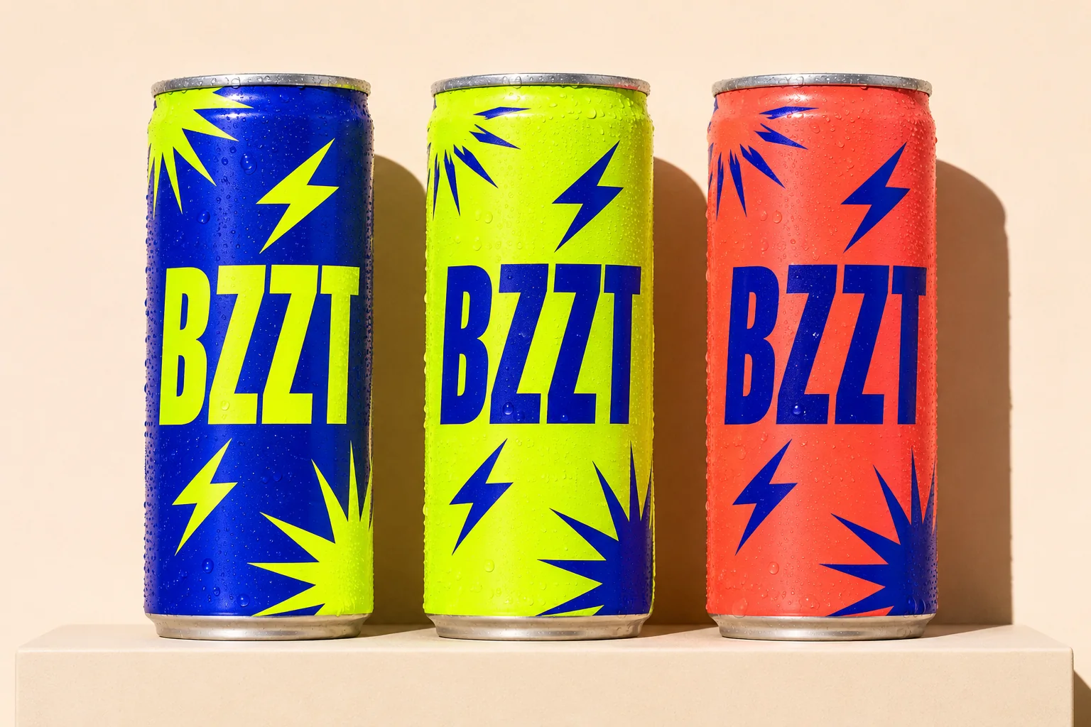
Hover over a flavour or tap it: background, wordmark, burst and bolt swap colours, and the order always stays the same.
The brand · Bzzt
Flavour with a pulse.
Bzzt is an invented brand of fermented botanical drinks. Our fictional client: a small team, loved in cafés and ready for restaurants and shop shelves. Bzzt tells alcohol-free through flavour and fun, not through giving something up.
Hypothesis first, then the big idea
Alcohol-free is usually told as giving something up. Our hypothesis: it can be told through flavour, occasion and fun instead. That led to the big idea, flavour with a pulse. Fermentation is the story, and the brand turns it into energy, tension and rhythm.
- Cobalt#1727D8
- Acid Lime#D5FF28
- Hot Coral#FF665C
- Flash Yellow#FFE75A
- Warm Cream#FFF2E1
- Ink#172048
Decision log · what we did
What we did
- BriefA small team brewing fermented botanical drinks, sold in cafés today, heading for restaurants and selected shops.
- StrategyTwo clear roles, people who choose alcohol-free on purpose and hosts who should recommend Bzzt, plus the idea of flavour with a pulse.
- NameRøar and Fizzly rejected, Bzzt chosen because it's short, compact and sounds like a fizz and a spark.
- MoodboardsClean Lab against Electric Pop, calm and familiar against loud, precise and surprising, and one honest decision.
- Identity and flavoursFour heavy letters, a bolt as a sidekick, colour roles that swap per flavour, labels and imagery.
Brand facts
Per project · Vol. 01 · fictional client
- Client
- Invented: a small team brewing fermented drinks
- Series
- From brief to beautiful, Vol. 01
- Process
- Brief, strategy, three names, two moodboards, identity
- Imagery
- Made with AI, art-directed by wild & co.
Client, name and product are invented, the visuals made with AI. The process is real.
Your brief, our process
A good brief is half the way. From there we take you through strategy, names, moodboards and decisions to the finished brand, and at every step you see why we decide the way we do. Drink, café or service: the approach stays the same.
AI imagery & AI video for your brand Guide: AI images for business
Pop the brief
Brief in. Brand out.
Got a brief sitting in your notes app? Send it our way. We'll show you the whole route to the brand, one decision at a time.
Send your brief