Melt clubwild lab · One brand. Ten worlds.
Ten brand directions for an ice cream brand
Same scoop. Ten worlds.
What if the same ice cream stood in ten different shops, and each one felt like a brand of its own? For Melt club we did exactly that: one name, one scoop and ten worlds, from a midnight diner to a tennis club. No shoot, all made with AI, and at the end one question: which world would you order from?
Invented brand, made with AI. Concept, branding and art direction by wild & co.
One brand. Ten worlds. · Vol. 01
Many honest options, then one clear choice
A branding project rarely starts with the one perfect idea. It usually helps to see the options side by side: loud or quiet, playful or strict, summer or night. Every Melt club world has its own scene, palette, type idea and flavour, plus a second picture that shows the brand at work: at the kiosk, the counter, the window or the cart.
The series shows what the first step of a branding project can look like with us: one name, one product and ten completely different worlds side by side, instead of one single idea you have to believe in. Melt club is the first episode.
Ten worlds at the counter
Which world would you order from?
Tap a tub in the freezer and its world opens. Use the arrow keys to move along.
01/ 10
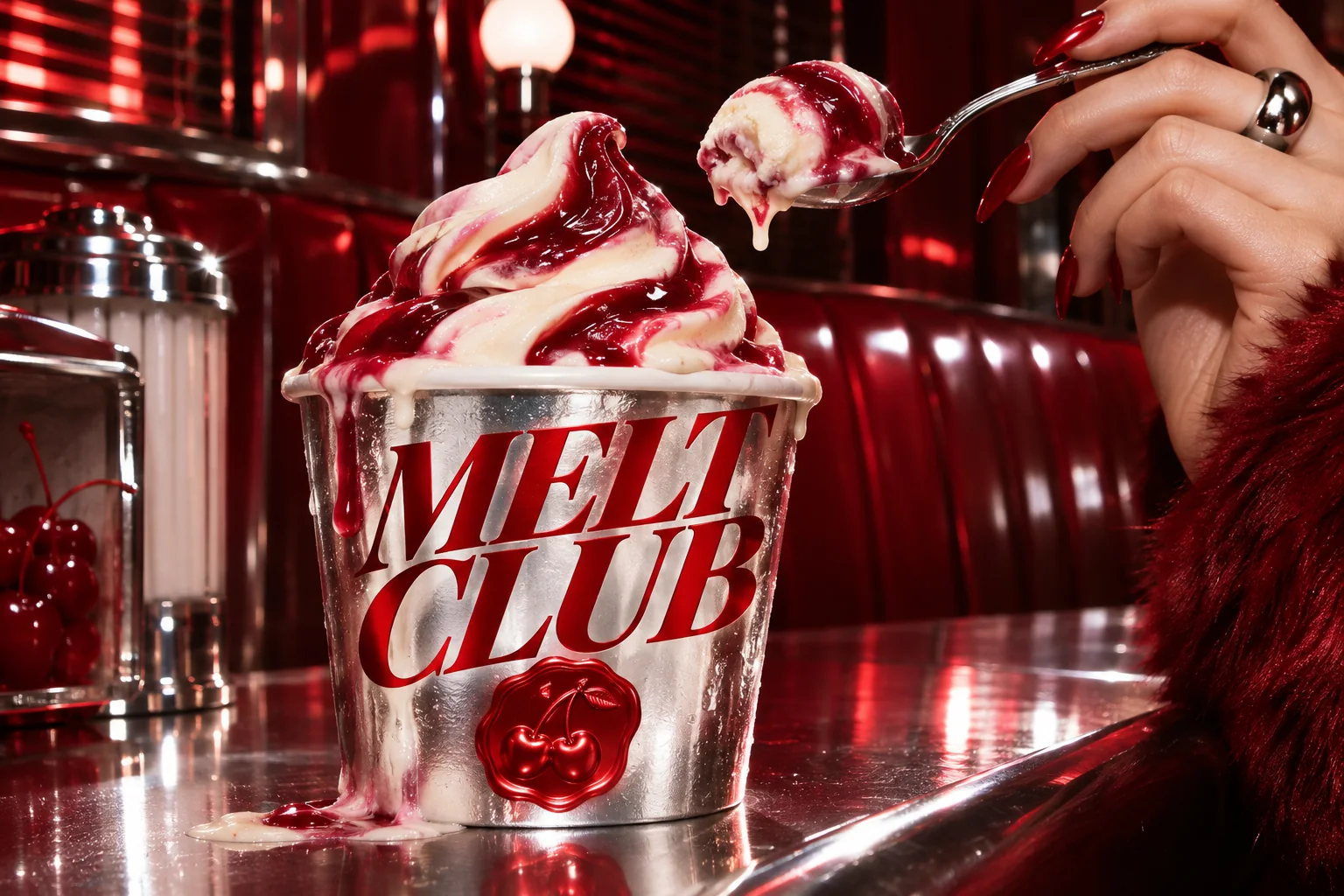
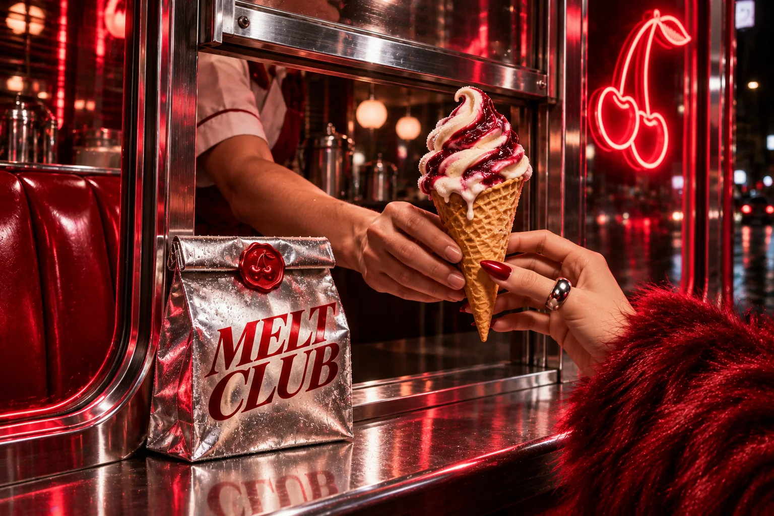
Chrome Cherry
Chrome, cherry, vanilla.
- Flavour
- Cherry vanilla soft serve
- Scene
- Midnight diner
- Type idea
- Red italic contrast serif
- At work
- Takeaway window
- #B2111C
- #C7CAD1
- #F3E9D2
02/ 10
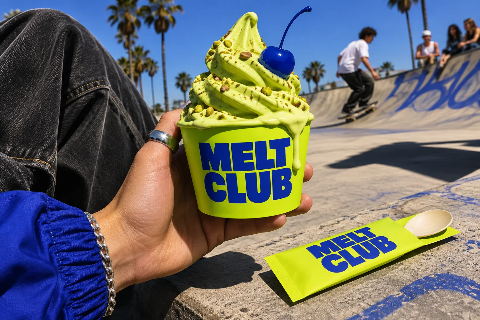
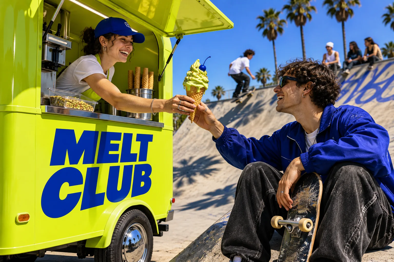
Acid Pistachio
Loud lime, cobalt type.
- Flavour
- Pistachio soft serve
- Scene
- Skatepark
- Type idea
- Compressed cobalt grotesk
- At work
- Mobile kiosk
- #C7ED3A
- #121212
- #1E3FBF
03/ 10
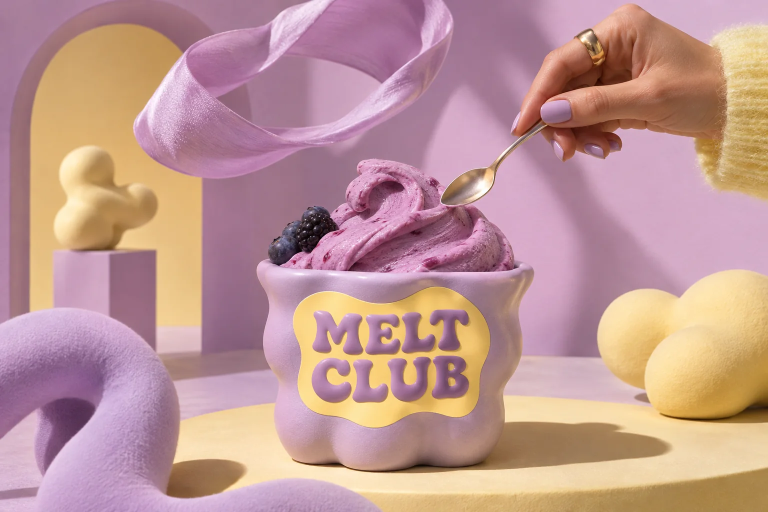
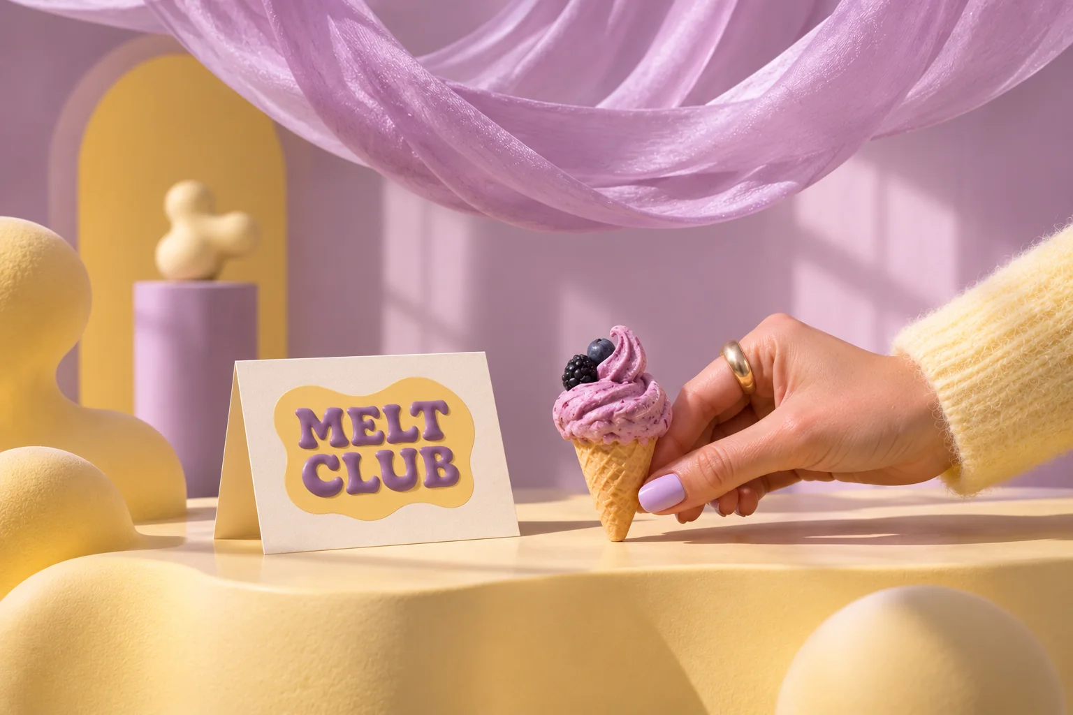
Soft Sculpture
Soft, inflated, sweet.
- Flavour
- Berry gelato
- Scene
- Gallery still life
- Type idea
- Inflated round serif
- At work
- Gallery counter
- #C7B1E4
- #F4E19F
- #7A4E6E
04/ 10
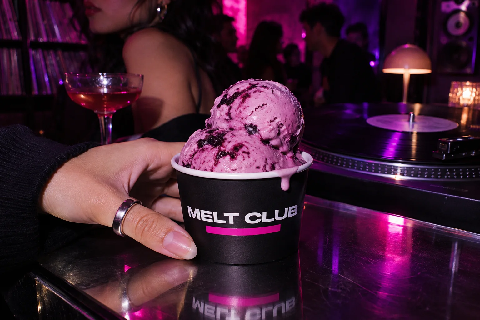
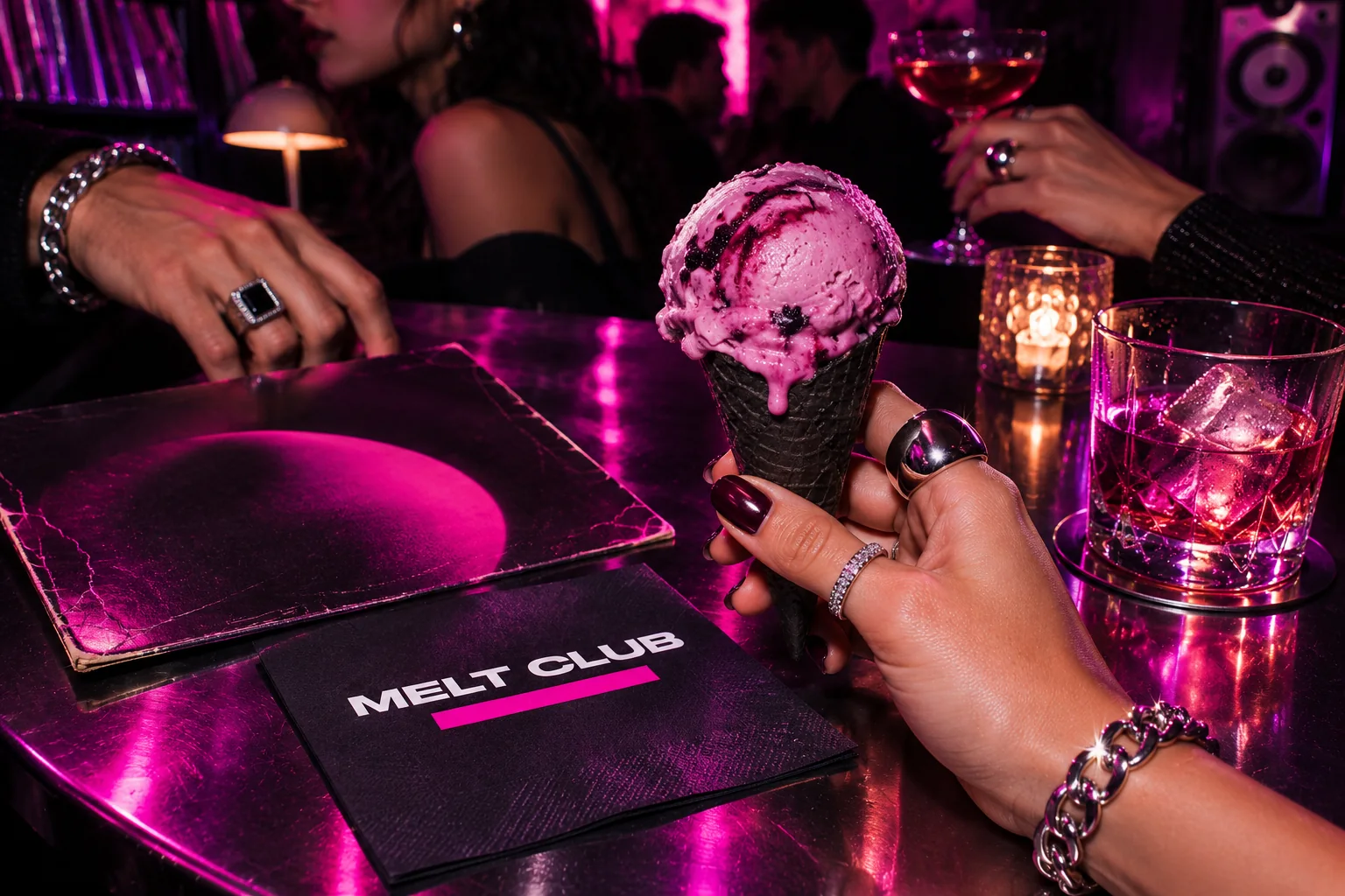
Ultraviolet Hours
After dark, in magenta.
- Flavour
- Blackcurrant
- Scene
- Listening bar
- Type idea
- Wide clean grotesk
- At work
- Bar table at night
- #0E0A13
- #E0199A
- #6B2FA0
05/ 10
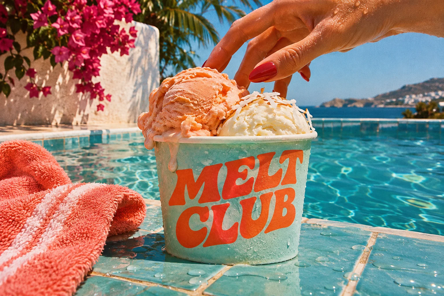
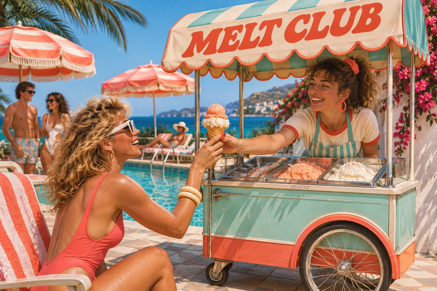
Poolside
Aqua, coral, a summer cart.
- Flavour
- Peach coconut
- Scene
- By the pool
- Type idea
- Playful retro serif
- At work
- Ice cream cart
- #7DD2CF
- #F0694E
- #F6C3A0
06/ 10
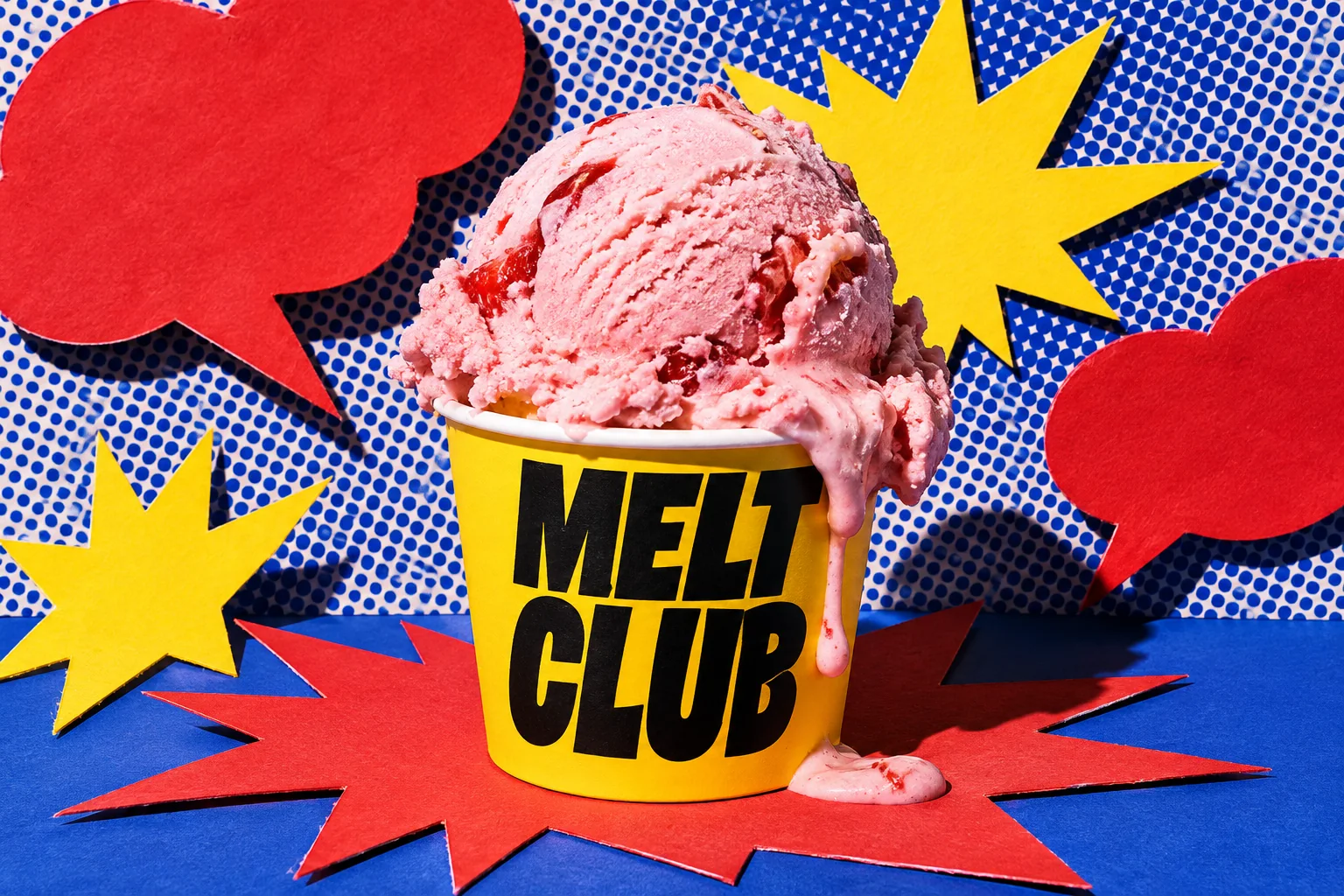
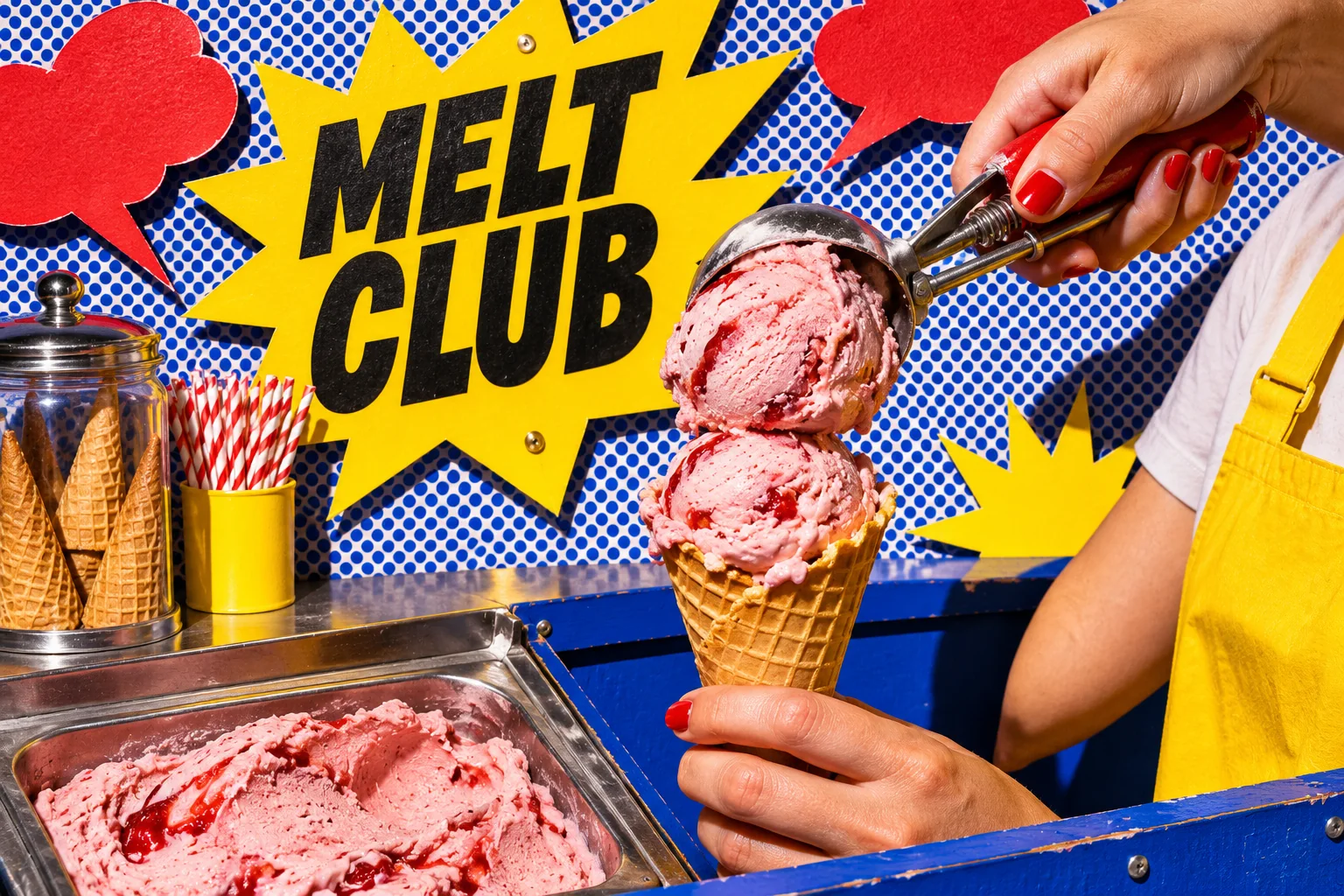
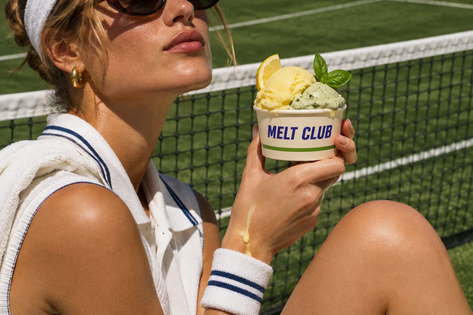
Comic Crush
Pow, strawberry.
- Flavour
- Strawberry
- Scene
- Pop-art set
- Type idea
- Black condensed block type
- At work
- Scoop counter
- #FDCF20
- #E5312A
- #1F3FA8
07/ 10
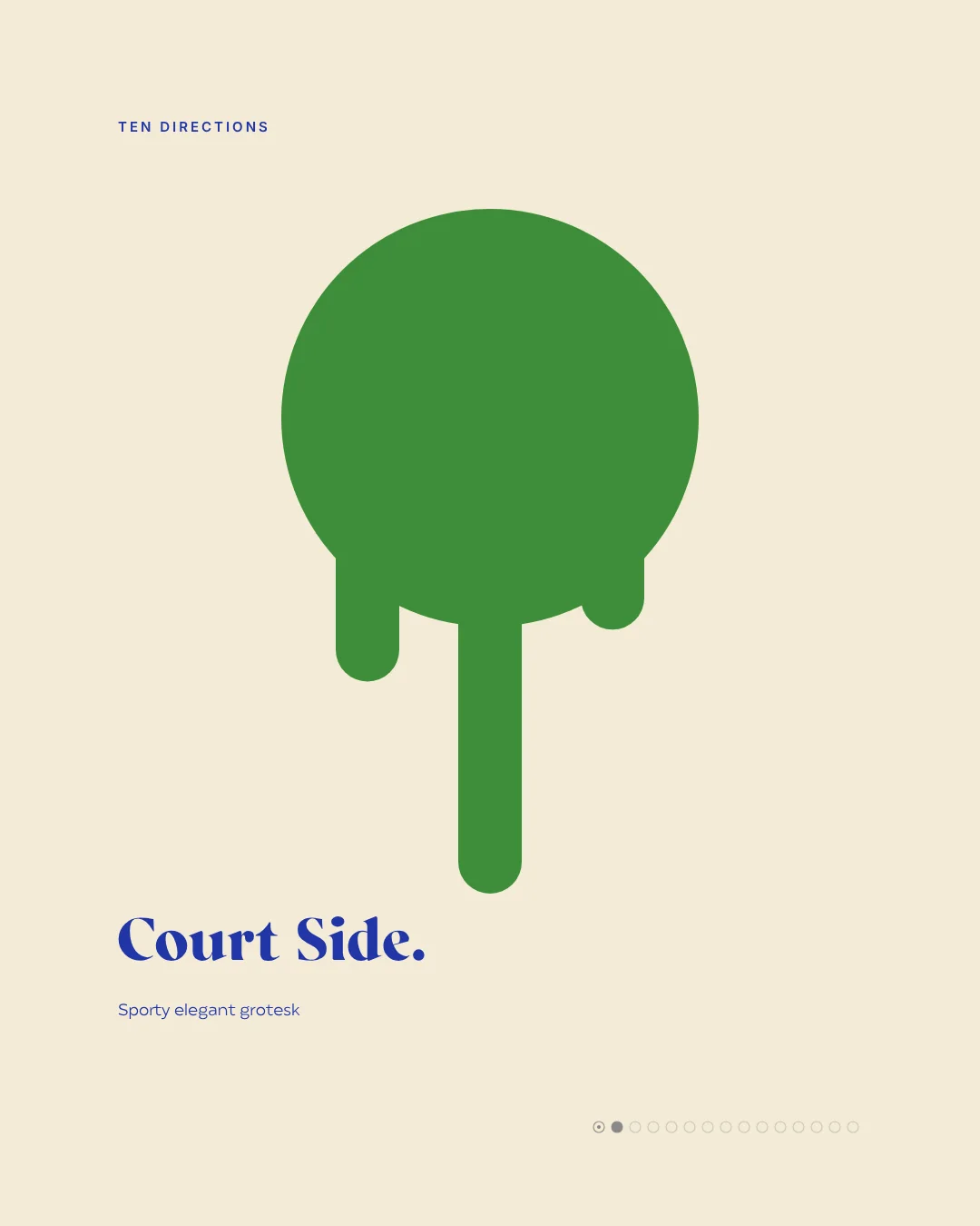
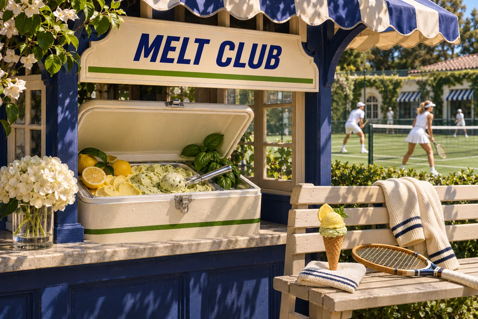
Court Side
Cream, navy, freshly cut grass.
- Flavour
- Lemon basil
- Scene
- Tennis court
- Type idea
- Sporty elegant grotesk
- At work
- Club kiosk
- #F2EAD4
- #3C8D39
- #1F2F8F
08/ 10
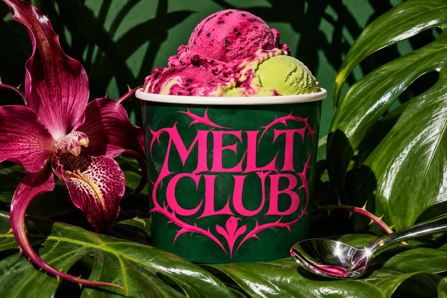
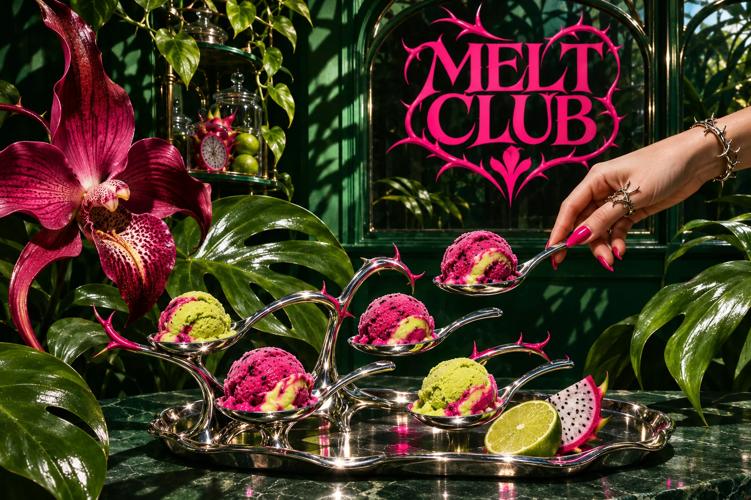
Botanical Alien
Thorns, hot pink, lime.
- Flavour
- Dragon fruit lime
- Scene
- Botanical fantasy
- Type idea
- Thorny expressive serif
- At work
- Shop display
- #113C2B
- #EE2879
- #B7E04A
09/ 10
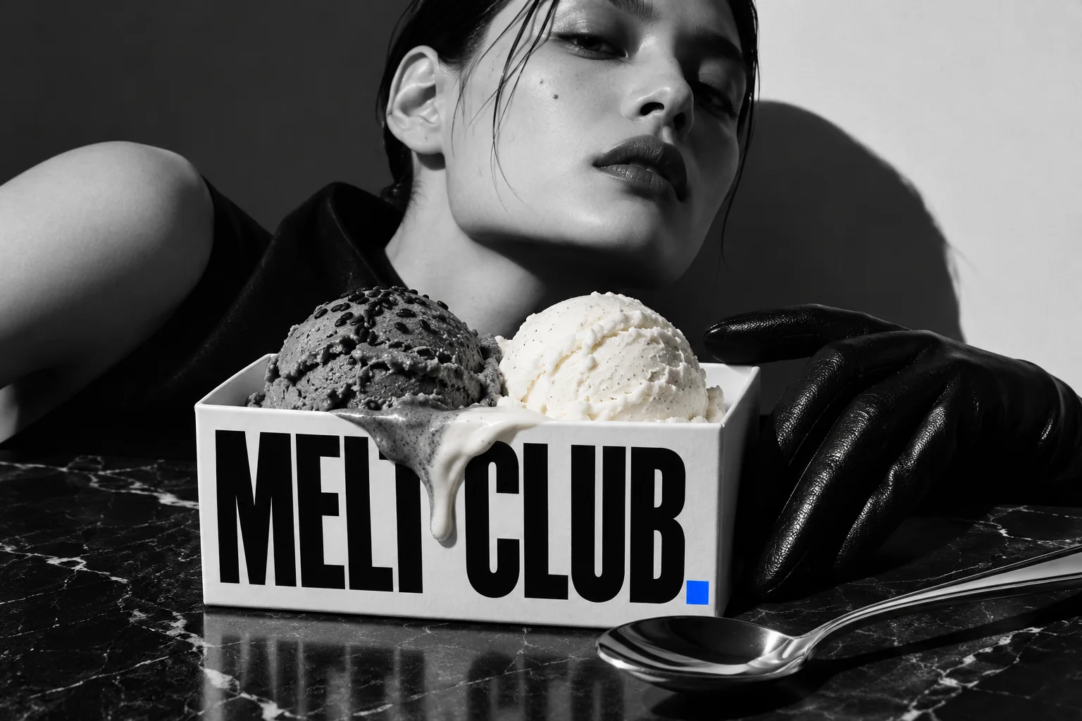
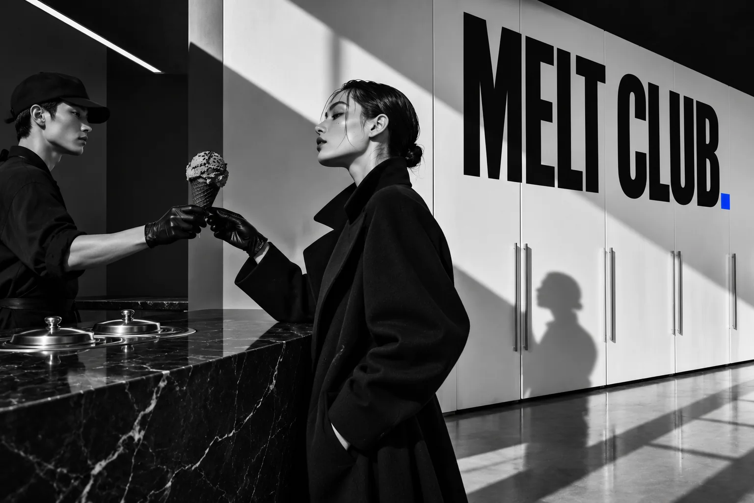
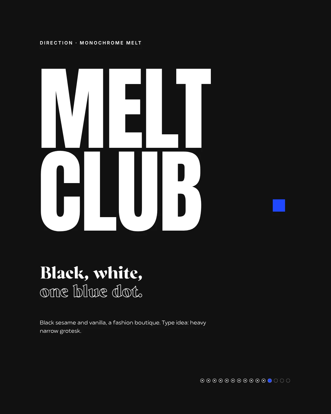
Monochrome Melt
Black, white, one blue dot.
- Flavour
- Black sesame and vanilla
- Scene
- Fashion boutique
- Type idea
- Very heavy narrow grotesk
- At work
- Boutique counter
- #111111
- #1E46FF
- #F5F5F5
10/ 10
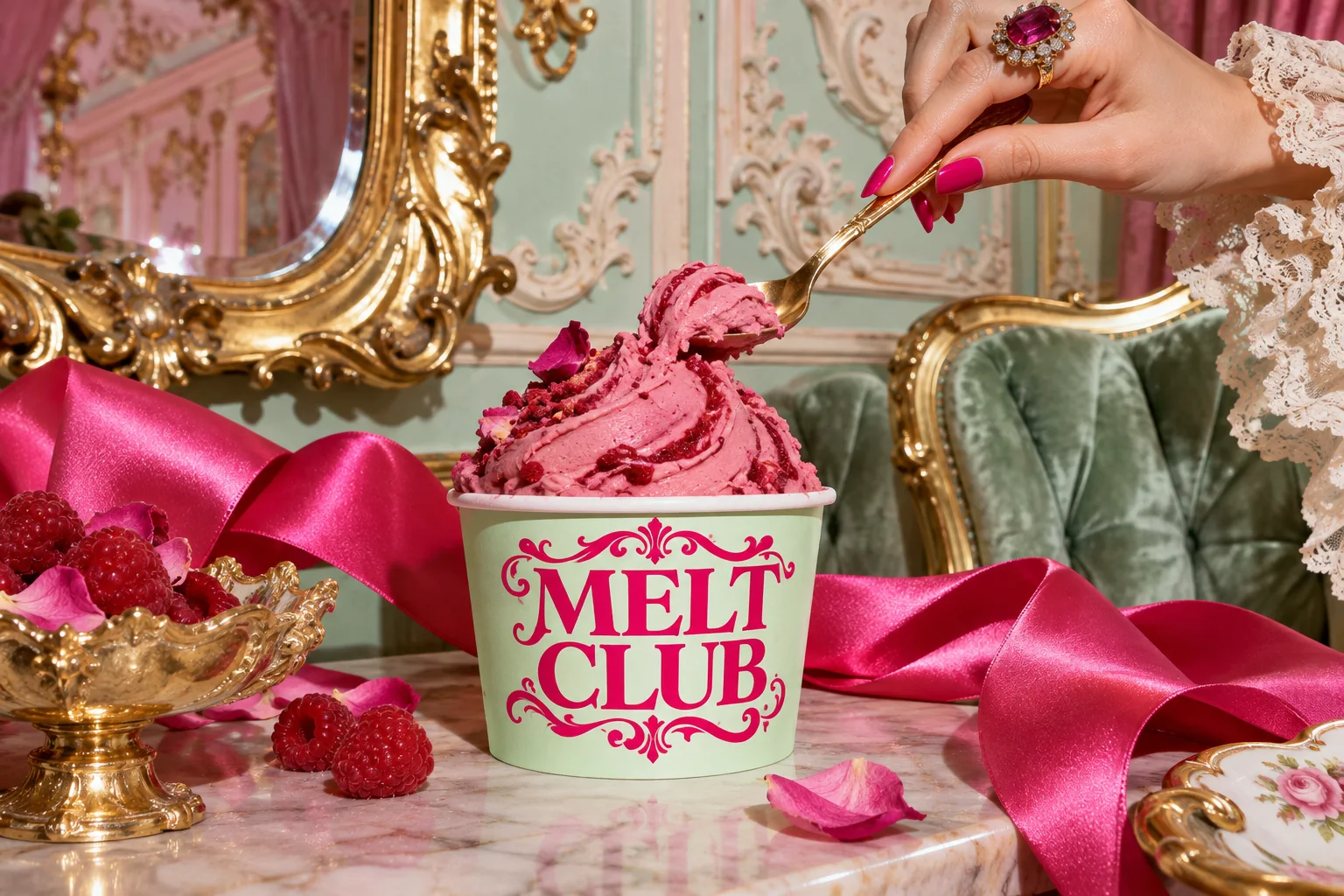
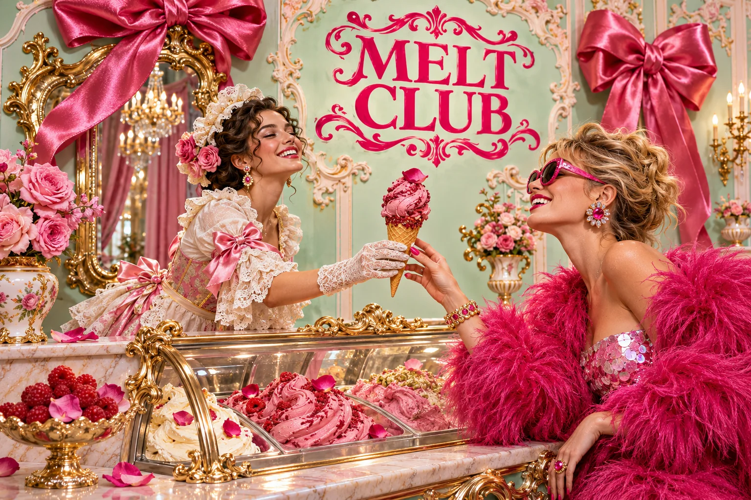
Rococo Riot
More is more.
- Flavour
- Raspberry rose
- Scene
- Rococo salon
- Type idea
- Opulent ornamental serif
- At work
- Gelato display
- #BCDFCA
- #DD247E
- #C9A24A
Ten briefs, one brand
Ten briefs, side by side.
- Red italic contrast serifCherry vanilla soft serve
- Compressed cobalt groteskPistachio soft serve
- Inflated round serifBerry gelato
- Wide clean groteskBlackcurrant
- Playful retro serifPeach coconut
- Black condensed block typeStrawberry
- Sporty elegant groteskLemon basil
- Thorny expressive serifDragon fruit lime
- Very heavy narrow groteskBlack sesame and vanilla
- Opulent ornamental serifRaspberry rose
Ten briefs for one brand
We wrote a short brief for every direction: place, three colours, a type idea and a flavour. The main picture shows the cup in its world, the second uses the first as a reference and deliberately switches the type of picture, so you don’t end up with ten versions of the same cup shot. The wordmarks in the pictures are concept drafts. Once a world is chosen, we draw the logo as a vector.
- BriefAn ice cream brand, one name, one scoop, as the first episode of One brand. Ten worlds.
- DirectionsTen worlds with their own scene, from Chrome Cherry to Rococo Riot.
- Colour and typeThree colours and one type idea per world, from italic serif to heavy grotesk.
- ImageryOne main picture and one at-work picture per direction, kiosk, counter, cart or display.
- ChoiceAll ten side by side, an animation where the palettes melt into each other, and an Instagram carousel.
Melt club · order
1 ×Chrome Cherry
FlavourCherry vanilla soft serve
ServedMidnight diner
Logodrawn after the choice
One scoop. Your world.
Same scoop. Ten worlds.
Melt club is an invented ice cream brand. The name and the scoop stay the same, everything else changes: place, colours, type idea and flavour. Ten directions, from chrome cherry in a diner to a rococo salon in mint and fuchsia. The wordmarks in the pictures are drafts, the final type is drawn once a world has been chosen.
- Brand
- Melt club, fictional
- Series
- One brand. Ten worlds. · Vol. 01
- Carousel
- 15 slides
- Images
- Made with AI, wordmarks as drafts
What this means for your brand
Before you commit to a logo, it pays to look in several directions. We show you how your brand could feel in different places, colours and typefaces, concretely enough that you can picture it in the shop. Then you choose, and we build out that direction properly.
AI imagery & AI video for your brand Guide: AI images for business
Which world would you order from?
Let’s find your flavour.
Before there is a logo, we show you several honest directions for your brand, with place, colours and tone. Then you choose, and we build out the one.
Check our services