Velawild lab · The first draft was bad
Art direction for AI product images of a candle brand
The first draft was bad. On purpose.
Full transparency first: our first two routes for Vela already looked good. So we started a third route with a deliberately weak prompt, to show what art direction actually does with AI images. The rough draft is staged; every step after it is a real edit.
Invented brand, made with AI. Concept, branding and art direction by wild & co.
Version historyRoute C
Routes A and B already looked good. We started route C badly on purpose, so you can see what happens afterwards.
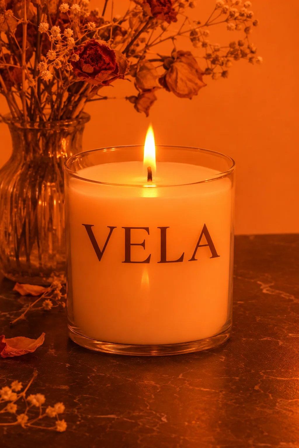
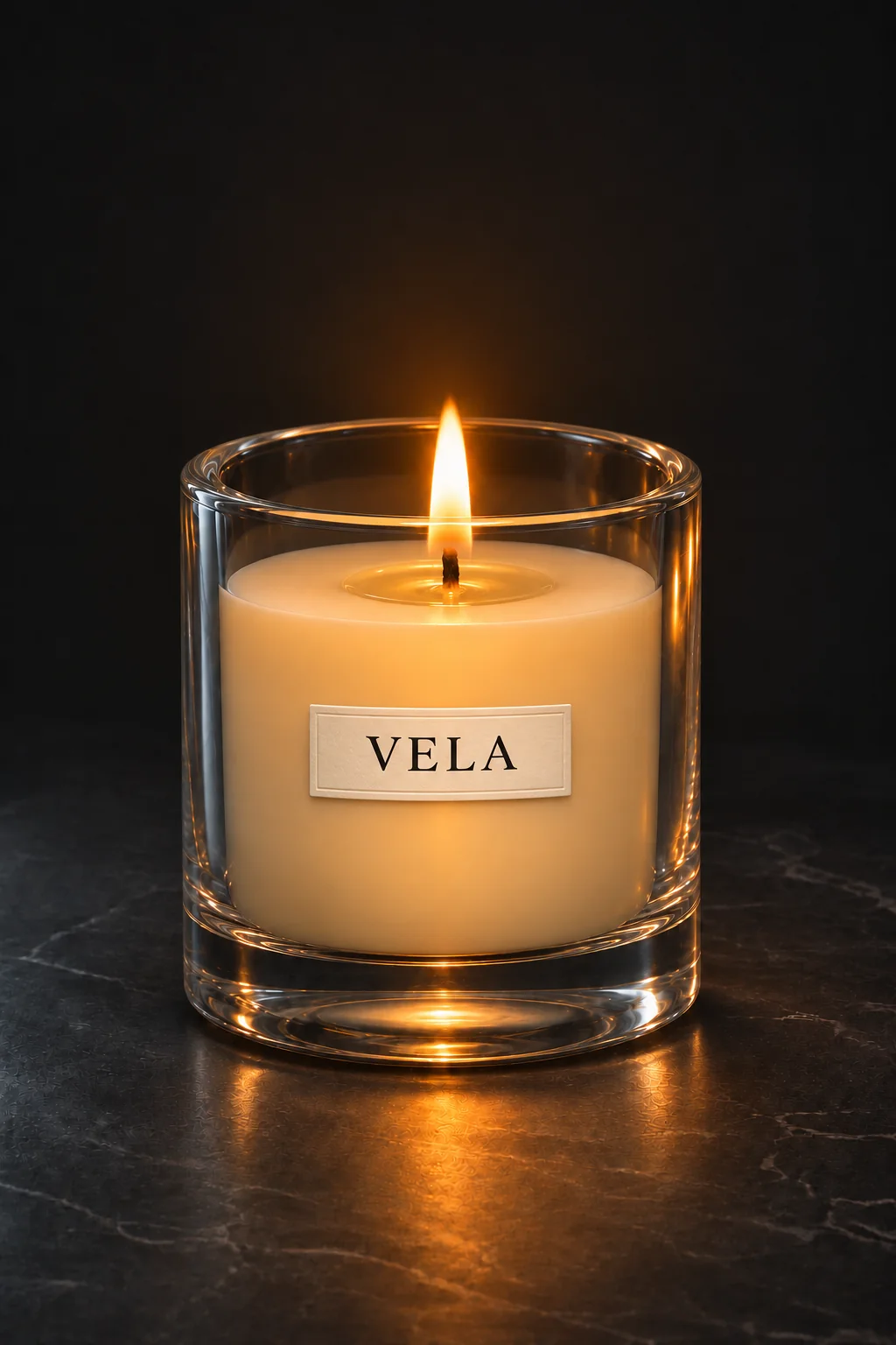
- Dried flowers, a vase: noise
- Harsh orange light
- Wax too high and flat
- Oversized wordmark
- Thin-looking glass
Edit by edit · route C
Edit by edit
Briefed badly. On purpose.
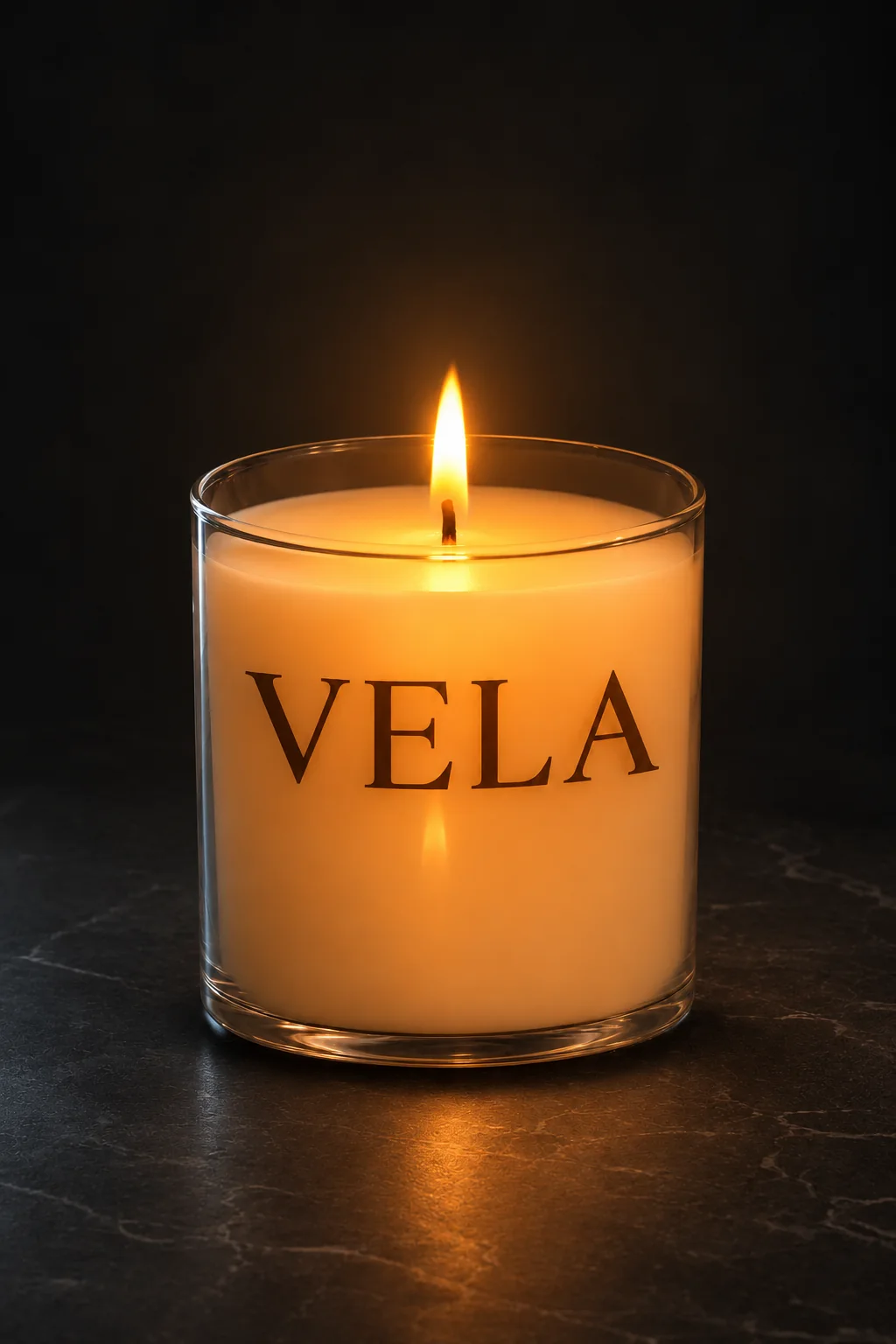
- +A deliberately weak prompt that orders the mistakes along with it.
The rough draft is staged. We deliberately under-directed the start; the AI didn’t fail on its own.
The brand · Vela
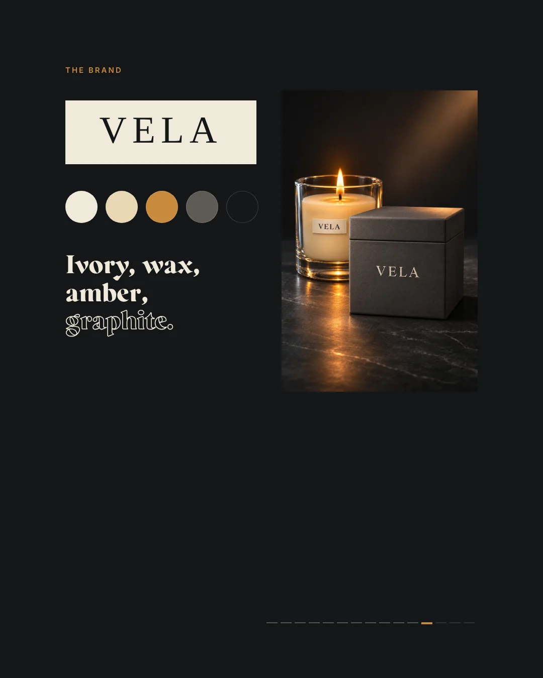
Heavy glass, calm light.
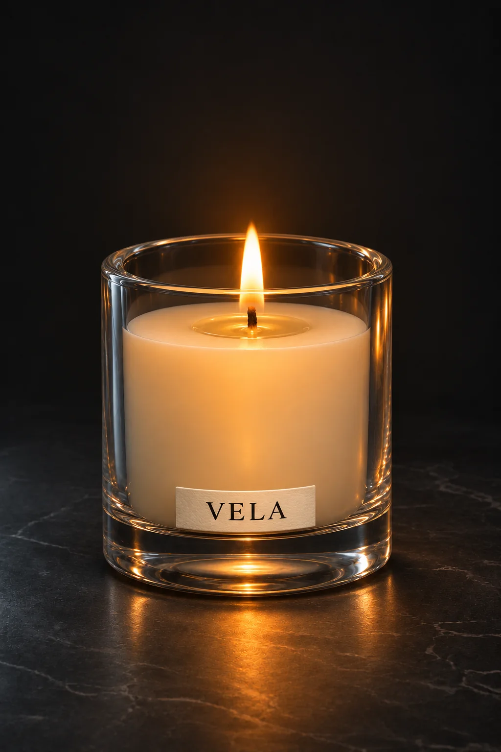
Vela is an invented candle brand: a clear, heavy-walled glass with a thick base, ivory wax below the rim and a cotton wick. On the front sits a small paper label with an embossed edge and black serif type; the box is graphite card.
Charcoal#151719Ivory#F1E9DAGraphite#262526Flame#B8793FCool rim#B4BDC3
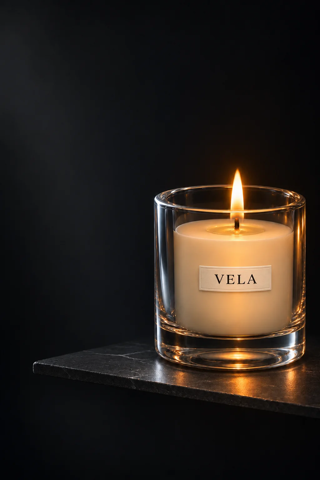
The reference for every picture after it
One final version, every picture after it.
The final key visual fixed glass, wax, label and light. Every further angle was generated on its own and then matched to the centred label position.
01ASide profile 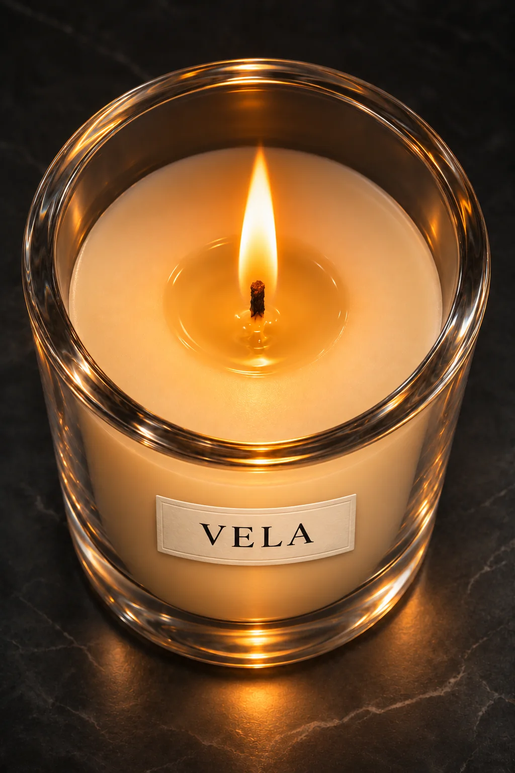
02ATop view 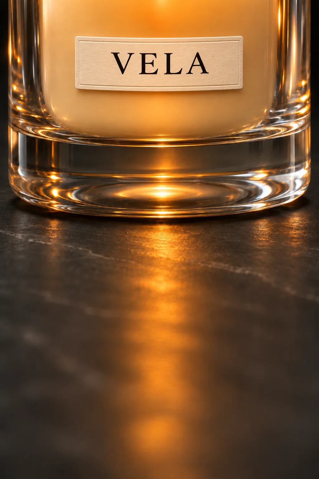
03AGlass base 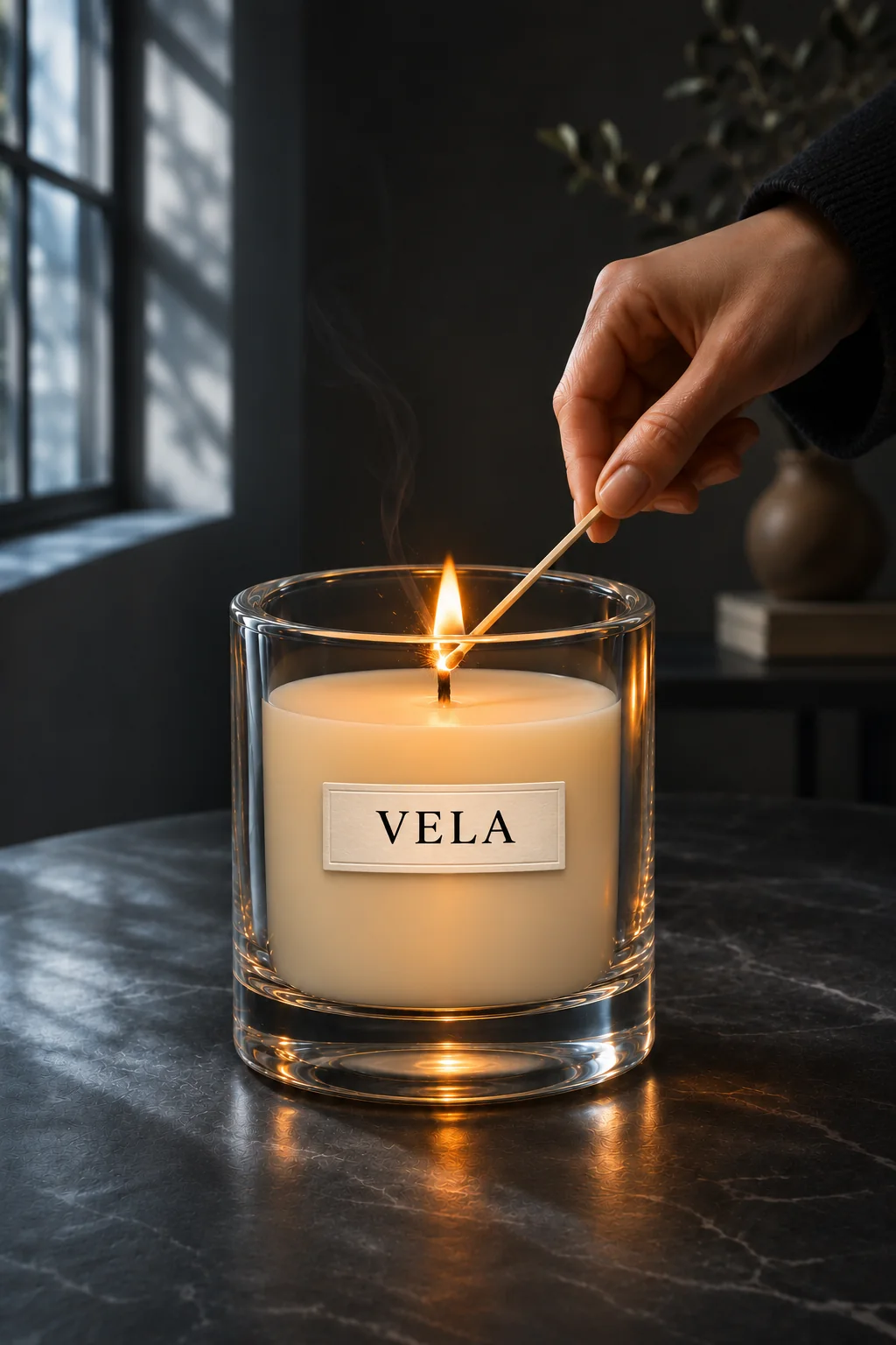
04AThe ritual 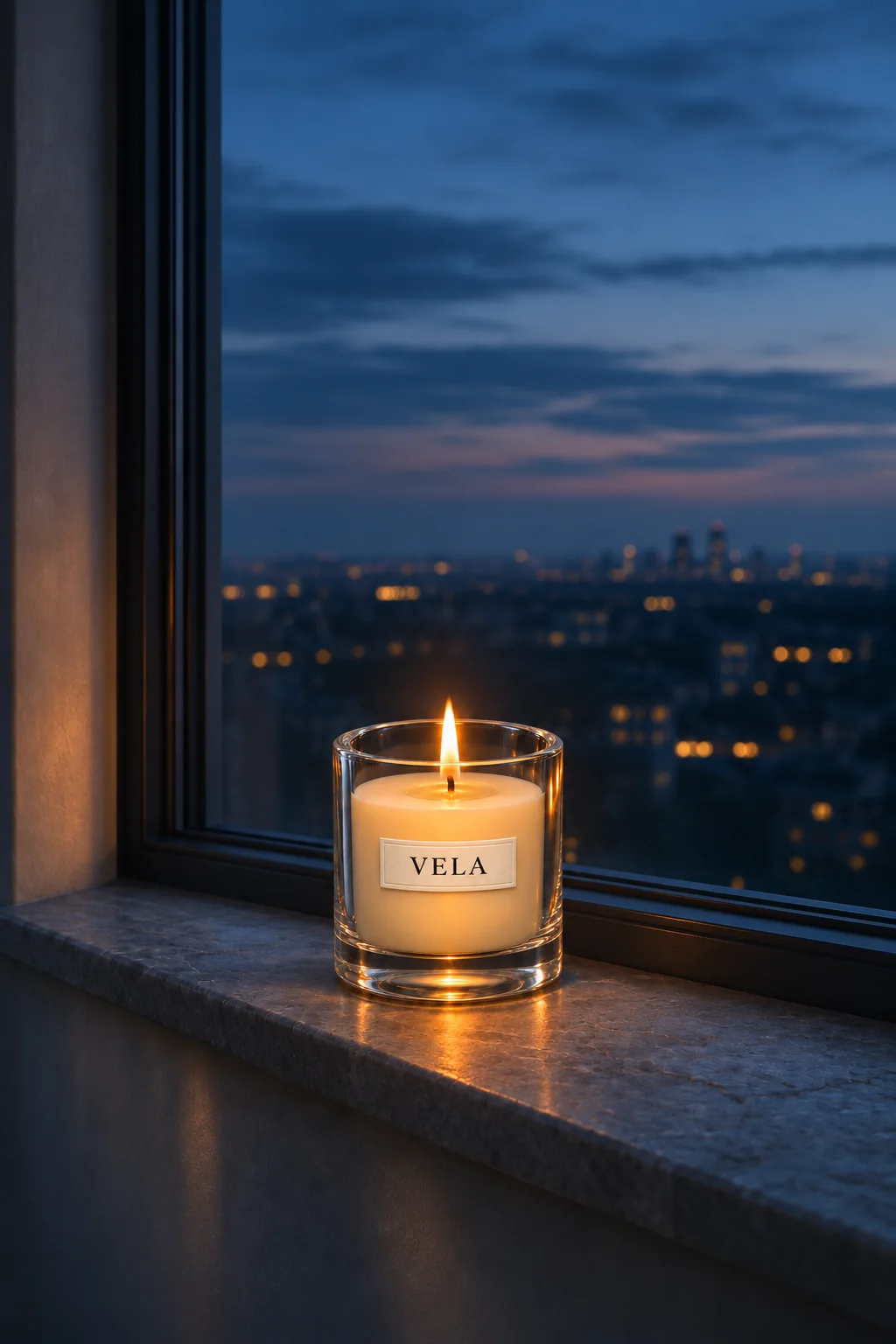
05AThe window 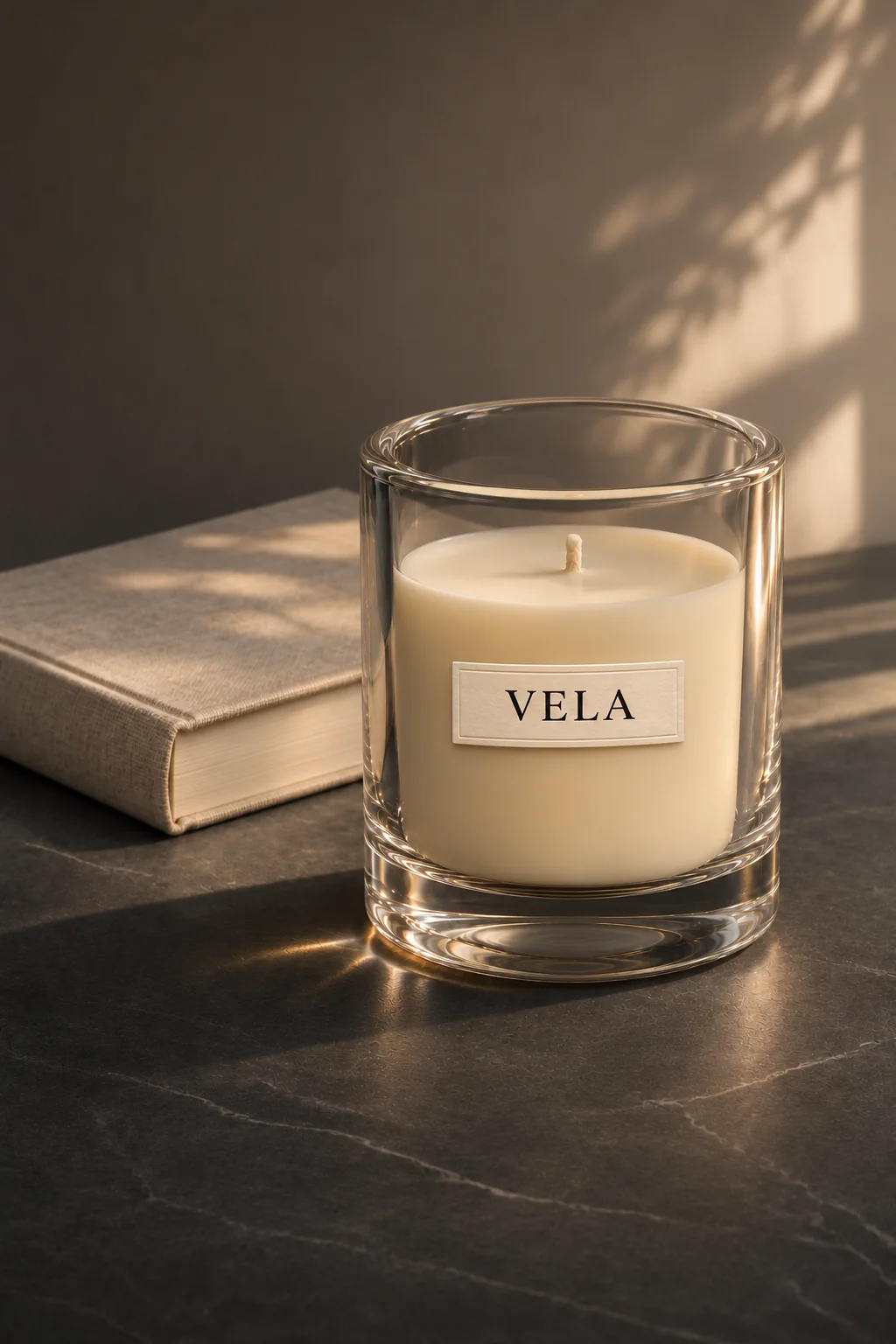
06AStill life
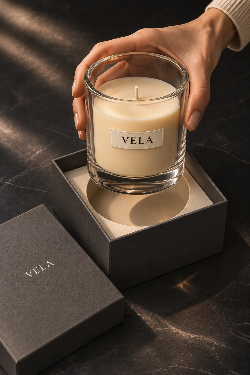
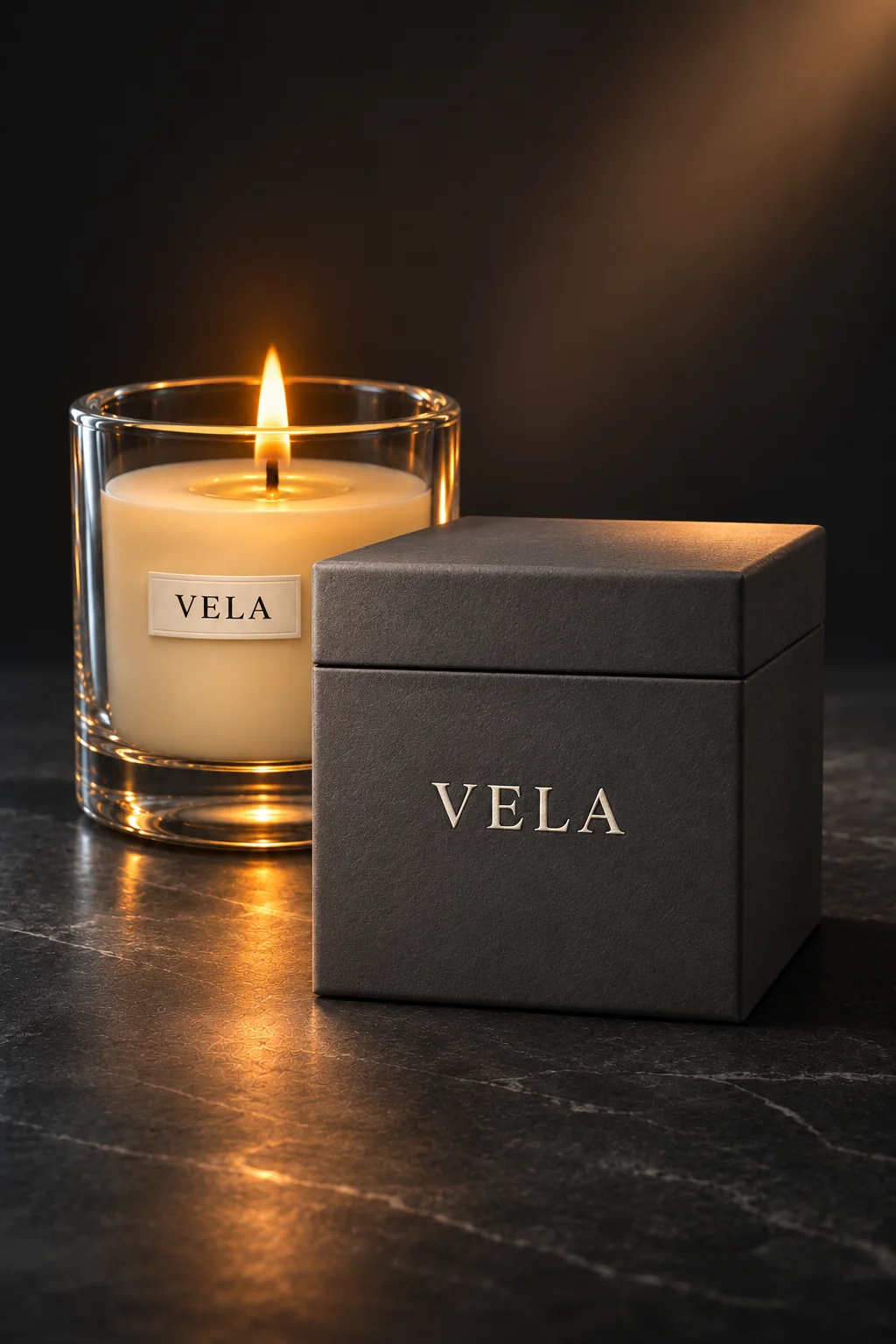
The object
Graphite card, a small serif.
The box repeats the label: quiet, centred, embossed. Graphite card, a light wordmark, nothing else.
How we built it
Edit, look, decide, repeat.
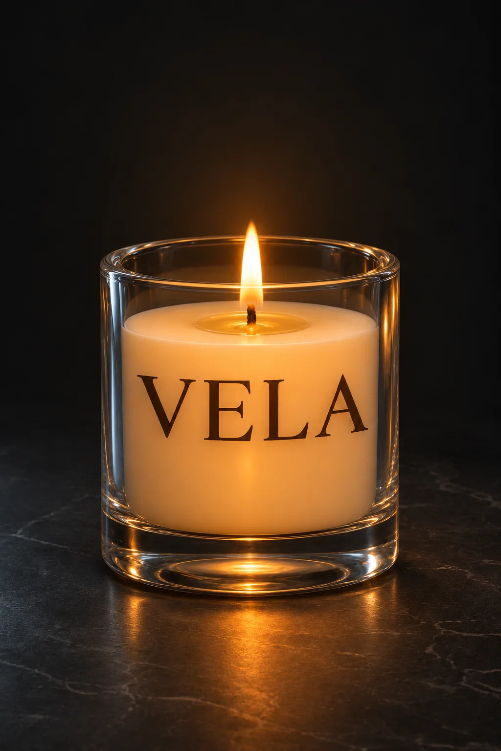
The first draft was bad is a new series about what happens between the first image and the finished motif. Vela’s starting point: harsh orange light, dried flowers and a vase as noise, thin-looking glass, wax too high and flat, a giant wordmark across the front. Then came three decisions, only one per edit: light and set, glass and wax, brand hierarchy.
Every edit builds on the one before. First, out with everything that distracts, so the flame can lead. Then heavier walls, a lower wax line and a real melt pool. Finally the big lettering became a small embossed paper label, and the label moved until it sat right in the centre. The final version became the reference for every picture after it: side profile, top view, the ritual, the window, the box.
Vela is fictional. All images are AI-generated; the rough draft was staged deliberately.
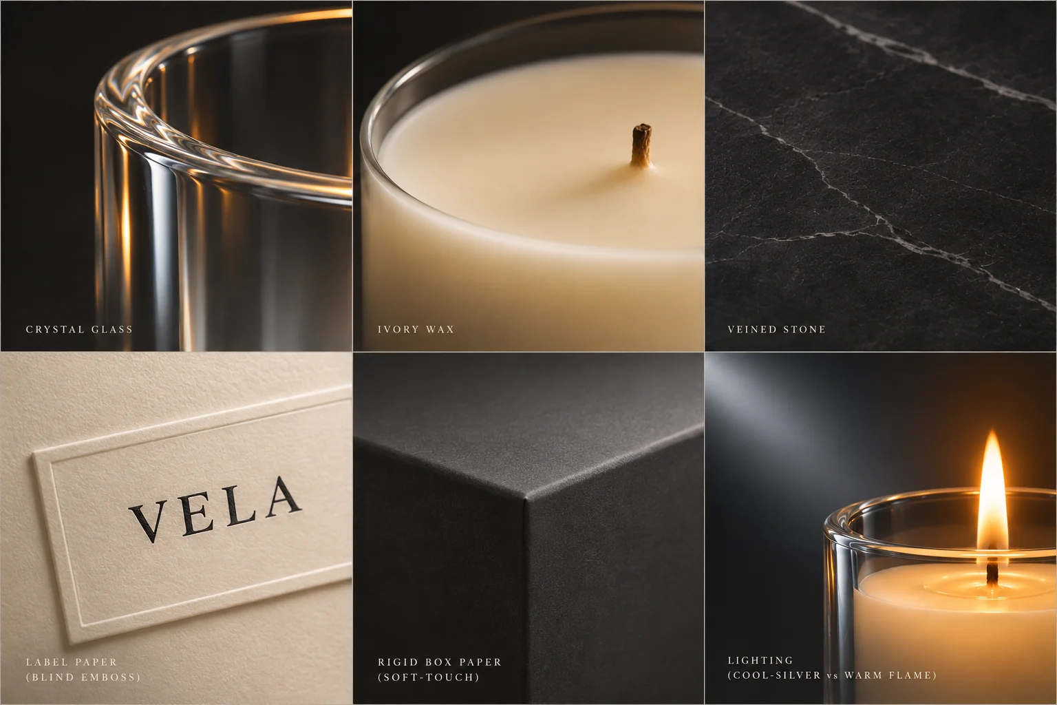
- BriefA candle brand as a case study for art direction with AI images, as the first episode of The first draft was bad.
- Rough draftA third route, briefed weakly on purpose and openly labelled as staged.
- EditsLight and set, then glass and wax, then label and brand hierarchy, one decision per step.
- DesignA black serif wordmark on ivory, a palette of charcoal, ivory, graphite, flame and cool rim.
- Visual worldThe key visual as reference, plus side profile, top view, ritual, window, still life and box.
Generating is easy. Directing is the work.
- Brand
- Vela, invented
- Series
- The first draft was bad, Vol. 01
- Carousel
- 15 slides, 1 animation
- Rough draft
- Staged on purpose, real edits after it
What this means for your brand
An AI image takes seconds. Whether it looks like your brand is decided afterwards: light, material, physics, hierarchy. That is exactly the work we do, traceable and step by step, so you end up with a key visual every further picture can build on.
AI imagery & AI video for your brand Guide: AI images for business
Your second draft
Your first draft doesn’t have to be the last.
You have AI images that are almost there? We take over the art direction, decision by decision, until they look like your brand.
Write us for your project