What belongs on a flyer, which format suits it and what matters in the print files? How to prepare your flyer, whether you have it designed or make it yourself.
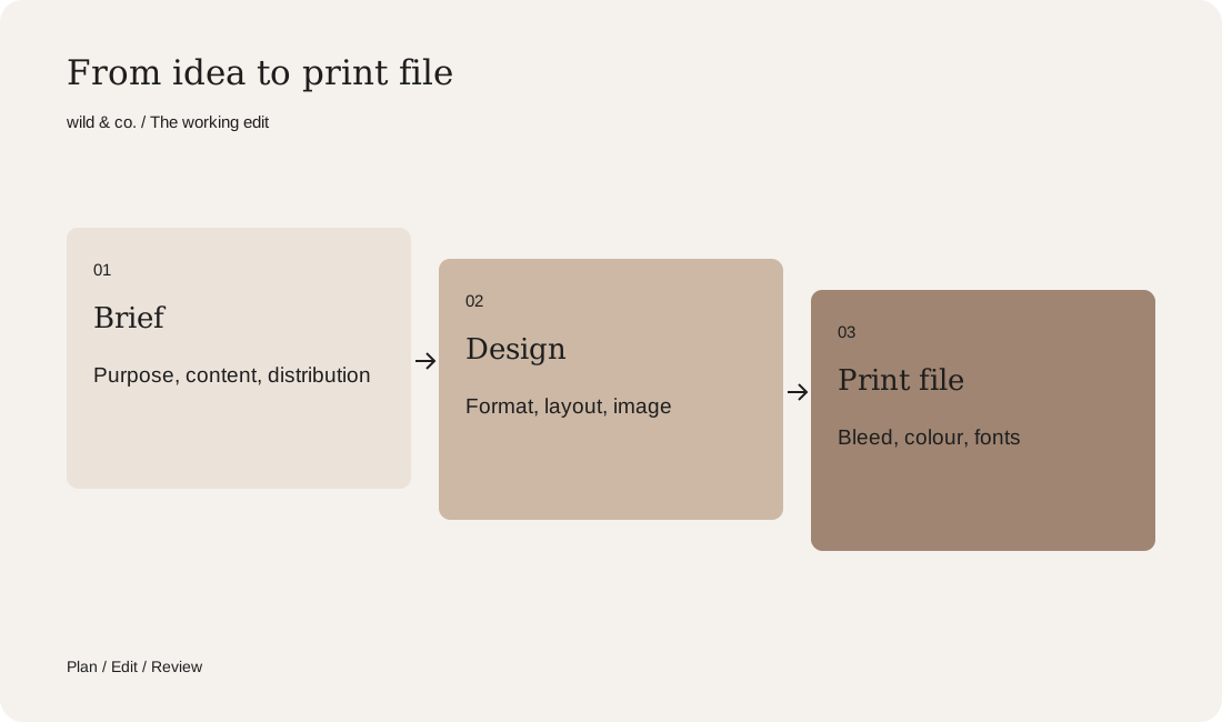
A good flyer has one purpose, one main message and a clear next step. Settle content, format and distribution before design, and have the print file set up with bleed, the right colour mode and embedded fonts.
A flyer is picked up, glanced at and then either pocketed or put down. That decision takes a few seconds. So a good flyer depends less on clever effects than on clear choices: what should happen when someone reads it? Who receives it, and where? What has to be on it, and what can go?
What is your flyer for?
Start with the purpose. A flyer for an opening needs the date, the place and a sense of atmosphere. A flyer that explains your offer needs structure and ways to get in touch. A voucher needs a clear condition. Write the purpose in one sentence, for example: ‘People who receive this at the fair should book an appointment.’ That sentence later decides the headline, the image and the structure. It also helps when you have the flyer designed, because the designer knows immediately what matters.
What belongs on a flyer?
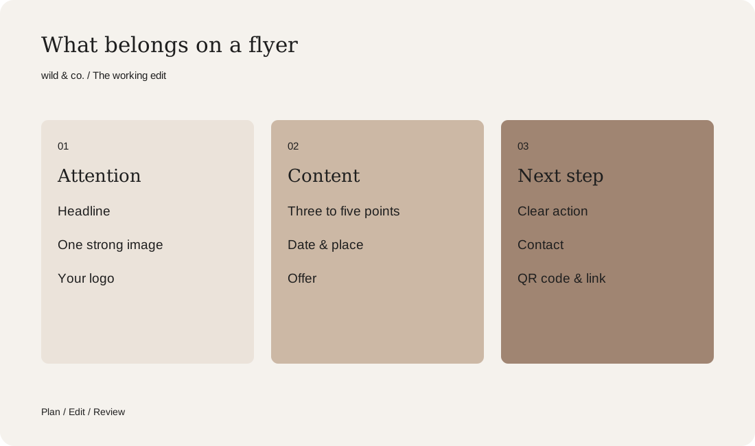
Less text almost always works better. Most flyers need these elements:
- A headline that says what it is about within two seconds.
- One strong image or graphic idea rather than many small pictures.
- Three to five short points about the offer or occasion.
- A clear action: book, visit, scan, call or write.
- Contact details, website and, if useful, a QR code leading to a relevant page.
- Your logo, clearly visible but not the largest element.
Choosing format, fold and paper
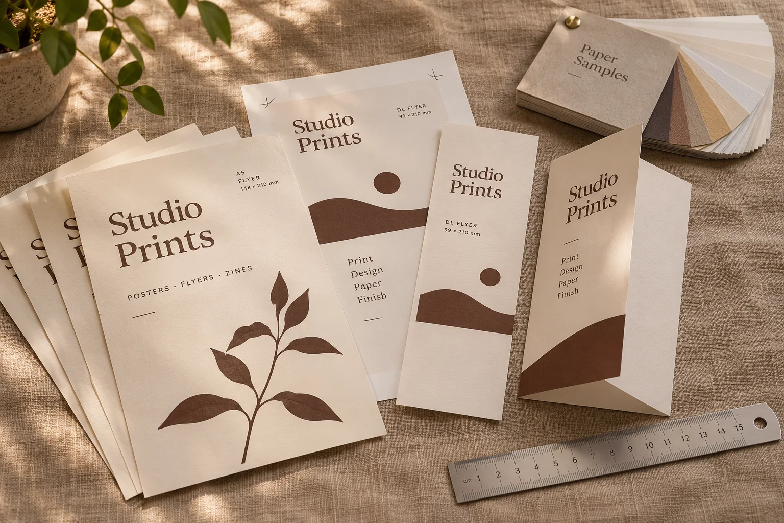
The format depends on where the flyer will end up. A6 fits any pocket and suits cards and vouchers. A5 offers room for an image and some information and is a common format for events. DL is slim, easy to display and fits in an envelope. Folded flyers hold more content but need a clear sequence so the panels are read in the right order. Paper weight and finish shape the impression too: a heavy matt stock feels very different from thin gloss. Ask your printer for samples before you decide.
Design: your corporate design instead of a generic template
A flyer is often the first thing someone holds from you. It should look like the rest of your presence, with the same colours, typefaces and imagery as your website and Instagram. If you have a corporate design, that is quick to do. If not, a flyer is a good moment to set the first rules. Our guide to having a corporate design created explains how. In the layout, allow enough white space, a clear hierarchy from headline to contact details, and text that stays readable at small sizes.
Setting up print files correctly
This is where most mistakes happen, and they only show when the boxes arrive. Before you send the file to the printer, check these points or ask your designer to:
- Bleed: backgrounds and images extend beyond the edge, usually by 3 mm. The exact value is in your printer's specification.
- Safe area: text and logos keep enough distance from the trim edge.
- Colour mode: CMYK or the colour profile your printer asks for. Screen colours always look slightly different.
- Resolution: images with sufficient resolution for print, not copied from the web.
- Fonts: embedded in the PDF or converted to outlines.
- Final check: spelling, phone number, date, link and a tested QR code. Look at a proof if you can.
Design it yourself or have it designed?
With online templates a flyer is made quickly, and for a spontaneous event that can be enough. Having it designed is worthwhile when the flyer represents your brand, when you print a large run or when you regularly need similar printed pieces. A good middle way is a template designed properly once in your corporate design, which you then fill with new details yourself. Flyers, posters and social posts stay consistent without every edition being designed from scratch.
Your flyer brief
Common flyer mistakes
Too much text, too many typefaces, a headline that speaks to nobody, or a QR code that leads to the home page instead of the offer: the most frequent mistakes happen when a flyer tries to say everything at once. Look at your draft from a metre away. What do you see first? If it is not the most important information, the hierarchy is not right yet. At wild & co. in Zurich we design flyers, business cards and other printed pieces as part of our graphic design work, in line with the rest of your presence. Use the brief above to prepare your next flyer.