What belongs in a corporate design, how is it developed and what should you receive at the end? An overview for anyone who wants a consistent presence.
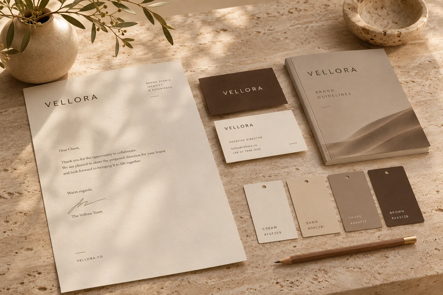
A corporate design defines how your brand looks: logo, colours, typefaces, imagery, layouts and templates. Start with where it will be used, and make sure the rules arrive in a short, practical style guide.
The website looks different from the presentation, the presentation different from the Instagram feed, and the business card still carries the logo from five years ago. It happens to almost every business that has grown without a clear system. A corporate design fixes exactly that. It defines how your brand looks, in a way that you and your team can actually apply on a busy Tuesday.
What is a corporate design?
Corporate design is the visual side of your business. It sits within corporate identity, which also covers attitude, language and behaviour. The logo is only one element. Together with colours, typefaces, imagery and layouts it creates a presence people recognise, even when the logo is out of sight. If you are still unsure what your brand stands for and whom it should speak to, look at positioning first. Our article Why branding matters is a good place to start.
The elements of a corporate design
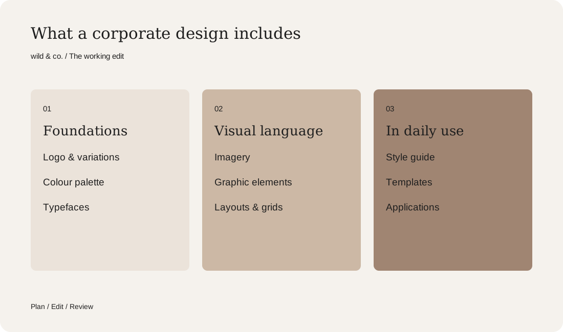
Which elements you need depends on where your brand appears. A studio with a website and Instagram needs different templates from a business with vehicles, packaging and a trade-fair stand. In most cases, these building blocks belong in the system:
- Logo with variations: horizontal, stacked, a short mark, light and dark.
- A colour palette with clear roles: background, text, accent, plus values for print and screen.
- Typefaces: one for headings, one for body text, with sizes and spacing.
- Imagery: light, colour, subjects and crops that suit you, and what to avoid.
- Graphic elements: shapes, lines, icons or patterns that make the work recognisable.
- Layouts and grids: how pages, posts and documents are built.
How a corporate design project works
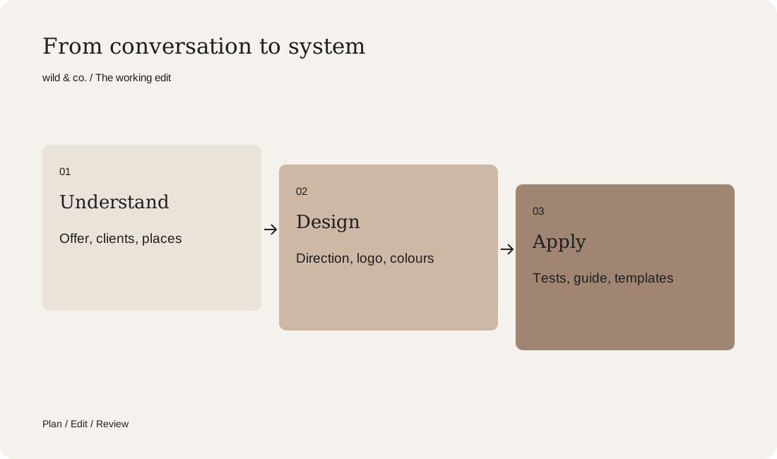
It starts with a conversation about your offer, your clients and the places where your presence has to work. The studio then gathers references and develops one or more visual directions, often as a moodboard. We describe our own approach in How we build a moodboard. Once a direction is chosen, the logo, colours and typefaces take shape. Then comes the part that is often skipped: testing the system on real applications. Only when a website home page, a social post and a document look right with the new rules is the design genuinely finished.
The style guide: rules people understand
A style guide, sometimes called a brand manual, records how the elements are used. It does not need to run to a hundred pages. What matters is that it answers the questions that come up in daily work: which logo goes on a dark background? How much clear space does it need? What colour is a button? What does a quote post look like? Good style guides therefore show examples as well as rules, right and wrong side by side. And they live where your team works, as a PDF, a web page or inside your design tools.
Templates: where your corporate design works every day
A corporate design pays off once it is used, which is why templates almost always belong in the project. Your own week shows which ones you need. Do you write many proposals? Do you present often? Do you post regularly? Typical templates include letterhead, proposal, presentation, email signature, social posts and Stories. A few good templates you actually open beat a large package that gathers dust in a folder. For printed pieces such as business cards and flyers, see our guide to having a flyer designed.
What shapes the scope of a corporate design
We cannot give you a price list here, because the scope varies widely. These questions move the effort the most. Answer them before you ask for proposals and you will receive offers you can compare:
- Are you starting from scratch or refreshing an existing presence?
- Is a new logo being designed, or does the current one stay?
- How many visual directions and feedback rounds are included?
- Which applications and templates must be ready at launch?
- How detailed should the style guide be, and in what format?
- Are type licences, photography or a shoot needed?
For proposals and cost drivers in the wider branding context, read our guide to branding costs in Switzerland.
Your corporate design plan
A new corporate design or a refresh?
Not every presence needs to start again. If your logo is known and works well, a refresh is often enough: sharper colours, a second typeface, rebuilt templates. A new corporate design makes sense when your offer or your audience has changed noticeably, or when your presence has become so inconsistent that patching it no longer helps. Note what should stay because people recognise it, and what bothers you most in daily use. The plan above helps you write exactly that down. At wild & co. in Zurich we develop corporate designs as part of our branding work, in person or remotely.