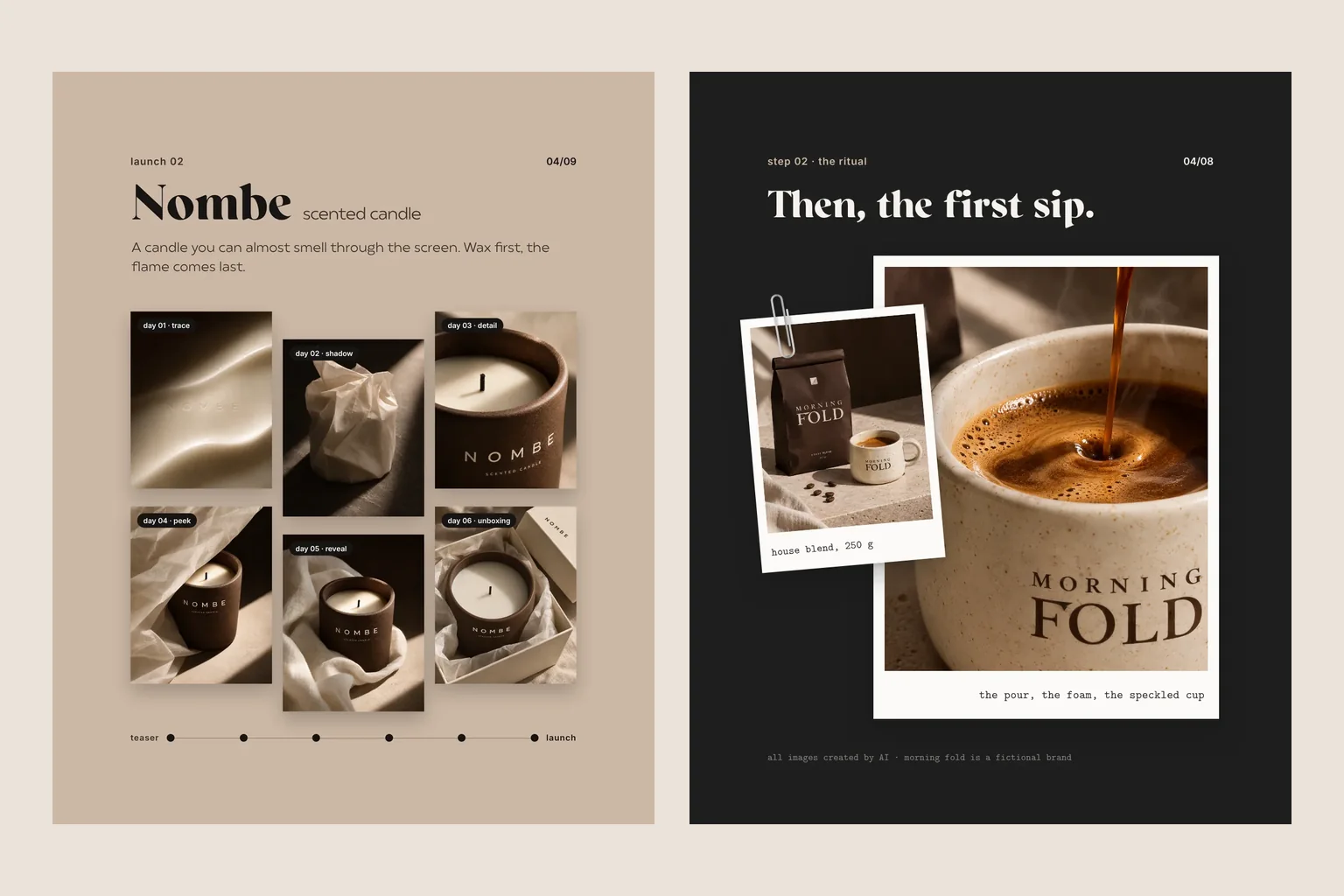
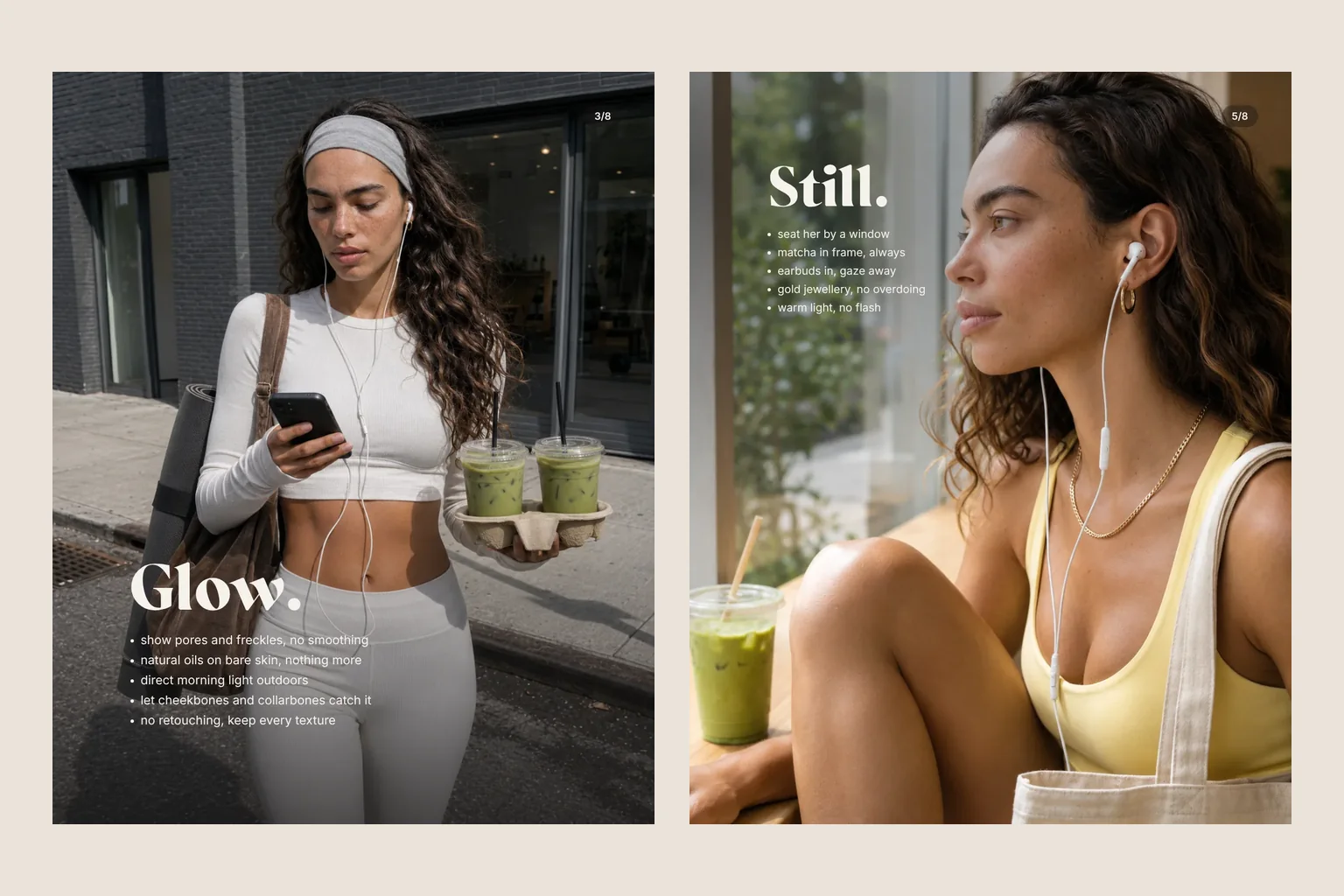
Making one good AI image is easy. The trouble starts around image ten, when the cap, the logo or the shape quietly changes. Reference images, a product spec and strict checking keep your product recognisable.
Consistency in AI imagery comes from preparation, not luck: solid reference images, a written product spec, a short list of fixed details, locked lighting and a check of every single image. Labels are corrected in post-production, and where a detail cannot be generated reliably, the real product photo goes into the scene.
Image one looks fantastic. Image two too, except the cap has turned a shade redder. By image three the tube has stretched, and in image four a letter has gone missing from the logo. Anyone who has built an AI series around one product knows the pattern. One beautiful picture is no longer the hard part; keeping the product identical across many is. This guide explains how to manage that, whichever tool you use.
Why products drift in AI images
An image model has never seen your product. What it has seen is an enormous number of similar ones, and every time you ask, it assembles a fresh version from that memory. Ask for a brown tube with a pink cap and you will get a convincing brown tube every time, just never the same one twice. The busier the scene, the more the product wanders. Water, hands, shadows and reflections pull the model's attention away, and small things such as lettering, screw threads and proportions are the first to slip. Consistency therefore means giving the model as little freedom as possible with the product and plenty of freedom with the scene.
Reference images: the original from every side
Good references come first. If the product exists, photograph it plainly: neutral background, soft light, no harsh reflections. If it only exists as a design, you need a render or a carefully checked first image that is declared the original from then on. A useful set includes:
- a straight front view with a readable label,
- side and back views, so shape and depth are clear,
- close-ups of the cap, closure, seams or embossing,
- the label as a flat artwork file for later corrections,
- the texture if it appears in shot: cream, powder, fabric, surface finish.
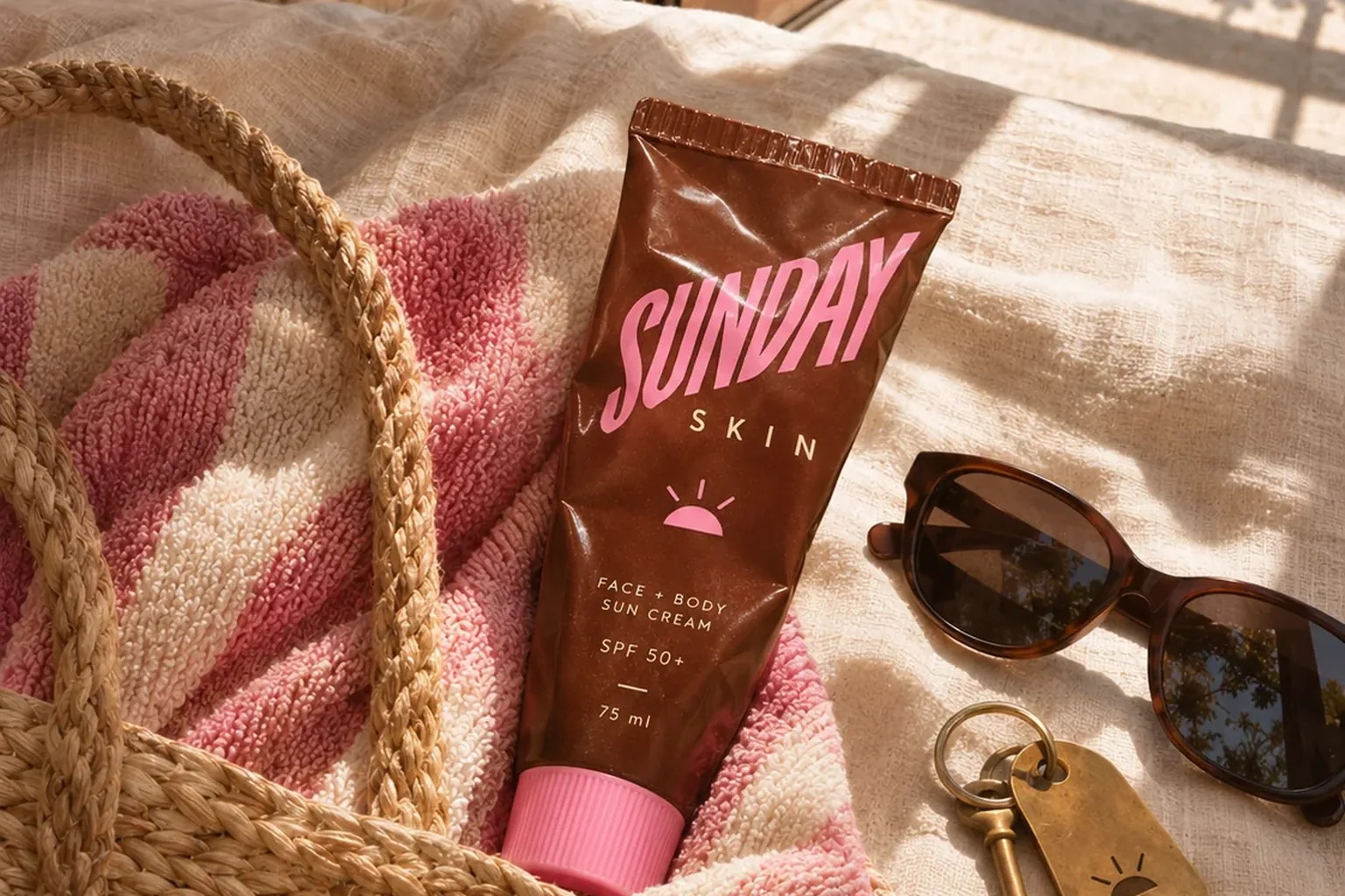
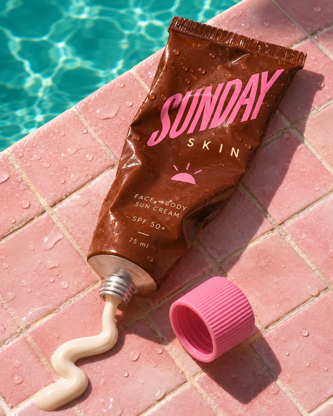
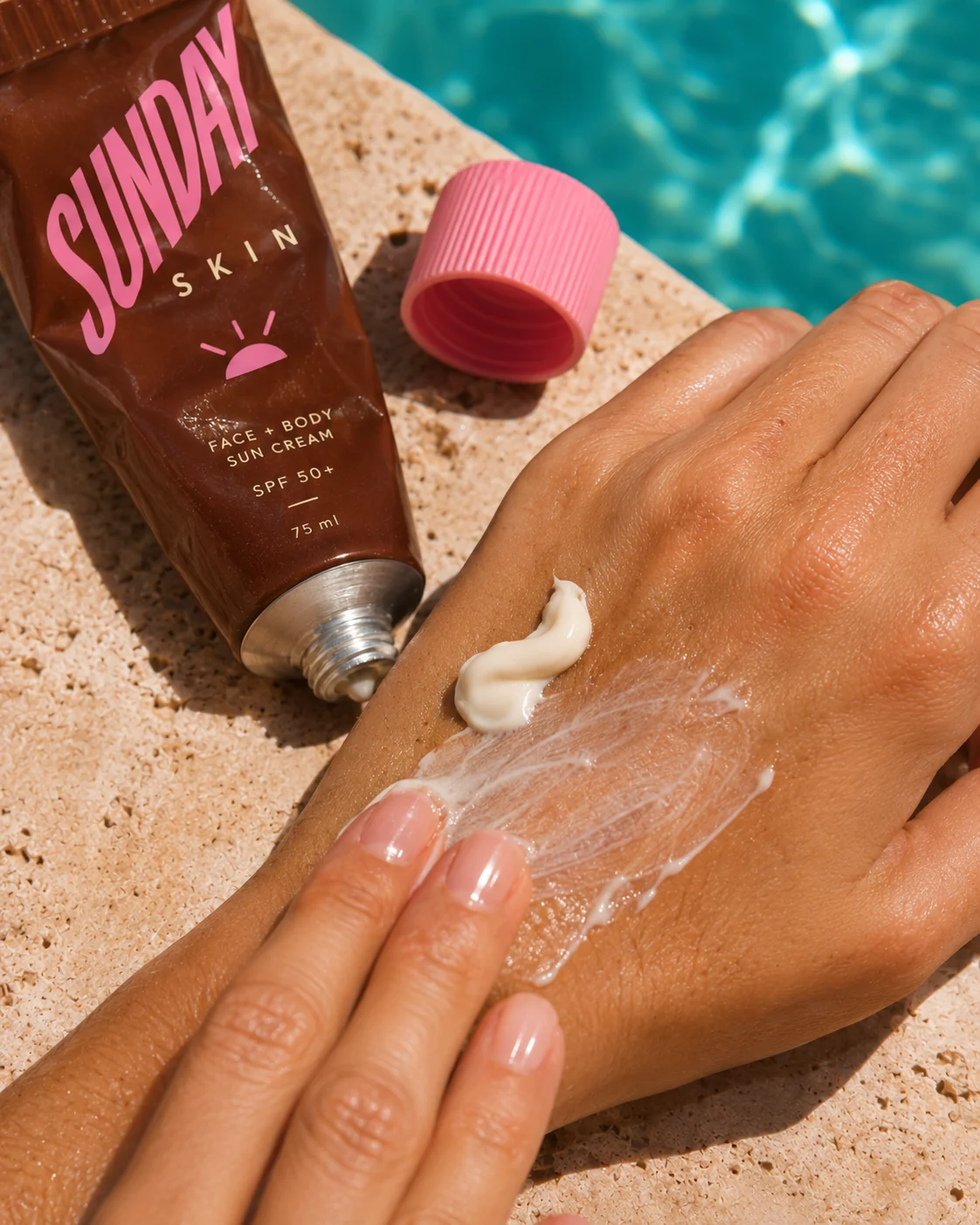
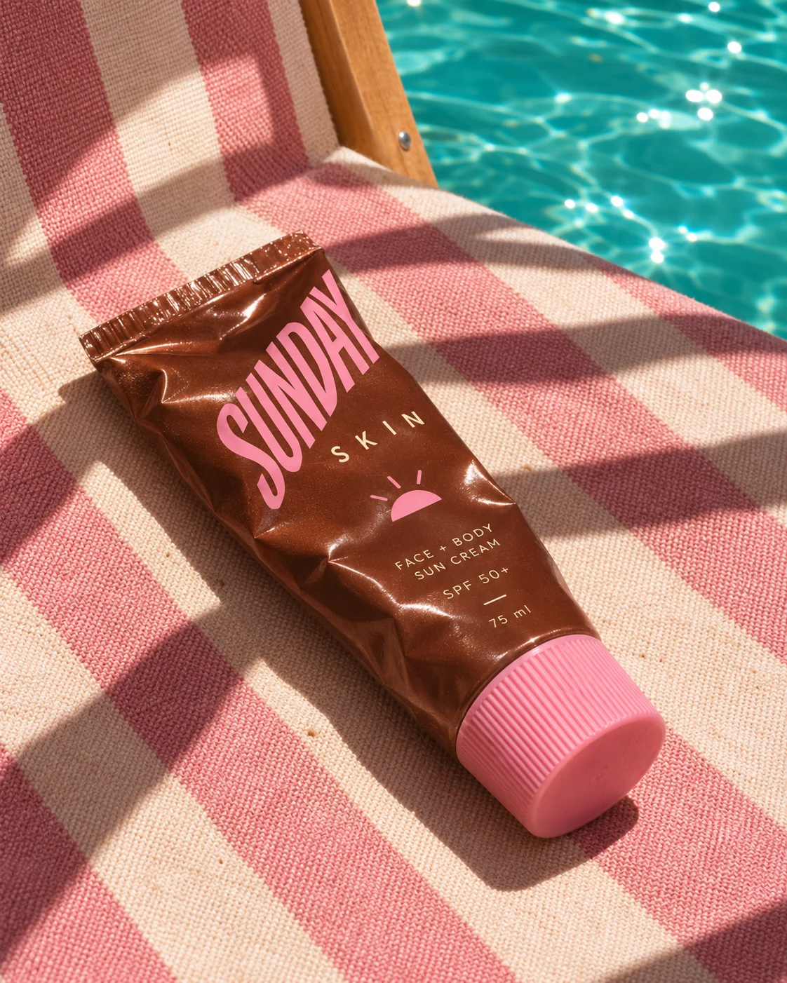
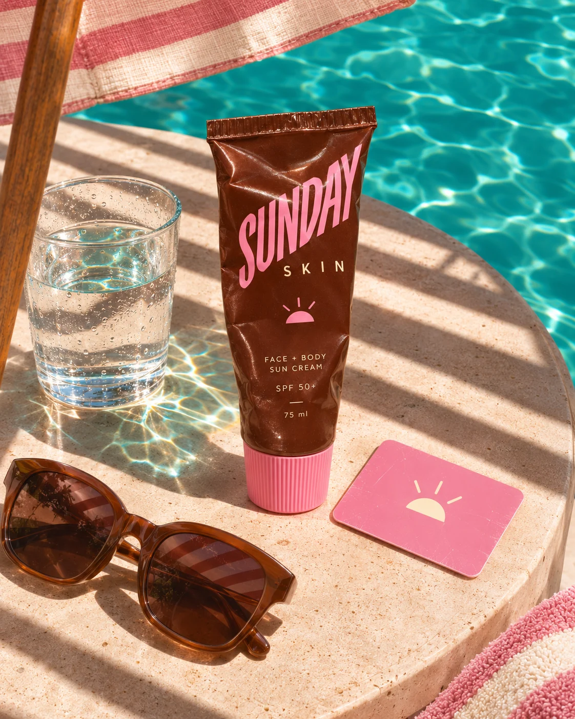
For Sunday Skin, a fictional SPF 50+ sun cream we invented in a cocoa-brown tube with a pink cap, the very first image of the series became the reference. Every image after it was briefed against that one tube and judged against it. The brand, the product and all the pictures were made with AI and art-directed by wild & co.
Your product spec for AI images
Writing a product spec
Pictures show, words pin things down. A product spec describes your product as dryly as if you were explaining it over the phone to someone who has to rebuild it. It goes into every single generation, word for word. Changing the description from image to image is one of the most common reasons a product starts to look different.
- Product type and size, for instance a tube that sits comfortably in one hand.
- Shape: straight or tapered, crimped top, rounded or square edges.
- Colours by name and, where you have them, by value: product, cap, lettering.
- Material and finish: matt, gloss, ribbed, transparent.
- Label: which words, in which order, in which typeface.
- What it never has: no pump, no glitter, no second colour on the cap.
That last line sounds trivial but saves hours. Models like to add whatever is typical for similar products. Rule it out in writing and you will not have to retouch it out later.
The short list of fixed details
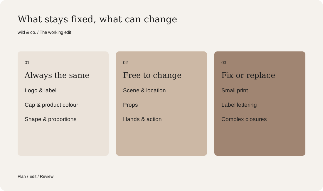
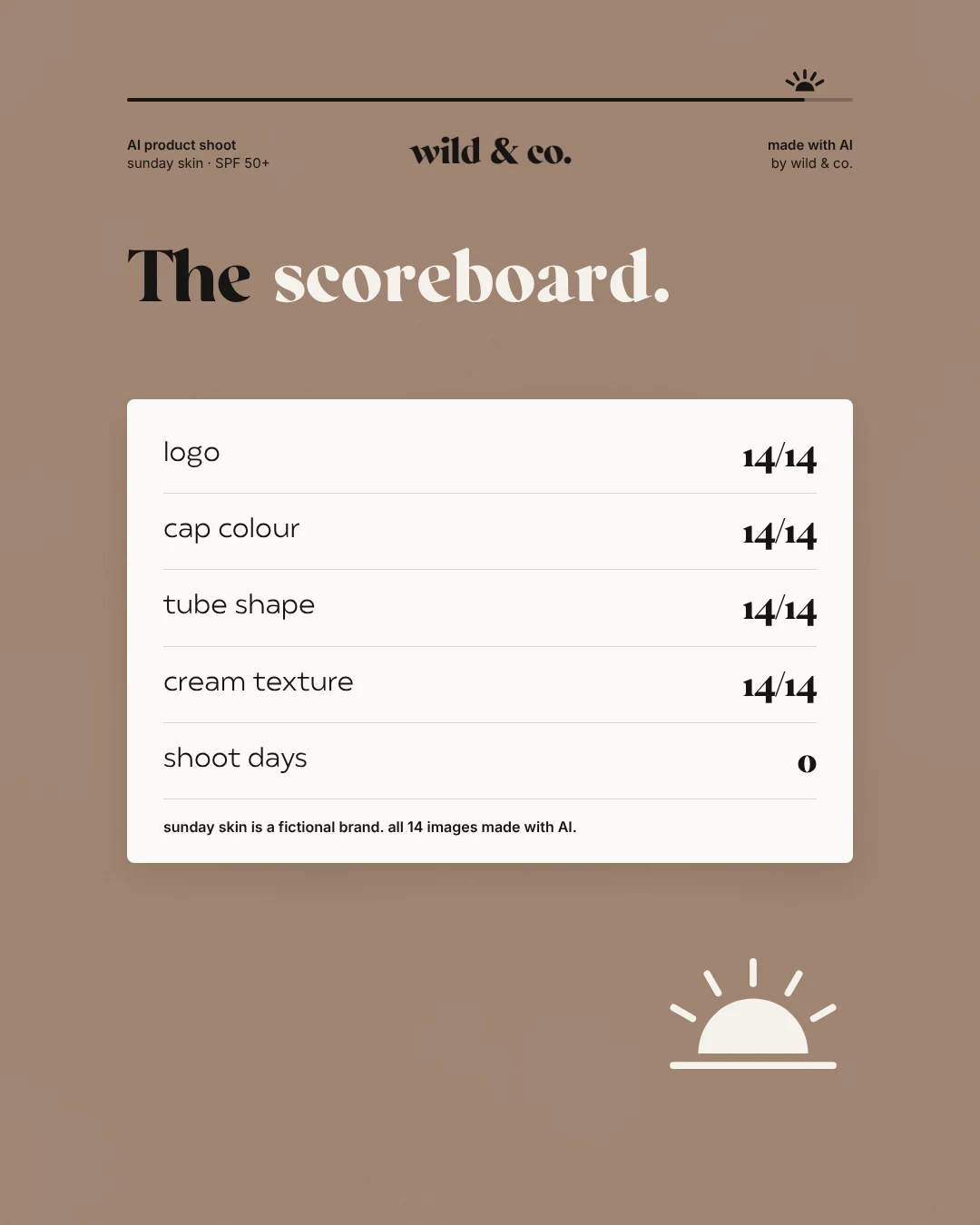
Boil the spec down to a checklist of four or five features that make your product instantly recognisable and that must never change. Everything else is allowed to move: location, props, hands, mood. For Sunday Skin the list had four entries: logo, cap colour, tube shape and cream texture. The carousel for the series asks outright whether AI can keep one product the same fourteen times, then shows the scoreboard. All four details held in all fourteen images.
The list works twice: while generating you know what to watch, and while selecting you get a clear yes or no instead of a gut feeling. A gorgeous image with the wrong cap does not make the cut, however much you like it.
Locking light and camera
Even when the scenes change, the series should feel as if it was shot on one day with one camera. Fix the direction, time of day and hardness of the light, for example low afternoon sun from the left with crisp shadows. Fix camera height, lens and angle as well: overhead, eye level, or just above the table edge. Treat these settings as firmly as the product spec and change only what a particular scene truly needs.
Steady light has an underrated side effect: colours stay put. A pink cap looks different in shade than in full sun, and that is precisely where a model begins to reinterpret the colour. On Sunday Skin, even the shadows were written into the brief.
Checking every image, not just the best one
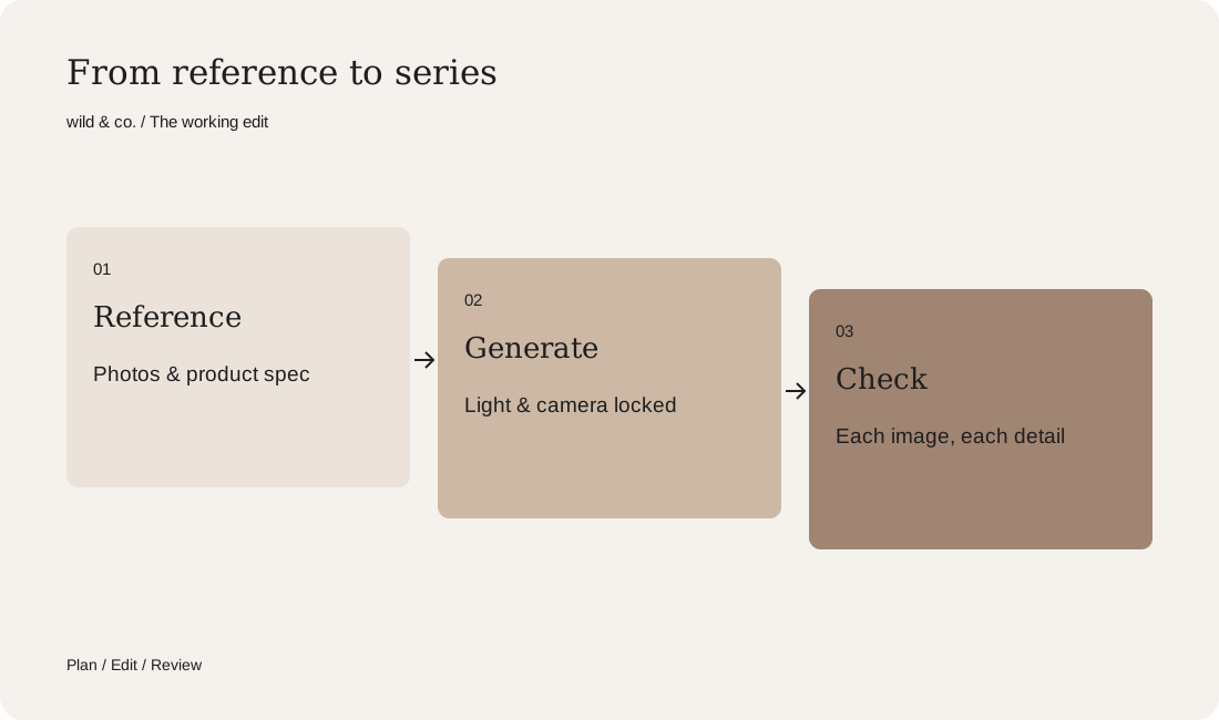
Checking is the step people skip most often. Look at every image at full size next to the reference, never as a thumbnail on your phone. A fixed routine helps:
- Silhouette: are shape and proportions right, including relative to a hand?
- Colour: product, cap and lettering compared directly with the reference.
- Logo and label: read them letter by letter instead of skimming.
- Details: threads, crimp, seams, embossing and the number of elements.
- Physics: does the product sit believably, do shadows and reflections make sense?
- Hands and skin, if in shot: fingers, grip and where they meet the product.
Score each image against your list of fixed details and keep a record. Take stock after the first few. If one feature keeps failing, the cause is usually the spec or the references, not bad luck.
Correcting labels and lettering
Text remains a weak spot for image models. Short words in large letters often come out fine, while small print such as ingredients, SPF values or volume is rarely reliable. Plan for label corrections from the start. This is where the flat label artwork earns its keep: in post-production it is mapped onto the product in perspective and matched to the light, curvature and creases. That is cleaner than regenerating until the lettering happens to be right. It is also more honest, because the product in the image then carries exactly what the real packaging says.
When to composite the real product photo
Some products are hard to reproduce reliably with AI: intricate closures, fine engraving, clear bottles with liquid inside, devices covered in buttons. And whenever an image is meant to sell in an online shop, the product has to be exact. In those cases the scene is created with AI while the product goes in as a real photograph, blended in with matching light, shadows and reflections. For that to work, the product shot has to suit the planned light and angle. If you know early that a composite is coming, photograph the product from the right angle in the first place.
And if a face has to stay the same too?
People follow the same principles: references, a written description of face shape, hair, skin tone and distinguishing features, locked light and ruthless selection. Faces are even less forgiving, though, because we notice the tiniest difference immediately. When a product and a person share the frame, check them separately, the product against its list first, then the face against its references. Our guide to creating an AI model explains how a recurring face for a brand is built.
Plan for consistency instead of hoping for it
Consistent AI imagery depends far more on preparation than on the tool. Settle references, spec and fixed details before the first image and you save rounds of corrections later. Check every frame and fix labels properly, and you can publish a series in which the product does not suddenly change in image seven. Use the template on this page to record what must stay the same for your product. At wild & co. in Zurich we plan and check AI product imagery and full campaigns image by image, for brands across Switzerland.