With cosmetics, the image has to show what nobody can touch online: texture, colour, the feel on skin. Which images a beauty brand needs, what matters with colour and hands, and when AI helps. With a shot list to fill in.
Cosmetics imagery has to show what shoppers cannot touch online: texture, colour and application. That means packshots, swatches, hands and a consistent look across every variant. AI suits moods, scenes and campaigns. For shop images, the texture of the actual formula and legible labels, the real product remains the more reliable source.
Jars, tubes and tins often look much alike from the outside. What matters is inside: how the cream looks, how it spreads, what colour it leaves on the skin. In a shop you can try it; online you cannot. That is why product imagery for cosmetics has to do more than a clean packshot. This guide covers imagery for skincare and beauty brands, whether it is photographed or created with AI.
Why beauty imagery works differently
Photograph a chair and you see almost everything that matters. Photograph a hand cream and you mostly see packaging. The product itself, its consistency, sheen and colour and the way it sinks in, has to be made visible by the image. Cosmetics also go straight onto the skin, and anyone buying a cream wants to imagine how it feels. Good beauty imagery therefore turns touch into pictures: a texture you want to reach for, a hand using the product, light that tells you whether a finish is matt or dewy.
The images a beauty brand needs
Not every brand needs every type, but together these cover most channels:
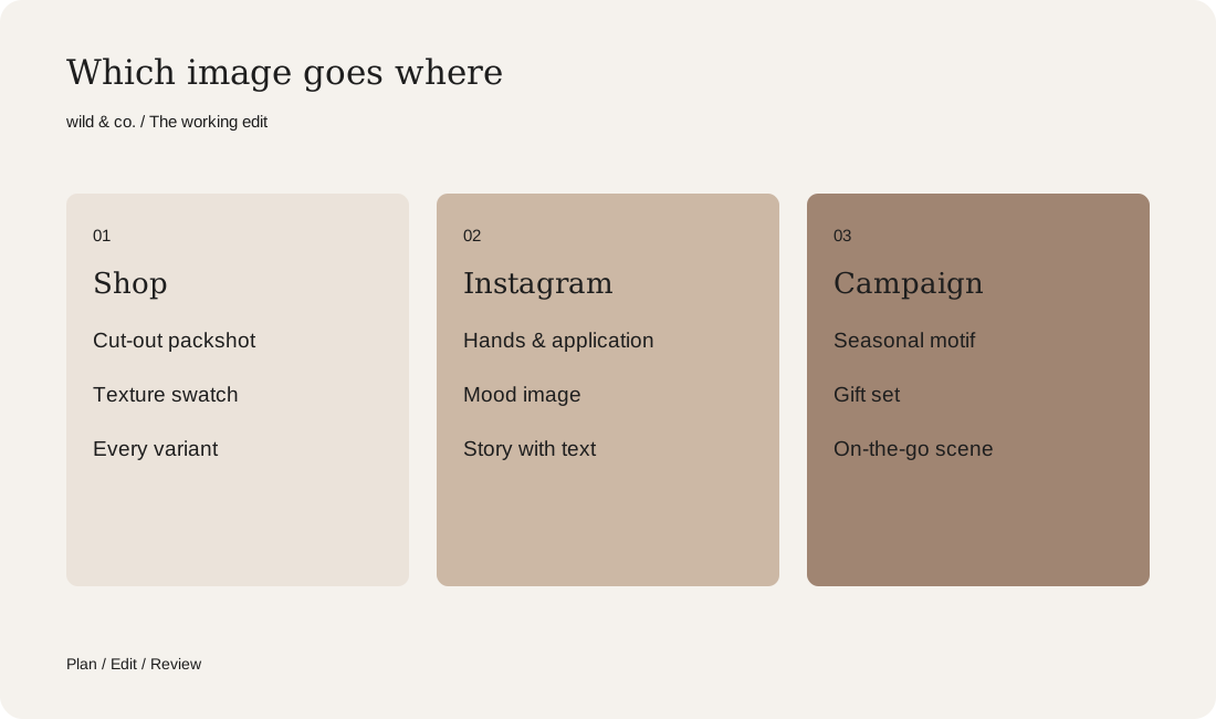
- Packshot: the product cut out or on a calm background, front-on, for the shop and marketplaces.
- Open product: lid off, pump pressed, tube squeezed, so people can see what is inside.
- Texture and swatch: the formula as a smear, a drop or a swirl, close up and sharp.
- Application: hands spreading, applying or simply holding the product.
- Variant line-up: every scent or shade side by side, to make choosing easier.
- Mood and everyday life: in the bathroom, in a bag, on a trip or wrapped as a gift.
- Images with room for text, for Stories, banners and newsletters.
Your beauty shot list
Textures and swatches: the close-up that convinces
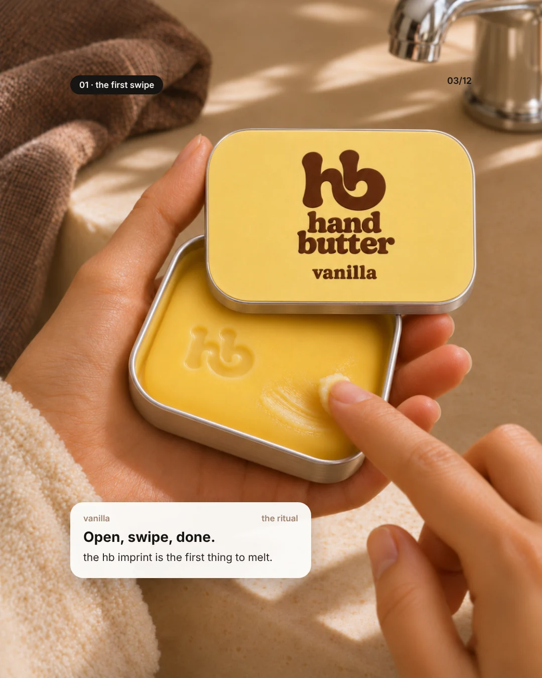
In cosmetics the texture close-up is often the strongest image. It answers the question nobody can ask online: rich or light, creamy or gel-like, matt or shimmering? A swatch, a stroke of product on skin or on a smooth surface, adds colour and coverage to the story. Light makes or breaks it. Soft light from the side reveals structure, while flat front light hides it. And the surface must be fresh, because dried edges and fingerprints in the jar jump out at close range.
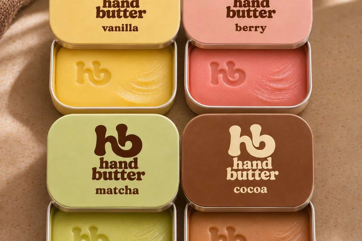
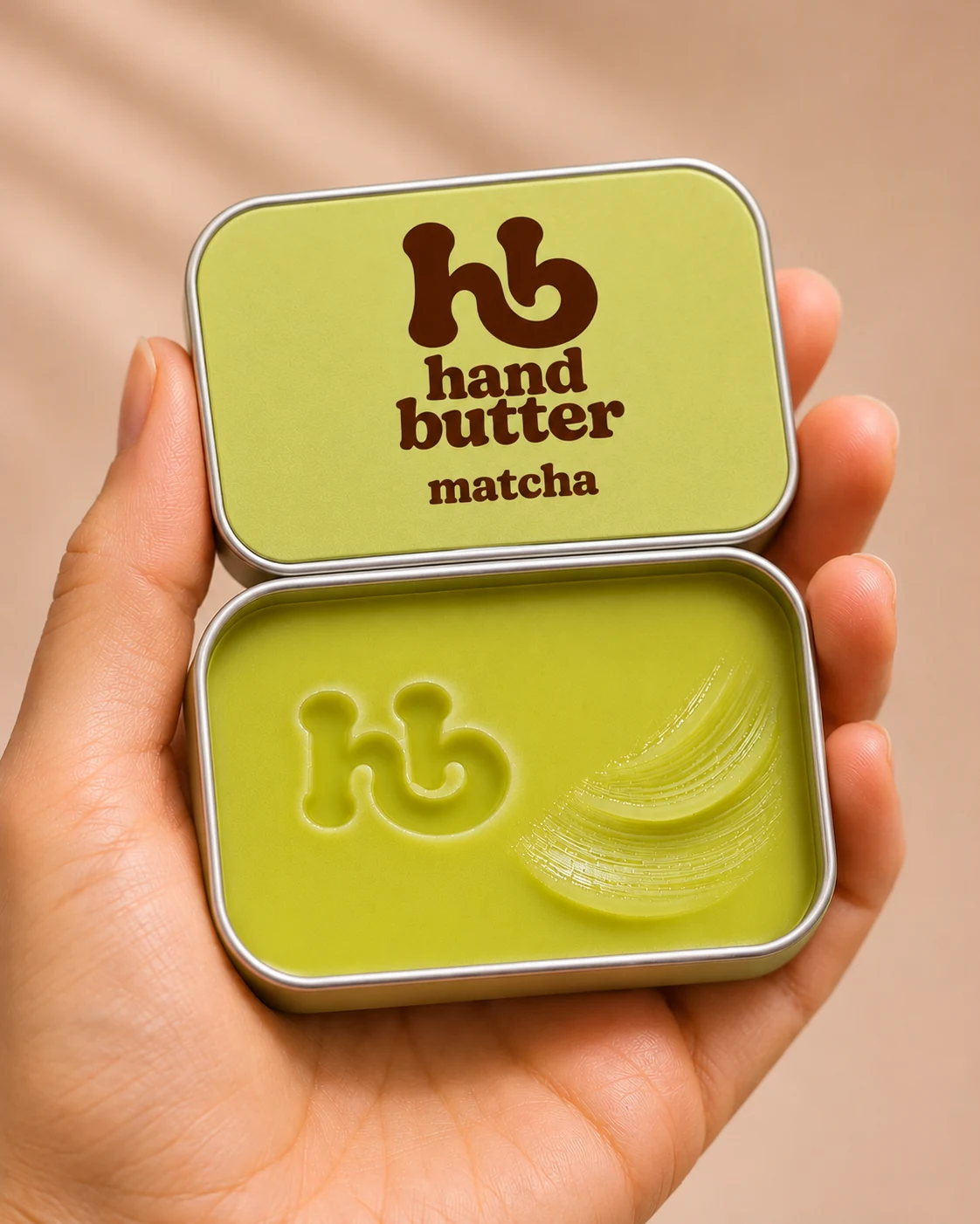
Our invented hand balm hand butter comes in four scents, vanilla, berry, matcha and cocoa, each with an embossed hb mark and a small swipe in the tin. That single detail tells you the balm is firm enough to hold an imprint and soft enough to scoop with a finger. Every image of the brand was made with AI and art-directed by us.
Colour accuracy: the cream has to match the jar
Few things disappoint more than a pink that looks soft on screen and loud in the jar. With make-up, tinted skincare or any coloured formula, accurate colour is a matter of trust rather than style:
- Shoot with a grey card or colour chart so the white balance can be corrected later.
- Compare every image with the real product in daylight, not only on screen.
- Use the same white balance and the same edit across a whole series.
- Record colour values for the packaging and, where possible, the formula, and share them with everyone involved.
- Check AI images against those values, because models tend to shift tones in ways that are easy to miss.
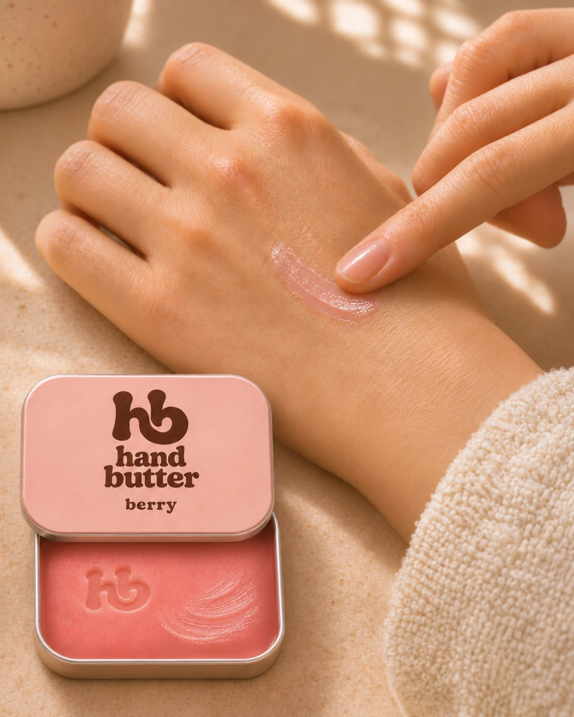
Some products look different in the pack and on the skin. A balm can be a strong pink in the tin and almost sheer on the back of a hand. Show both, otherwise people will expect a colour that never appears on their skin.
Hands and skin in the frame
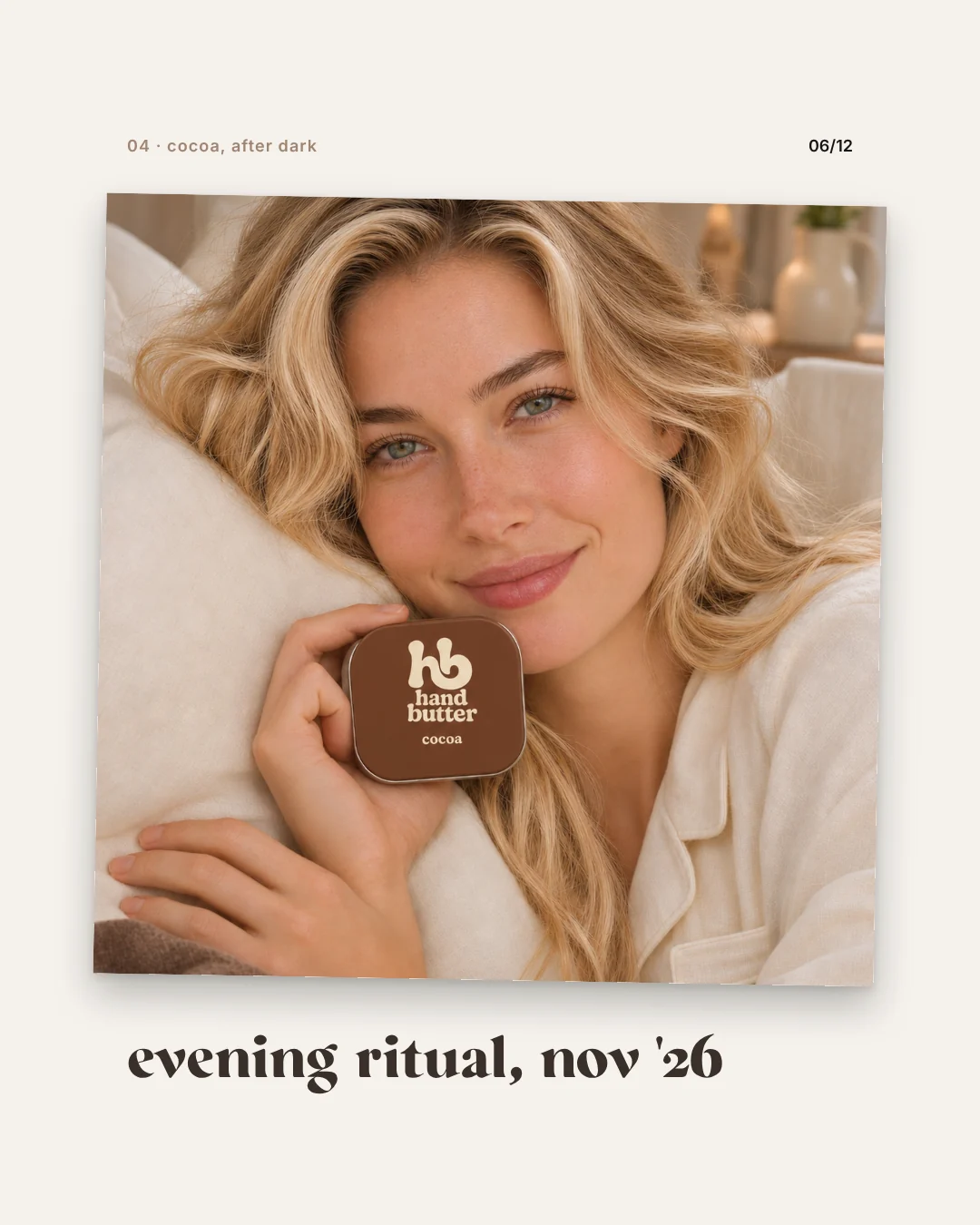
Hands are the lead actors in beauty imagery: they show scale, application and feel all at once. Look for well-kept but natural nails, calm gestures and a grip that matches how people really hold the product. With skin, real texture beats poreless smoothness. Heavily retouched skin looks artificial, and with skincare it suggests an effect no cream can deliver. Hands are still a weak spot in AI imagery, so count the fingers, look closely at joints and nails and check that the hand fits the size of the pack.
One look across every variant
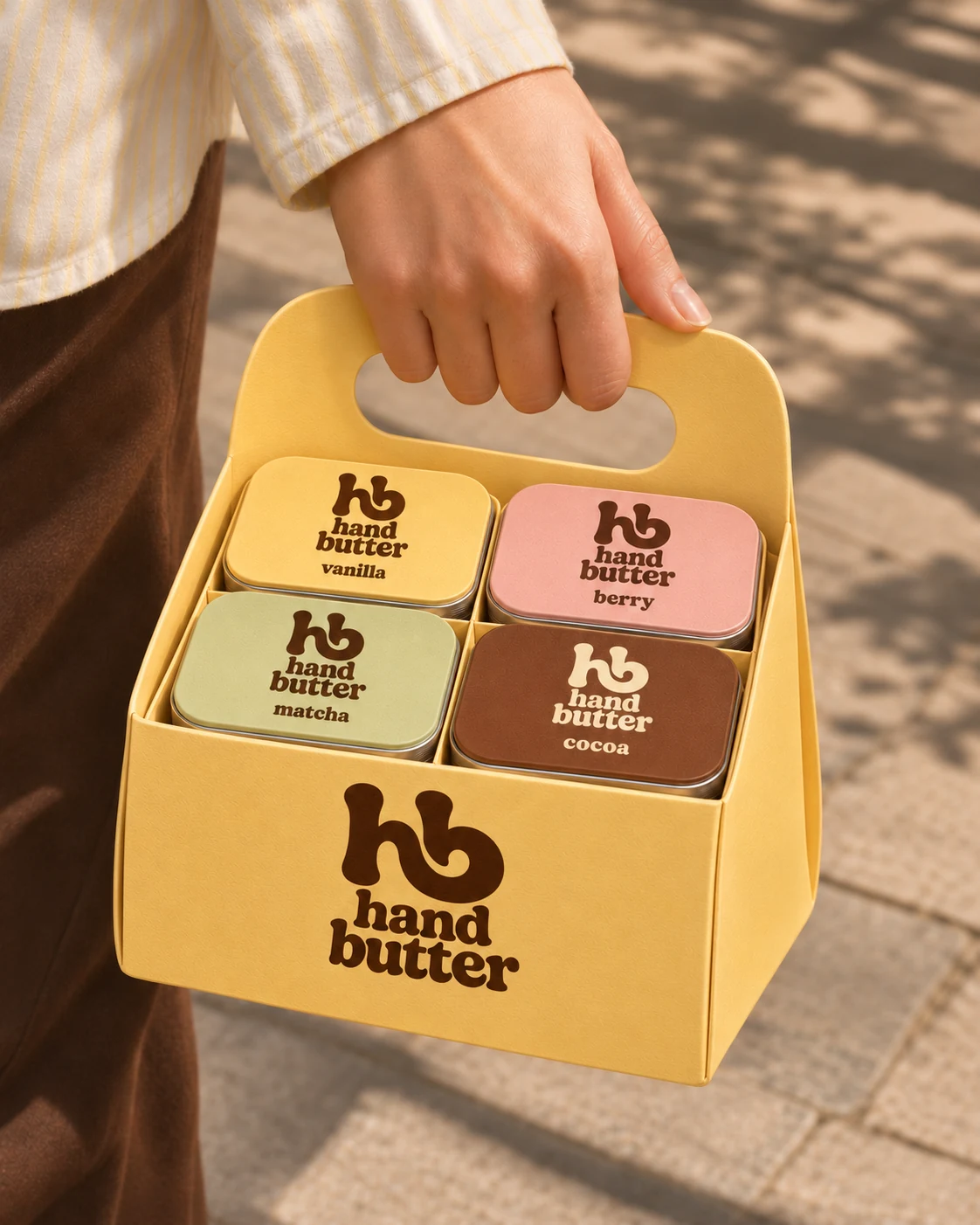
Once a brand has several scents, shades or sizes, consistency becomes the real work. Each variant should be recognisably different and still part of the same family. hand butter gives every scent its own colour, from yellow and pink to pale green and brown. A fixed frame holds them together: the same tin, the logo always in the same place, warm side light and sandy surfaces.
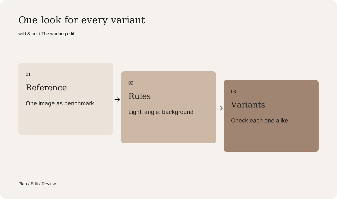
Define a frame like that before any images are made: direction of light, camera angle, background family, distance to the product and props. A reference image helps, because every later picture can be measured against it. Then a shade added a year later still looks as if it had been part of the range from the start.
Formats for Instagram and the shop
Plan formats before the shoot or the AI production, not afterwards. In the Instagram feed, 4:5 portrait works well; Stories and Reels need 9:16 with space at the top and bottom for text and controls. Shops usually use square or slightly portrait images, and many marketplaces require a white background for the main image. If one picture has to serve several channels, compose it with enough air around the product to crop without losing anything. And look at your images at the size they appear in a feed or a product grid. If the product is hard to recognise there, it needs a tighter crop.
When AI helps and when you need a real shoot
AI is strong wherever mood, place and story matter: the product at the airport, in the bathroom on a Sunday morning, as a gift set under someone's arm or in a seasonal campaign. Scenes like these take real effort to photograph; with AI they need no travel and no set. AI is also useful for pre-launch ideas, for new scents that have not been filled yet, or for testing a visual direction.
You need the real product in front of the camera wherever the image makes a promise about the product itself. The texture of your actual formula, the exact shade of a foundation, a legible label with ingredients and the packshots for your shop should come from the real product or at least use it as the reference. Often the combination is strongest: real packshots and textures as the base, AI for campaigns and social media. Our guide to product photography covers how to plan a classic shoot.
Honest about effects and retouching
Cosmetics advertising must not mislead, and that applies to images as much as to copy. A cream that makes wrinkles vanish in the picture, or a before-and-after helped along by retouching or AI, promises something the product cannot keep. Show effects only as far as they are backed up, retouch skin with restraint and label AI imagery openly. Platforms such as Instagram label some AI content themselves, and many brands add a note voluntarily. The product in the picture has to be the product customers receive.
Shoot it yourself or have it made?
A few texture shots and everyday scenes on a phone are a good start, especially with daylight from a window and a calm surface. It gets demanding when several variants must look exactly alike, when colours have to be accurate and when images are needed for shop, feed and campaign in every format. Use the shot list above to note which images your brand needs. At wild & co. in Zurich we create AI imagery and campaigns for beauty and skincare brands across Switzerland and beyond, in person or remotely.