From brand core to logo, colour and material, all the way to print-ready files: how packaging design comes together for a small brand, and how to test it before the first run is printed.
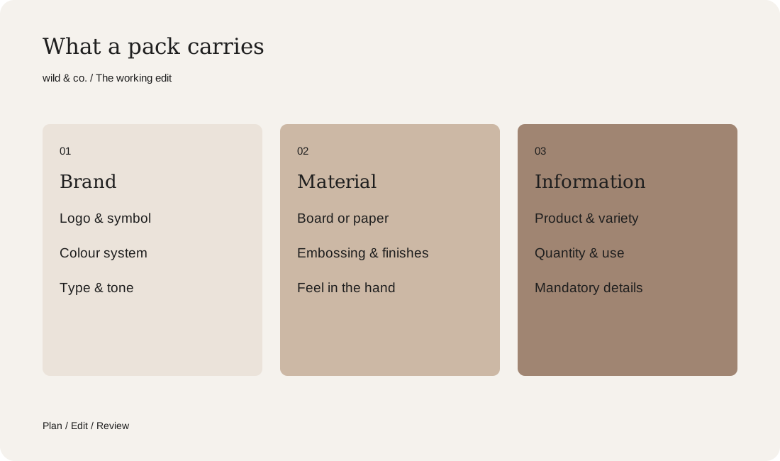
Good packaging design starts with the brand core, not the box. Logo, colour system, material and finishing build on it. A clear hierarchy decides what goes on the pack. Mock-ups and AI visuals help you test, while a physical sample and clean print files protect the print run.
Packaging is often the first part of your brand that anyone actually holds. On a shelf, in a parcel, on the kitchen counter. It has to protect, inform and sell, and at its best people keep it because it feels too nice to throw away. This guide walks through how packaging design comes together for a small brand, from the brand core to the day the files go off to the printer.
What packaging design has to do
Packaging design covers everything that wraps a product: boxes, bags, labels, tins, sleeves and shipping cartons. It is as much about shape and material as about logo, colour, type and copy. Good packaging does three jobs at once. It gets the product to the customer intact. It explains in a few seconds what is inside and who it is for. And it looks so clearly like your brand that people recognise it from across the room.
Brand core first, box second
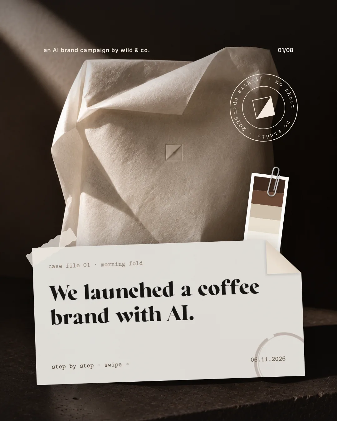
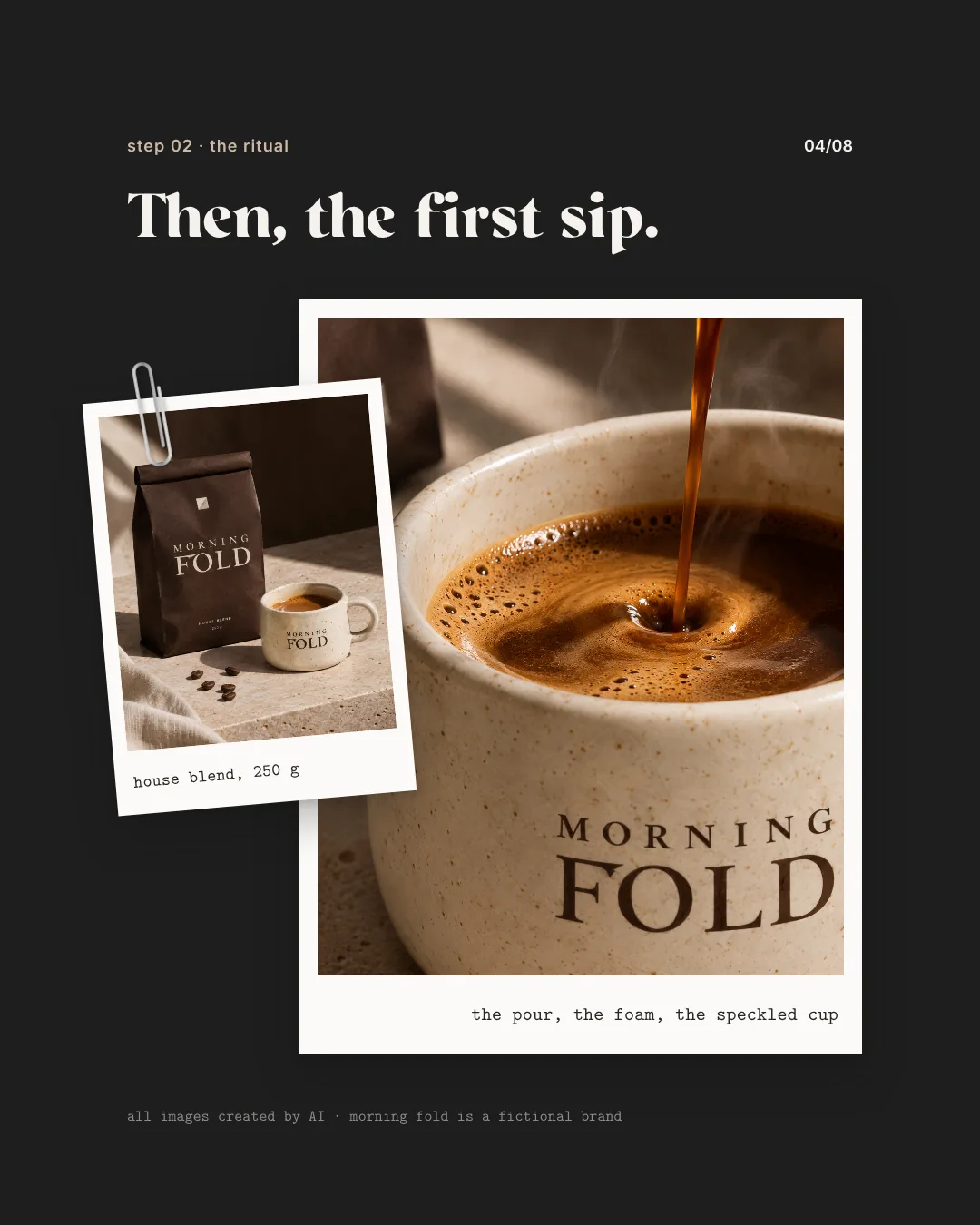
The most common mistake happens right at the start: beginning with the box. Yet the brand core decides almost everything that follows. What does your brand stand for, who is the product for, and what should someone feel when they open it? For Morning Fold, a fictional coffee brand we created as an independent AI study, the whole brief was a single sentence: a coffee brand for slow mornings, warm, quiet, folded like paper, no loud colours. Every later decision, from the logo to the paper stock, could be traced back to it.
Try to write your own brand core just as briefly. If it will not fit into two or three sentences, the packaging will try to say everything at once, and it will show. If you do not have a visual identity yet, it is worth developing a corporate design first, so that packaging, website and social media speak the same language from day one.
Your packaging brief
Logo and colour system on the pack
On packaging, a logo has to cope with awkward conditions: tiny on a label, large on a tote, embossed, stamped or wrapped around a curved surface. Check early whether you have a compact version or a symbol that works on its own, and whether both still read on dark or textured material.
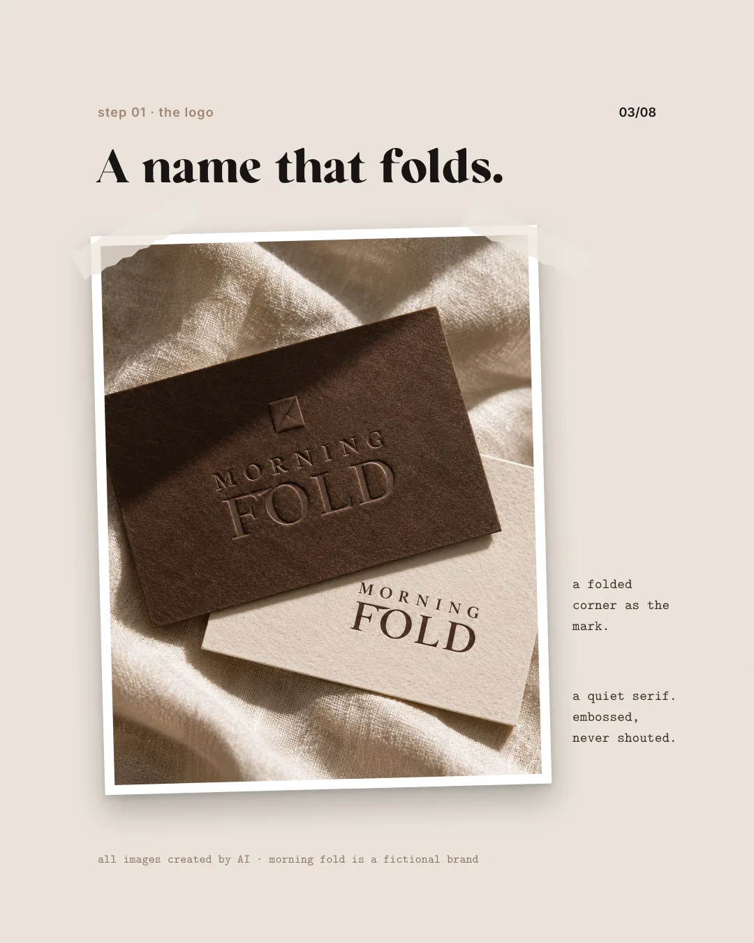
A colour system decides which colour does which job: one main brand colour, one or two supporting colours and, if there are several varieties, a clear rule for telling them apart. Morning Fold's symbol is a folded corner that works as well on a coffee bag as on a small sticker, and its palette is called espresso, cocoa, stone, oat and linen: five calm tones from deep brown to natural white. With a system like that, every new product slots in without you starting from scratch.
Materials and finishing: what people feel
Packaging gets handled, and the material speaks too. Uncoated paper feels natural and calm, coated stock smooth and bright, kraft paper handmade, metal solid and lasting. Choose according to the product, the protection it needs and your brand, and ask early about recyclability and where the material comes from, because plenty of customers care about both.
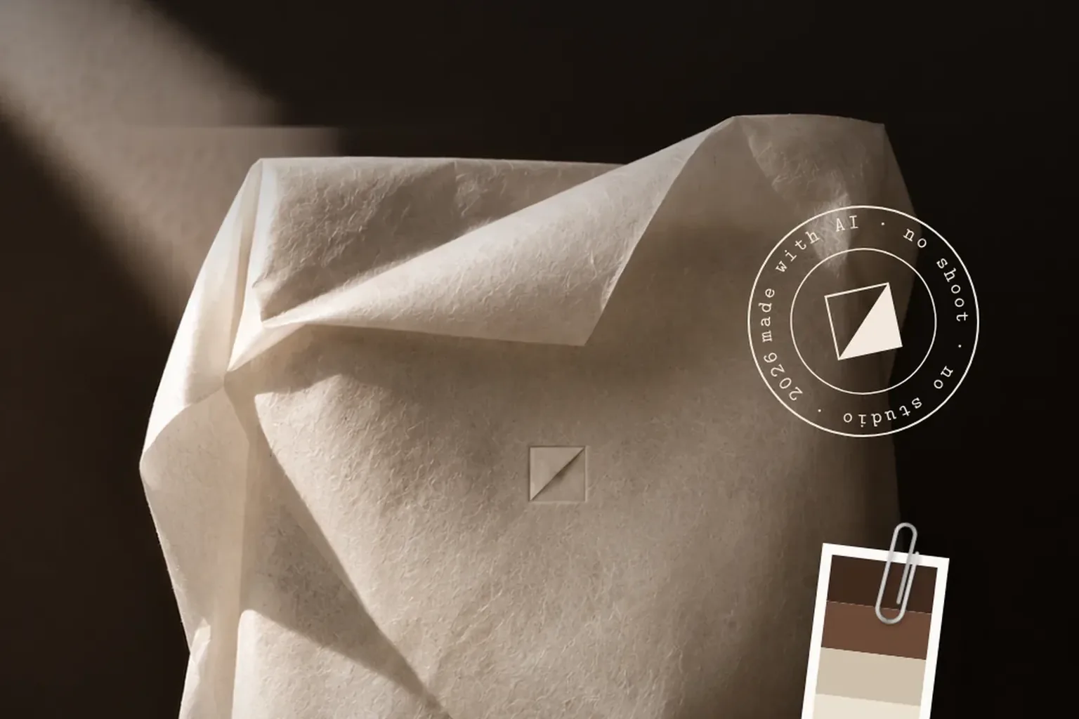
Finishes are the details you feel before you see them: embossing, foil, spot varnish, a coloured edge. They work best when used sparingly. Morning Fold's logo is embossed rather than printed, a quiet choice that matches the brand core exactly and leaves a relief on dark board you can trace with a fingertip. One practical point: every finish needs its own layer in the print files, and some need a dedicated tool, so talk to your printer before the design is final.
What goes on the pack, and in what order
A lot of information competes for very little space. A clear hierarchy keeps it in order:
- Brand first: logo or symbol, clearly visible but not necessarily the largest element.
- Then the product: what it is, which variety, which version.
- Then the benefit or what makes it special, in one short line.
- Quantity, contents and directions, usually on the back or side.
- Mandatory information, barcode, recycling notes and contact details, legible rather than tucked away.
What is mandatory depends on the product: food, cosmetics and electrical goods each have their own rules. Check them with your manufacturer or a specialist before you design, and decide early which of Switzerland's national languages the copy will appear in. Three languages take up far more room than one, and there is nothing more frustrating than a finished layout that has to be pulled apart at the last minute to fit an ingredients list.
Mock-ups and AI visuals: test before you print
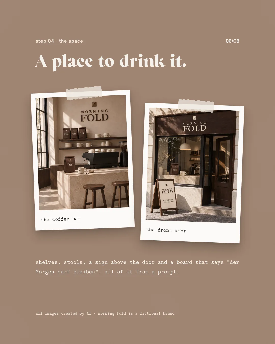
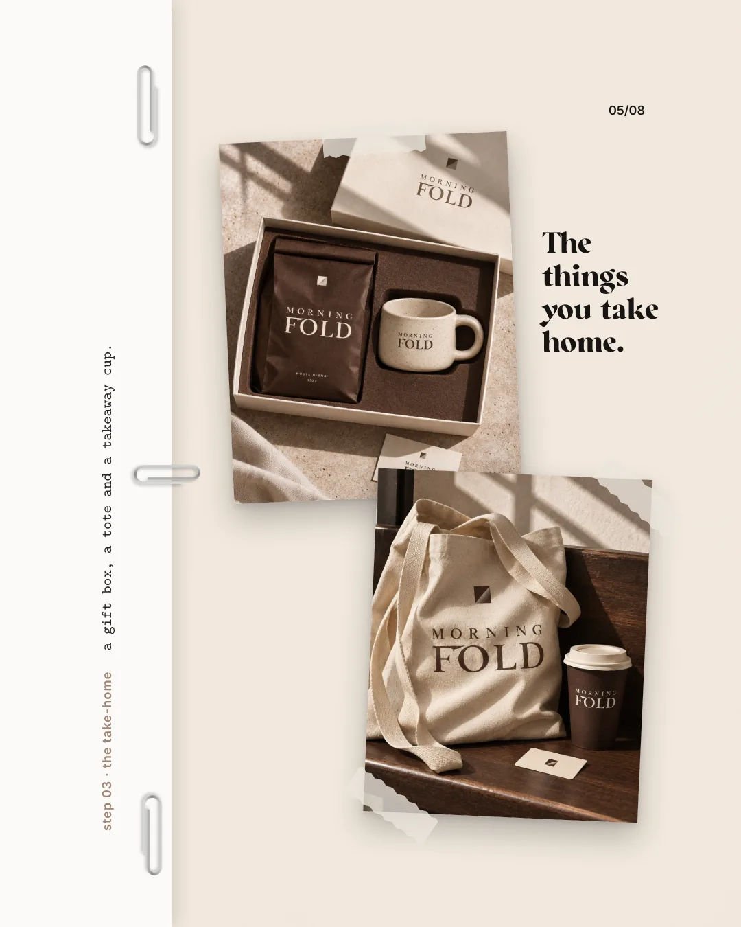
Almost any packaging looks good on a screen. Whether it really works only becomes clear when you see it where it will actually live. Mock-ups show the design on a realistic box, tin or bag. AI visuals go a step further and place the pack in whole scenes: on a shelf, on a breakfast table, inside a gift set. For Morning Fold, a coffee bag, a gift box with a cup, a tote and a takeaway cup all appeared in a single afternoon, before anything had been produced.
Images like these are ideal for comparing options, checking colours and discussing an idea with your team or with stockists. They do not replace a physical sample, though. Paper, embossing and colour on board look different in the hand than in a picture, so order a prototype or a press proof before the full run and hold it next to the product.
Print-ready files and working with your printer
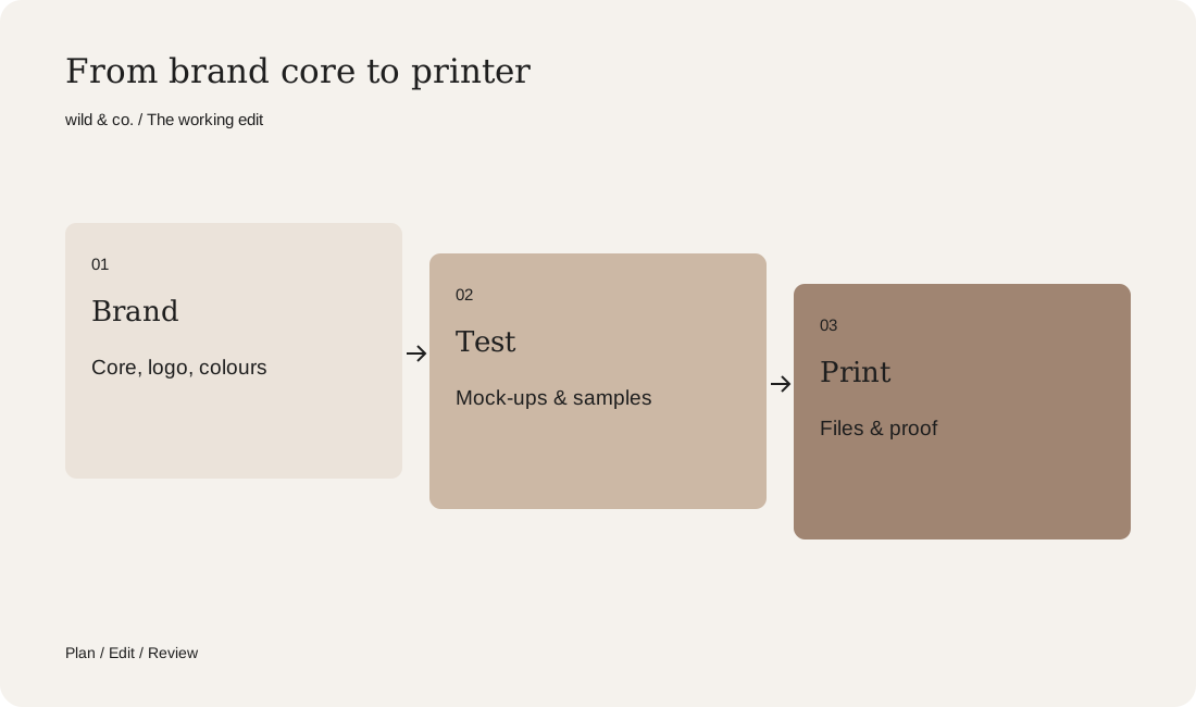
Bring the printer in early, ideally before the design is finished. They know which materials, formats and finishes are feasible, and they supply the die line your packaging is built on. Clean print files include:
- The printer's die line on its own layer, left unchanged.
- Bleed around every panel, so no white edges appear after cutting.
- Colours in the right colour space, with any spot colours clearly named.
- Fonts outlined or embedded, and images at sufficient resolution.
- Finishes such as embossing or varnish on separate layers.
- A proof you approve before printing and, where possible, a physical sample.
Ask about minimum quantities, lead times and storage too. For small runs it often pays to keep the number of structures low, for example one box for every variety, told apart by different labels.
Common packaging design mistakes
Many problems only show up once the packaging has been printed. These are easy to avoid beforehand:
- So much text on the front that nothing stands out.
- A logo that stops being legible when small or on dark material.
- Varieties that differ only by one small word.
- Colours matched on screen and never checked on the real material.
- A pack that does not fit the shipping box or sends a lot of air through the post.
Design it yourself or have it designed?
For a single label with a clear template, you can do a lot yourself. Once there is a product range, finishes, several languages and a printer involved, experience pays off, because mistakes tend to surface only at the press, when they are expensive to fix. Use the brief above to note what your packaging needs to do. At wild & co. in Zurich we design packaging, labels and print-ready files to fit your brand, for clients across Switzerland, in person or remotely.