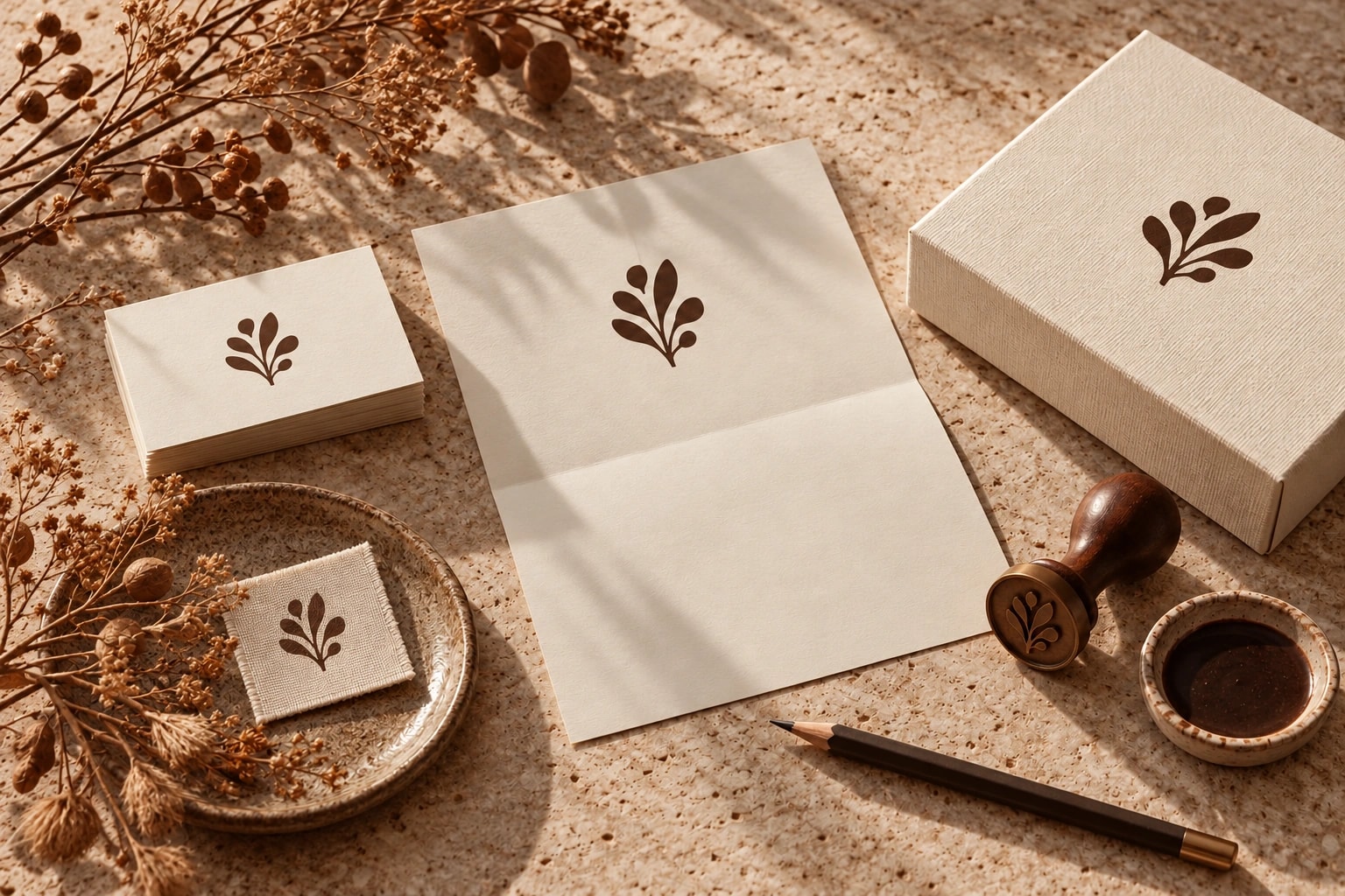
Colours, typography and practical applications: how to build a visual identity you can use across your website, social channels and print.
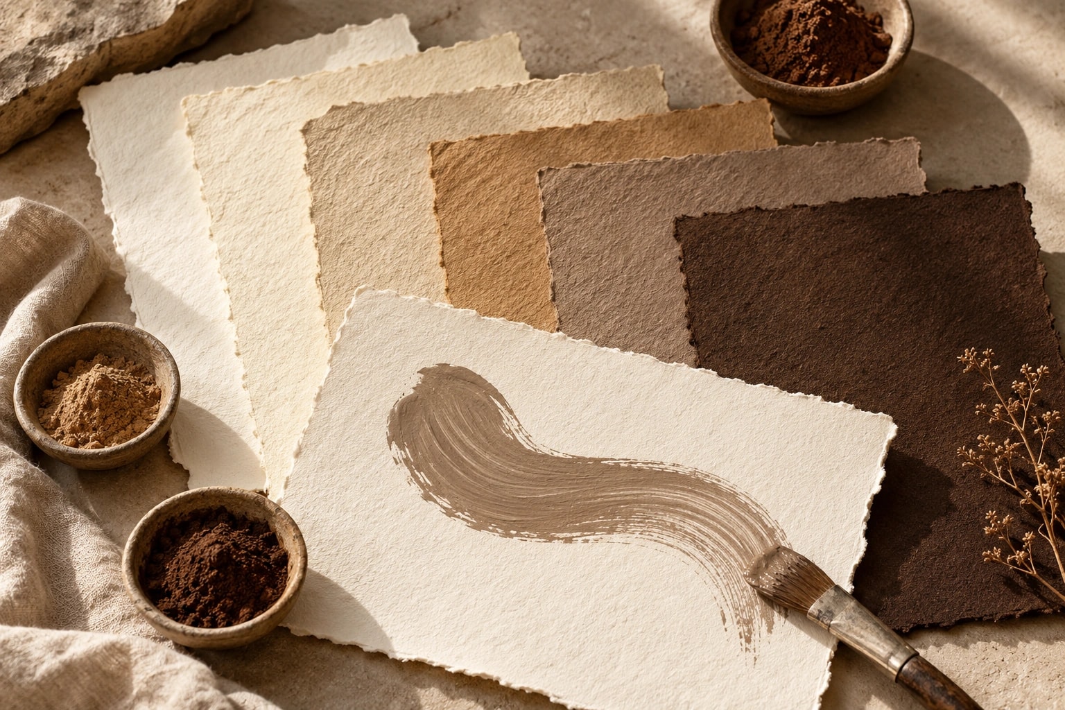
The decisions, applications and handover that make a visual identity useful in everyday work.
A logo can look excellent on a business card and become unreadable as a profile picture. A visual identity needs to handle both. Its value becomes clear in everyday applications, including those you create yourself.
Start with what the brand should express
Before choosing typefaces, discuss your offer, the people behind it and your customers. What should the identity communicate? What already fits, and what needs to change? A moodboard makes the proposed direction easier to discuss. References support that conversation; they are not designs to copy.
Test the elements together
The system may include a primary logo, supporting versions, colours, typography and an image direction. Choose the components around actual uses. Test them with real copy in a mobile page, a social post and a printed application. Long headings, small text and difficult colour combinations become visible much earlier this way.
- Check logos on light and dark backgrounds and at small sizes.
- Define specific text and background colour pairings.
- Check typeface legibility, required characters and licences.
- Describe the subjects, crops and atmosphere of suitable imagery.
Make the guide practical
A useful brand guide explains decisions through examples: which logo file to choose, which colours support reading and how a post can be composed. Include appropriate files and any agreed editable templates. Clarify the applications and licences included in the handover before work begins.
Plan the introduction
List where the previous identity still appears, from websites and profiles to presentations and printed materials. Decide what changes first and who handles it. At wild & co., we can develop the identity and its agreed applications. We also plan around the materials you want to manage independently afterwards.