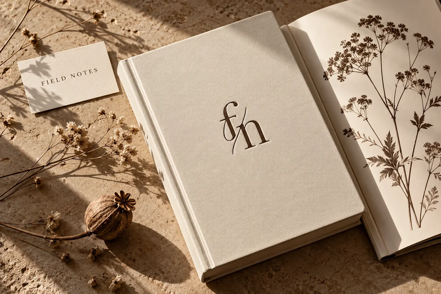
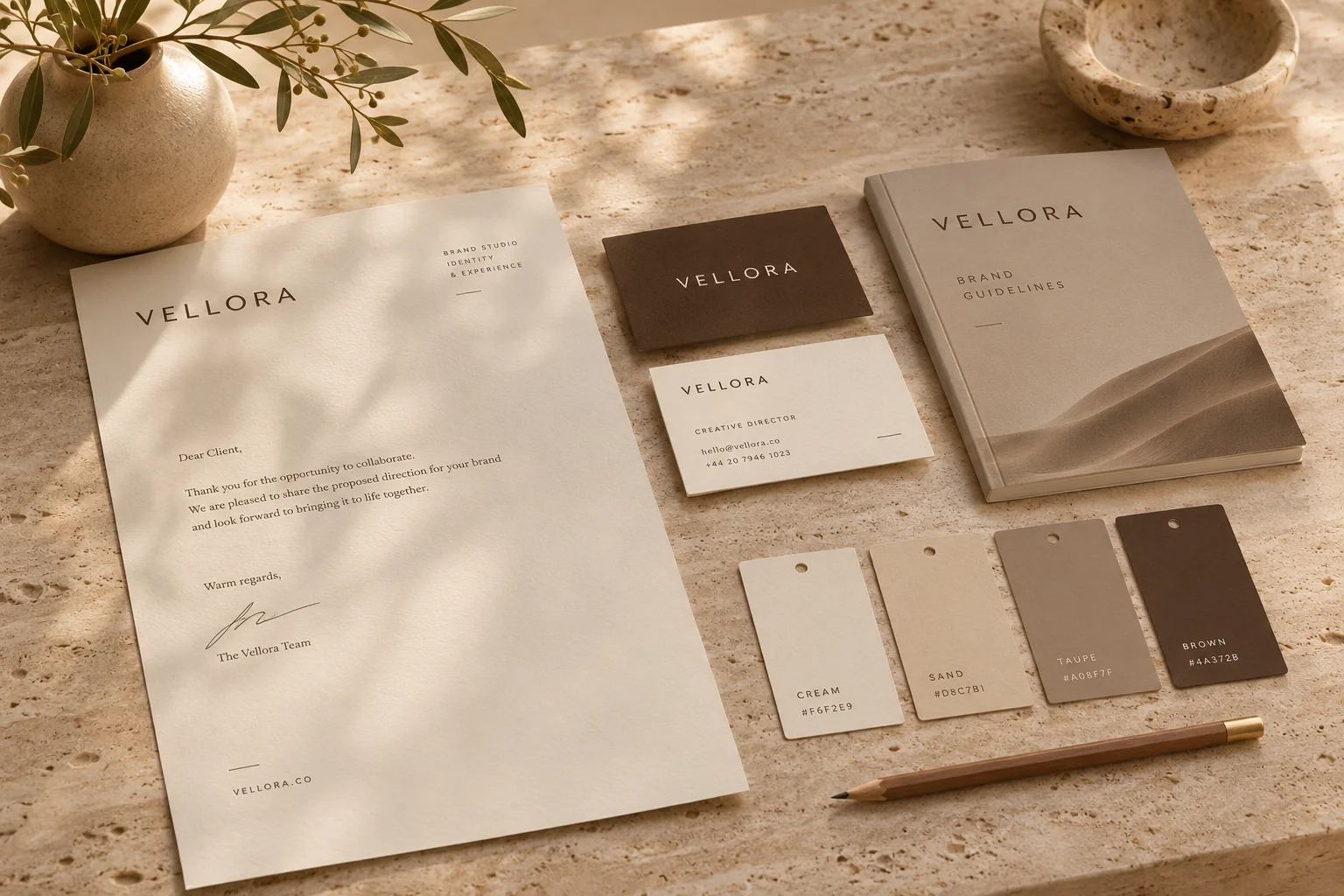
A monogram looks refined, yet it can turn generic in no time. When two initials work as a logo, how the letters find each other, and what matters on products, packaging and Instagram.
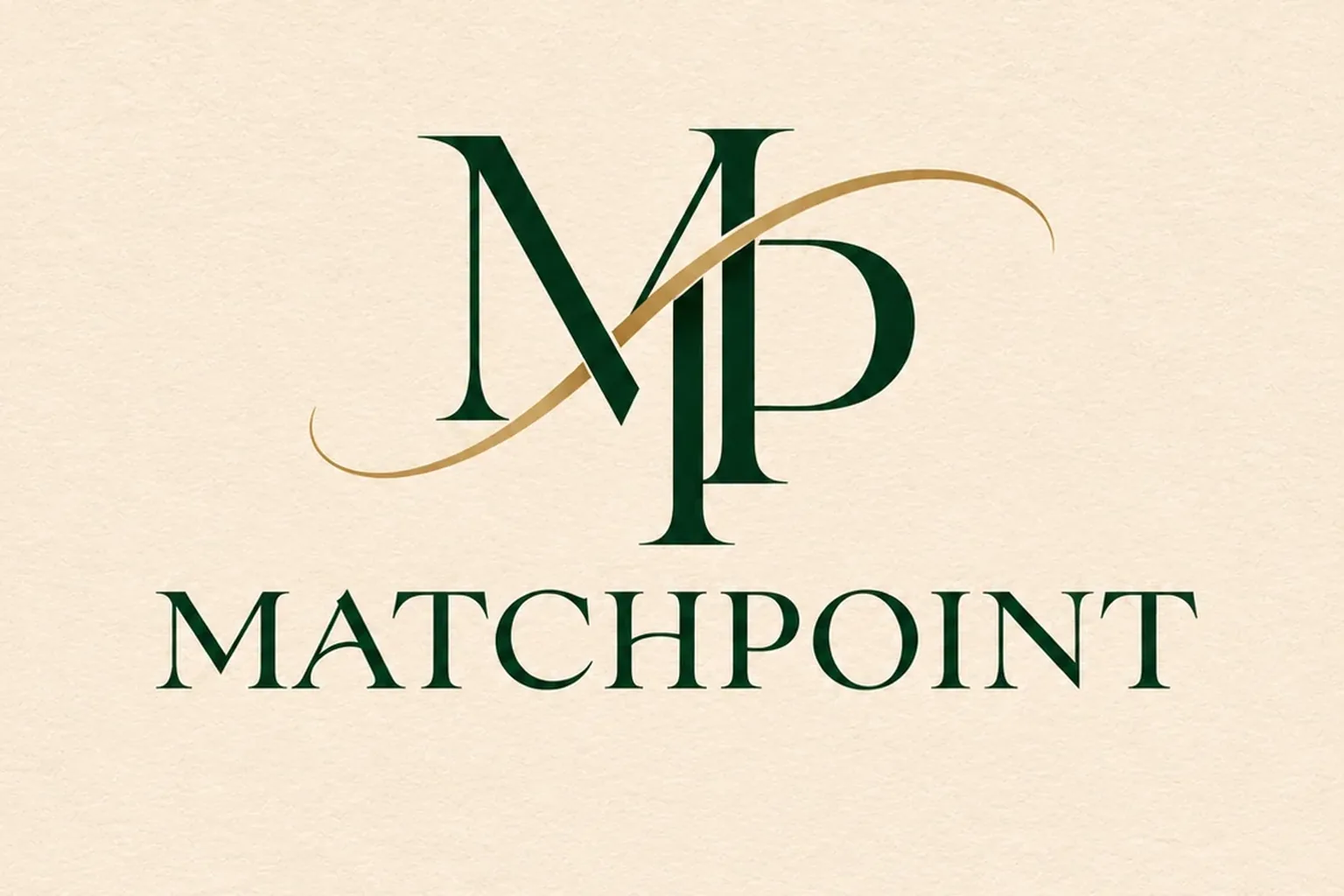
A monogram logo joins two letters into a single mark. It suits products, packaging and profile pictures, but a new brand needs its wordmark alongside it. What makes it work is a clear relationship between the letters, testing at small sizes and samples on the real material.
Initials woven together, foiled in gold on a lid or pressed quietly into leather. Few marks signal craft and heritage as quickly as a monogram, which is why so many brands ask for one. The catch is that few logo types become generic so fast. Lay two serif capitals over each other and you have a luxury mark that already exists a thousand times. Here is when a monogram earns its place, how to give it character and where it does its work.
What a monogram logo actually is
A monogram is a mark built from two or more letters, usually initials, drawn as one shape. For centuries they were stitched into linen, cut into seals and engraved on silver, mostly to say who owned what. As a logo, the job is much the same: it signs, and it fits where a full name will not. Unlike a plain lettermark, an abbreviation typed in an existing font, a monogram makes its letters respond to one another. They share a stroke, interlock or combine into a silhouette neither would have on its own.
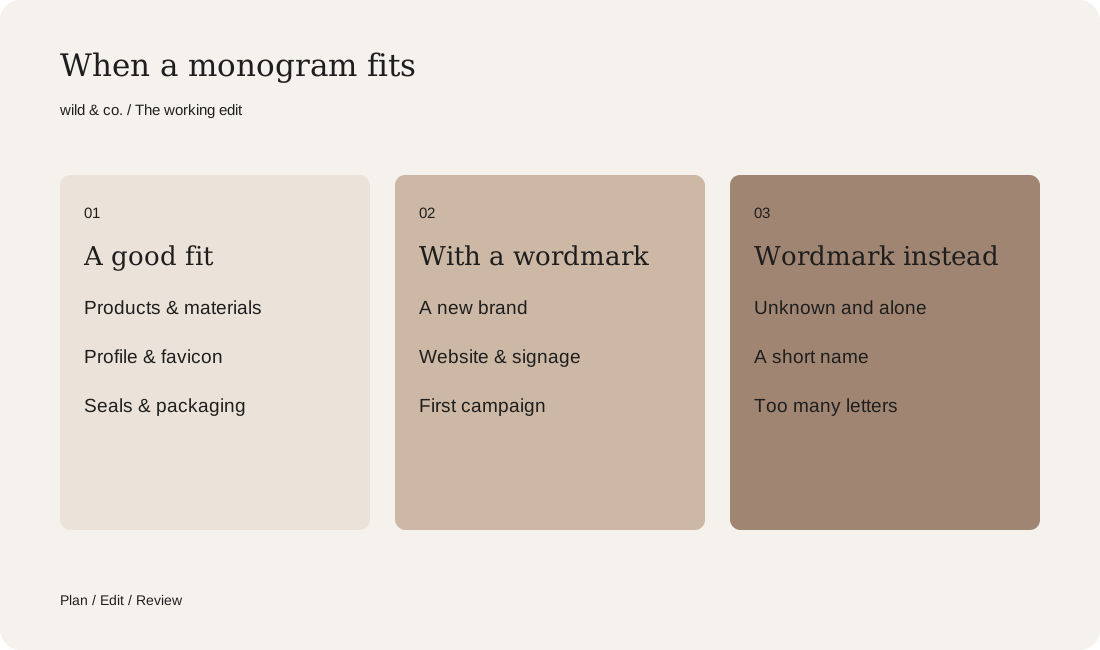
When a monogram is the right choice
Nobody needs a monogram by default. It pays off when your brand regularly appears in small spaces or on physical materials, for example when:
- your name is long or made of two words, and you need a compact form for profile pictures, stamps and labels;
- you make objects where a full wordmark would shout: leather goods, jewellery, textiles, ceramics, sports equipment;
- the brand rests on craft, heritage or one person, such as an atelier, a practice or a label carrying its founder's name;
- you need a mark for seals, embossing or engraving that works without any colour at all.
It is a weaker choice if nobody knows your brand yet and the mark is expected to stand alone. Strangers cannot decode two initials. That is why a monogram almost always travels with a partner, the wordmark that spells out the name. Once people have seen the pair together often enough, the monogram can start appearing solo.
Your monogram brief
Two letters, one relationship
Everything in a monogram comes down to how the letters relate. There are a few basic patterns, and good marks often combine two of them:
- Side by side: equal letters, usually tightly spaced. Calm and easy to read, but the least distinctive.
- Interlocking: one letter passes through the other. It feels connected, provided the overlaps are drawn cleanly.
- Shared stroke: both letters use the same line, much like a typographic ligature. Often the most elegant route, because the result truly reads as one form.
- Offset or stacked: one letter sits higher or lower than the other, which adds tension and a recognisable outline.
- Framed: a circle, oval or crest holds everything together. Handy for seals and labels, though it can tip into old-fashioned.
Before choosing a typeface, draw your two letters plainly and look for what they share. M and P both own an upright, A and V mirror each other, an O can wrap around almost anything. Such accidents of the alphabet make the connection feel inevitable rather than forced. Check the reading order too, and watch for one letter quietly dominating.
Legibility at small sizes
Monograms tend to live in tight spots: a round profile picture, a browser favicon, a button, a leather tag. Hairlines, narrow gaps and delicate flourishes are the first things to vanish there. So test small in every round, not just at the end. Print the mark at thumbnail size, shrink it on your phone, squint at it from across the room. If the letters blur into a blob, the design is not finished.
If a detail is lovely large but troublesome small, keep the main version and add a simplified one with sturdier strokes, less ornament and more breathing room. Both must still read as the same sign.
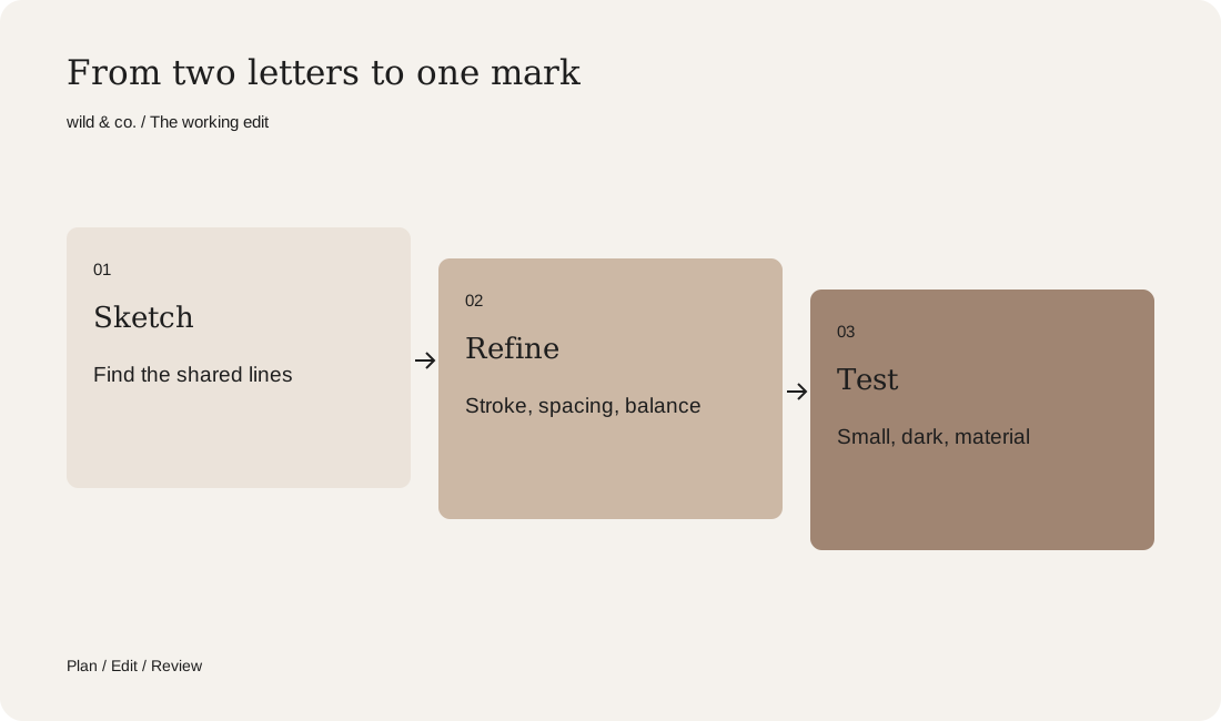
Pairing the monogram with a wordmark
The monogram and the wordmark should look as though one person drew them. They can use different letterforms, but stroke weight, contrast and the feel of the serifs need to agree. Put a flowing script monogram above a technical sans serif and you get two brands sharing one sign.
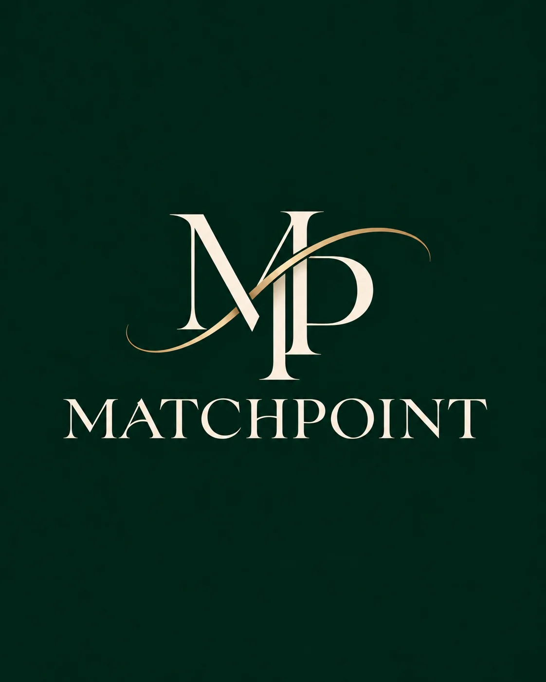
For Matchpoint, a fictional heritage tennis atelier we invented, the pair was planned from the start. The M and P share a single upright that drops above the baseline, and a gold swoosh crosses both letters like the arc of a ball. Underneath, MATCHPOINT is set in the same classical serif spirit, widely spaced and calm. The monogram makes the entrance, the wordmark tells you who has arrived. The brand, its products and every image were made with AI and art-directed by wild & co.
Write down how the two appear together, stacked or side by side, and where the monogram is allowed to appear alone. That belongs in your usage sheet, next to minimum size, clear space and a light and a dark version.
Embossing, foil and engraving
A monogram is meant to be touched, and materials change it. Blind embossing creates the mark purely through relief, with no ink, so the shape must read without any contrast in colour. Gold or copper hot foil looks wonderful but punishes fine detail: thin strokes break up and narrow gaps fill in. With engraving, the material and the tool set the limits on how delicate you can go.
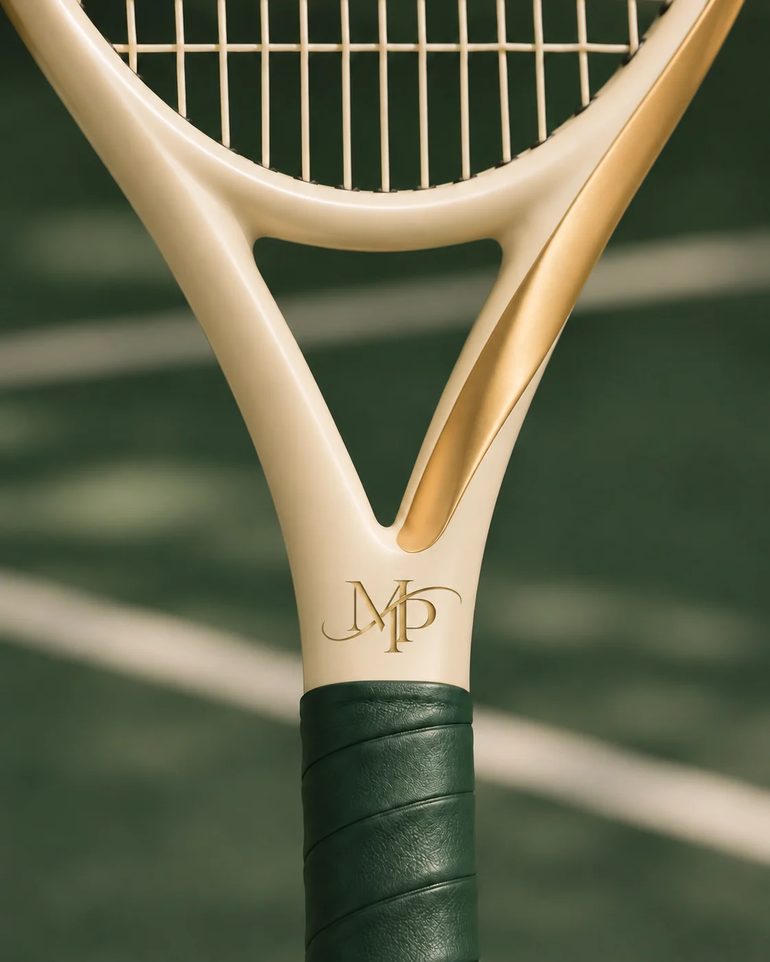
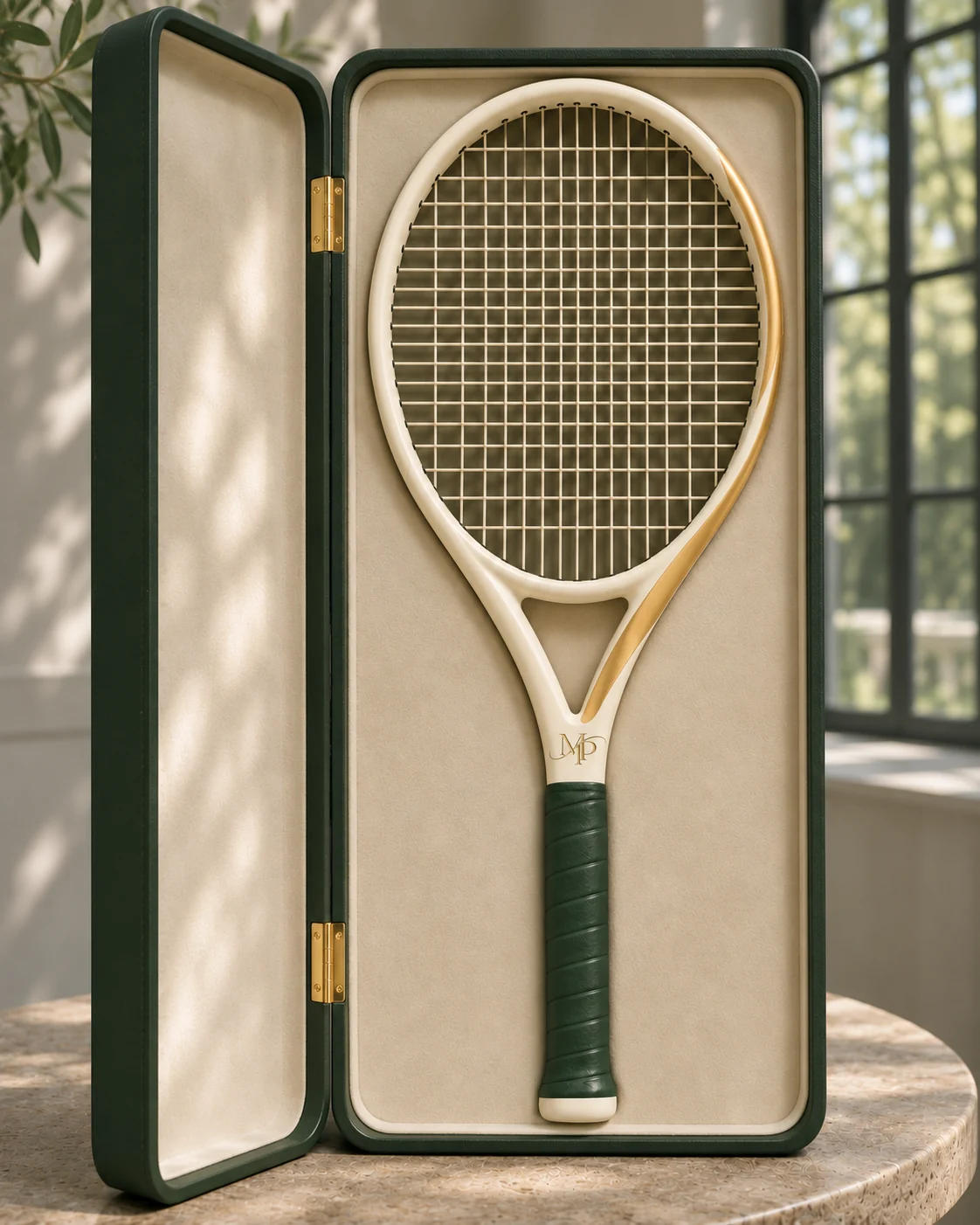
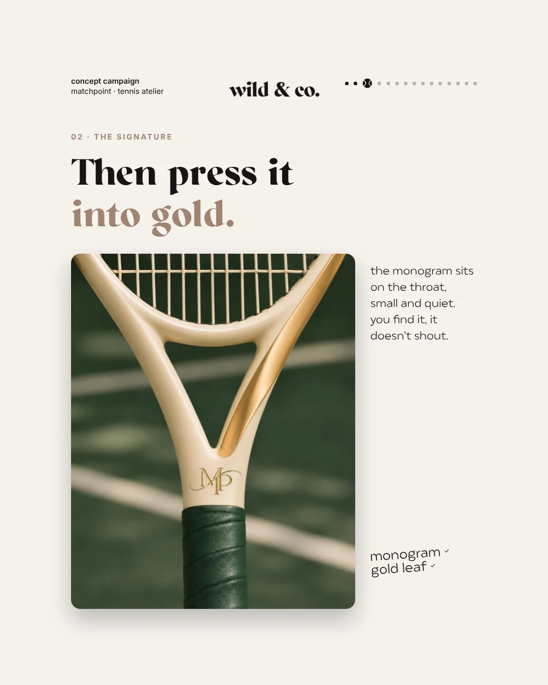
Talk to your printer, embosser or leather workshop early and ask for samples before the full run. On Matchpoint, the monogram is pressed in gold into the throat of the racket, just where the frame meets the green leather grip. It is tiny, it has no wordmark beside it, and you still know exactly whose racket it is. That is the whole point of a monogram.
Where a monogram does its job
A monogram is at its best wherever the full name would be too long or too loud:
- On the product: embossed, engraved, embroidered or on a sewn-in label.
- On packaging: a seal on the lid, a repeat pattern on tissue paper, a sticker that closes the box.
- On social media: the profile picture, where a long name would be illegible in a tiny circle.
- On the website: the favicon, and a quiet mark in the navigation or footer.
- On stationery: a stamp, the back of a business card, a watermark.
- In physical spaces: door plates, shop windows, aprons and other textiles.
List your own uses before sketching: they tell you how sturdy the mark must be.

Common monogram mistakes
- Two letters from a standard font placed on top of each other without any real connection.
- So many flourishes that the mark turns into a smudge at small sizes.
- Initials that accidentally spell another word or a well-known abbreviation.
- A monogram that looks a little too much like a famous one.
- A monogram used without its wordmark while nobody knows the brand yet.
- Skipping the material test, so the foil fills in what looked crisp on screen.
Because the number of letter pairs is limited, it is easy to drift towards an existing mark without noticing. Look at your competitors and search the trade mark registers early in the process, not the week before printing.
How to start your monogram
Begin with questions rather than fonts. Where will the mark appear, how small will it get, and what will it be printed, pressed or stitched on? Then sketch by hand and hunt for the shared lines. Digital drawing, testing and refinement come afterwards. For the wider picture of a logo project, including what drives the effort and which files you should receive, read our guide to getting a logo designed. At wild & co. in Zurich we design monograms as part of branding and logo design, so the mark, wordmark, colours and materials belong together from day one. Fill in the brief on this page and you will have everything needed to get started.