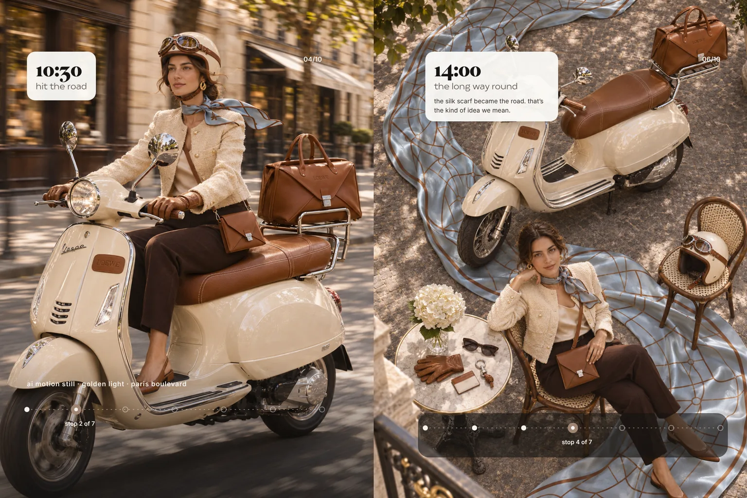
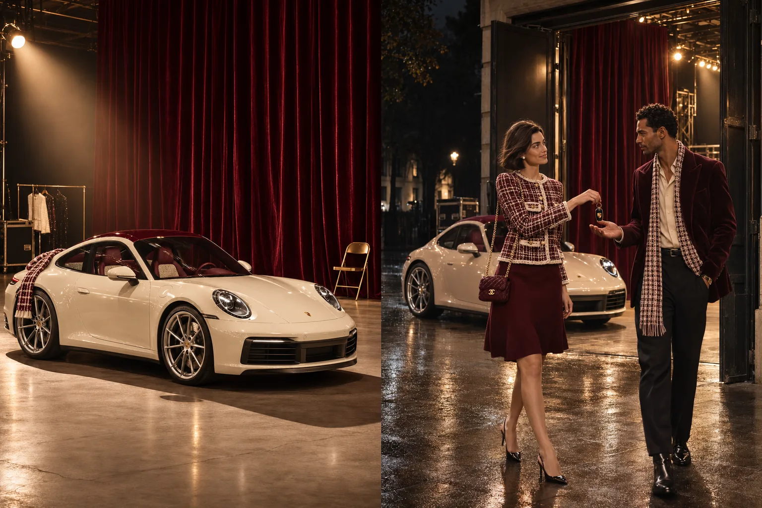
A luxury campaign looks expensive because someone made a great many decisions before the first image existed. Here is how to build a concept campaign for a luxury house, from the idea and the palette to a series that looks all of a piece.
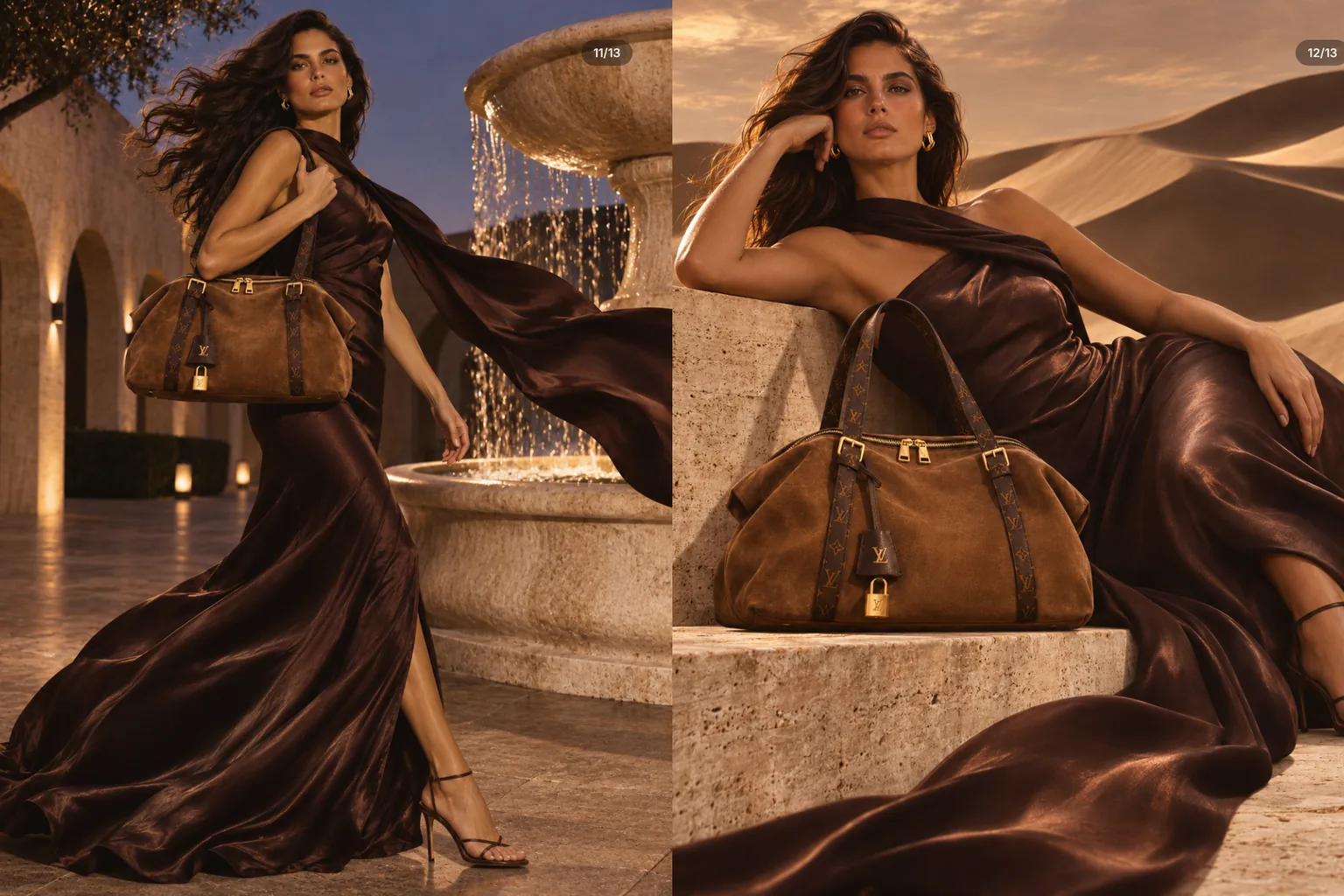
A concept campaign for a luxury brand starts with the product and its material, not with a prompt. From there come an idea, a palette of a few colours and locations from one family. A recurring motif, consistent light and a precise spec for model and product hold the series together. Real logos do not belong in your own advertising.
Luxury rarely sells a product. It sells calm, material and time. That is exactly why it is so hard to get right with AI: one beautiful image is quick, a series that feels all of a piece takes decisions. We developed a concept campaign for a Louis Vuitton bag, and this guide shows how it is built. It is an unofficial concept study, not affiliated with or commissioned by the brand. Trademarks belong to their respective owners. Every image was made with AI and art-directed by wild & co. In the journal we show the original images of the study, bag and monogram included, plus the palette and the process.
What a concept campaign is
A concept campaign shows how a brand could be staged: one product, one idea, one visual world and several images that tell a story together. Agencies use them for pitches, brands use them internally to test a direction, and creatives use them to show how they think. Our guide to spec ads with AI covers what unsolicited campaigns are and why we make them. This one picks up from there: how do you build such a campaign for a house where every detail has to be right?
What luxury looks like in a picture
An image rarely looks expensive because of the product alone. It is everything around it that signals an attitude. Once you know these signals, you can use them on purpose, with a camera or with AI:
- Space: plenty of air, few objects, clean lines. Nothing elbows its way into the frame.
- Material: suede, satin, stone. Surfaces you want to touch.
- Light: one main source, long shadows, often the golden hour.
- Pace: calm poses but fabric in motion. Nobody is in a hurry.
- Restraint: no price tag, no discount, hardly any text.
- Repetition: the same palette in every image, until you recognise the campaign by its colour alone.
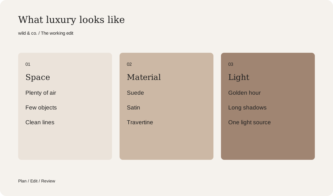
Your campaign mood sheet
An idea that starts with the product
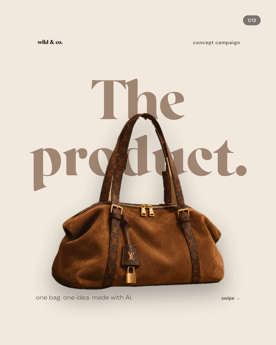
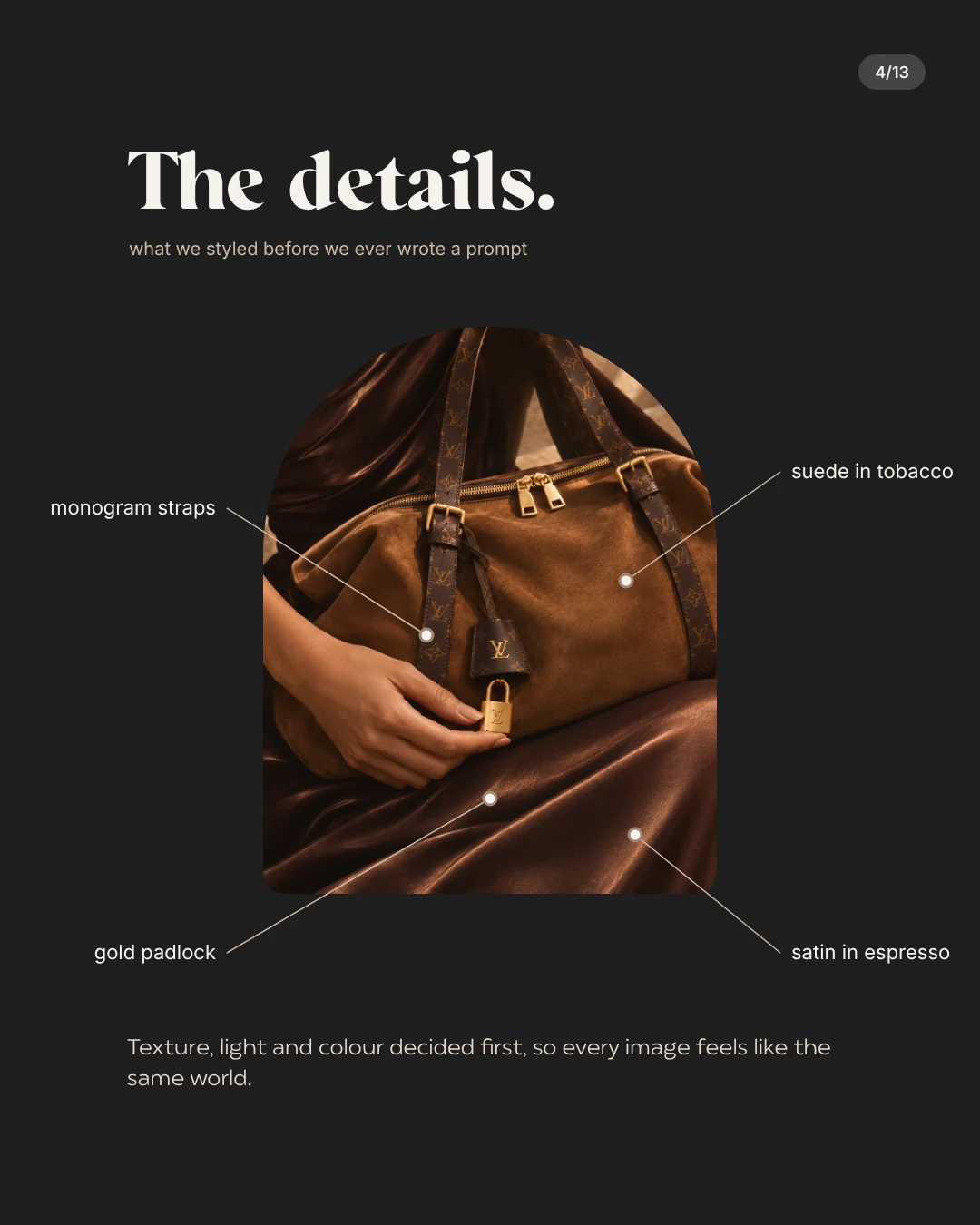
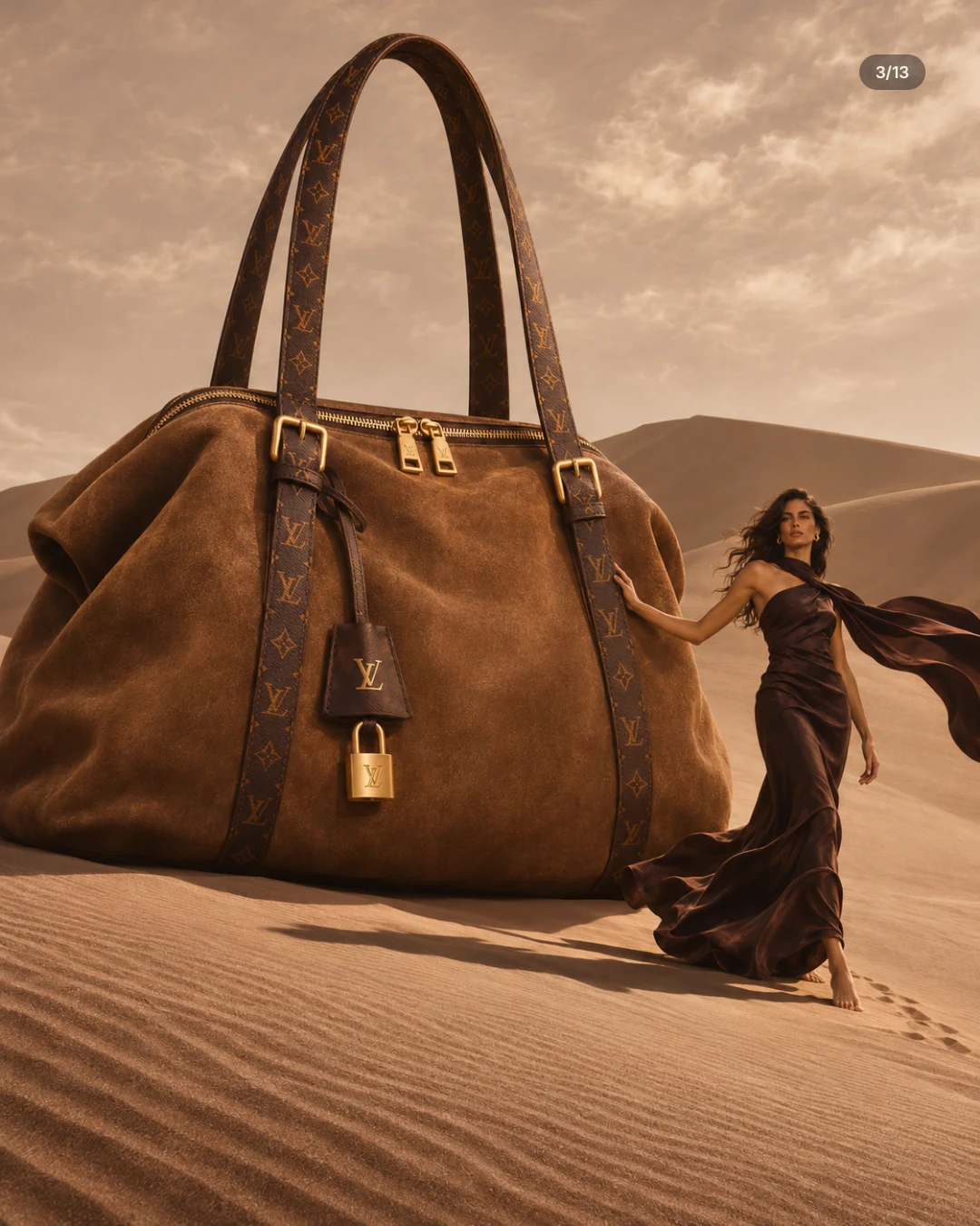
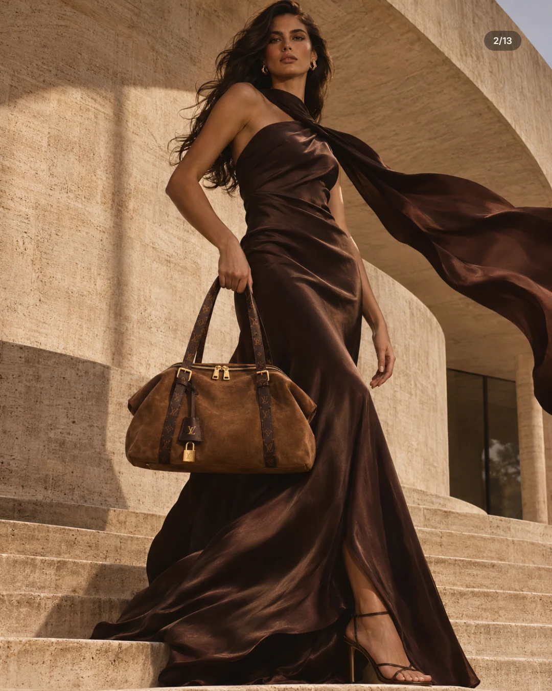
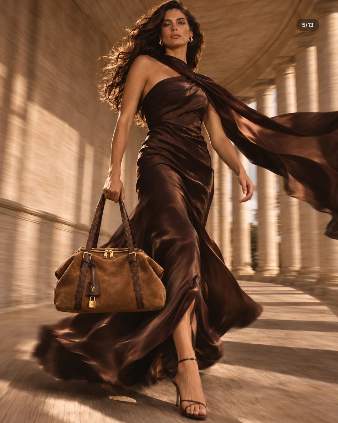
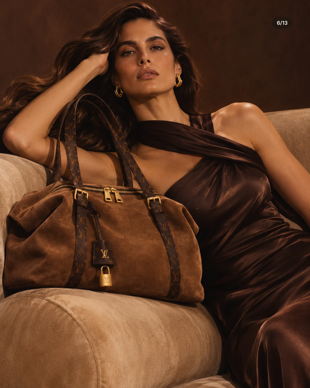
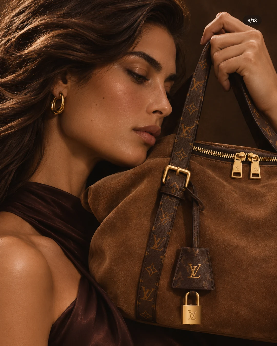
Our study centres on a bag in tobacco suede with monogram canvas handles and a gold padlock. Instead of inventing a story around it, we started with the material. Suede looks like sand in evening light. So the desert became the setting, with architecture in warm travertine as its counterpart. The idea fitted into a sentence: the bag belongs in this landscape, as if it had been made from it.
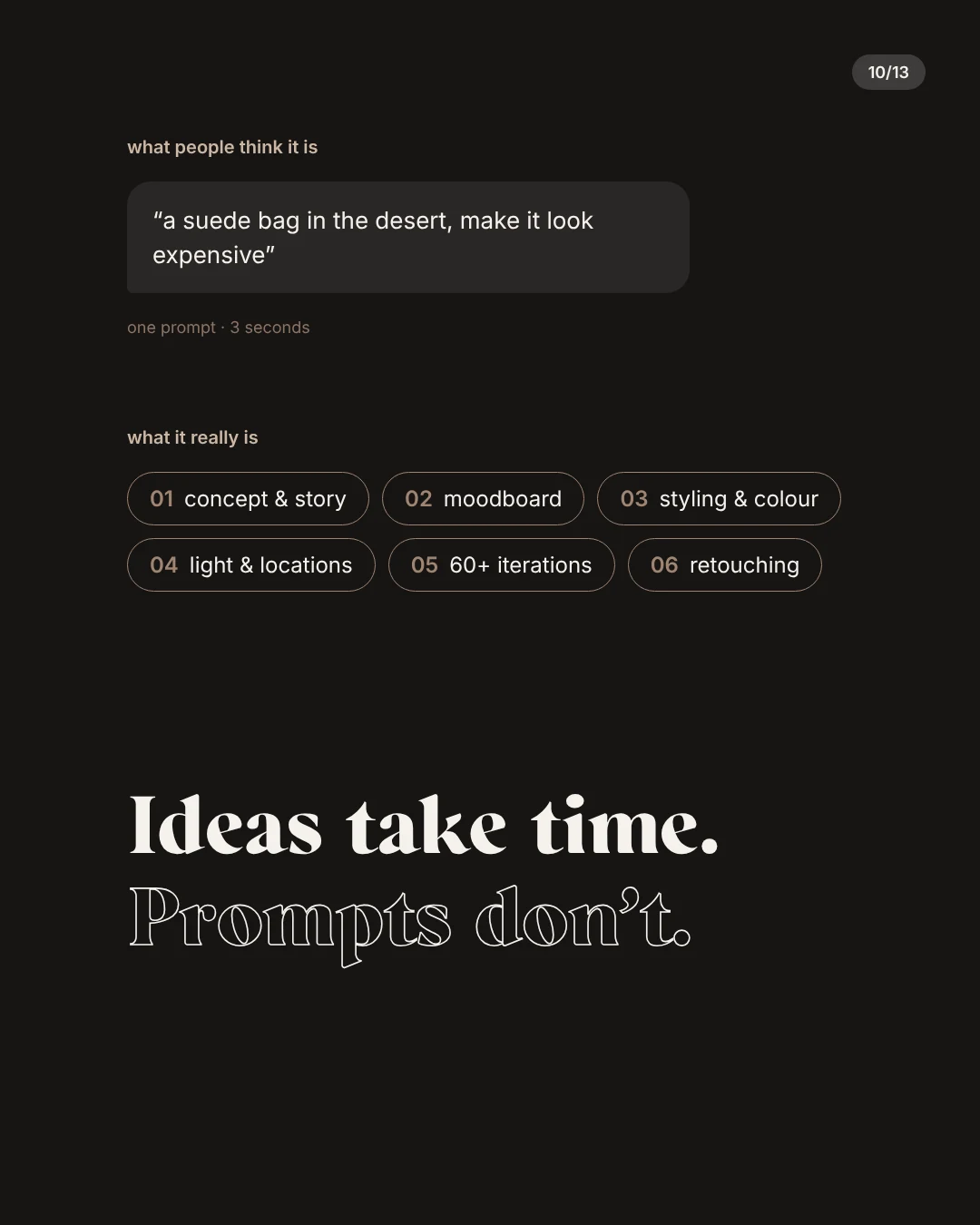
One slide in the carousel puts the difference neatly. What people think it is: a prompt along the lines of ‘a suede bag in the desert, make it look expensive’. What it really is: concept and story, moodboard, styling and colour, light and locations, a great many rounds of iteration and careful retouching. Or, more briefly: Ideas take time. Prompts don’t.
Setting the mood and the palette
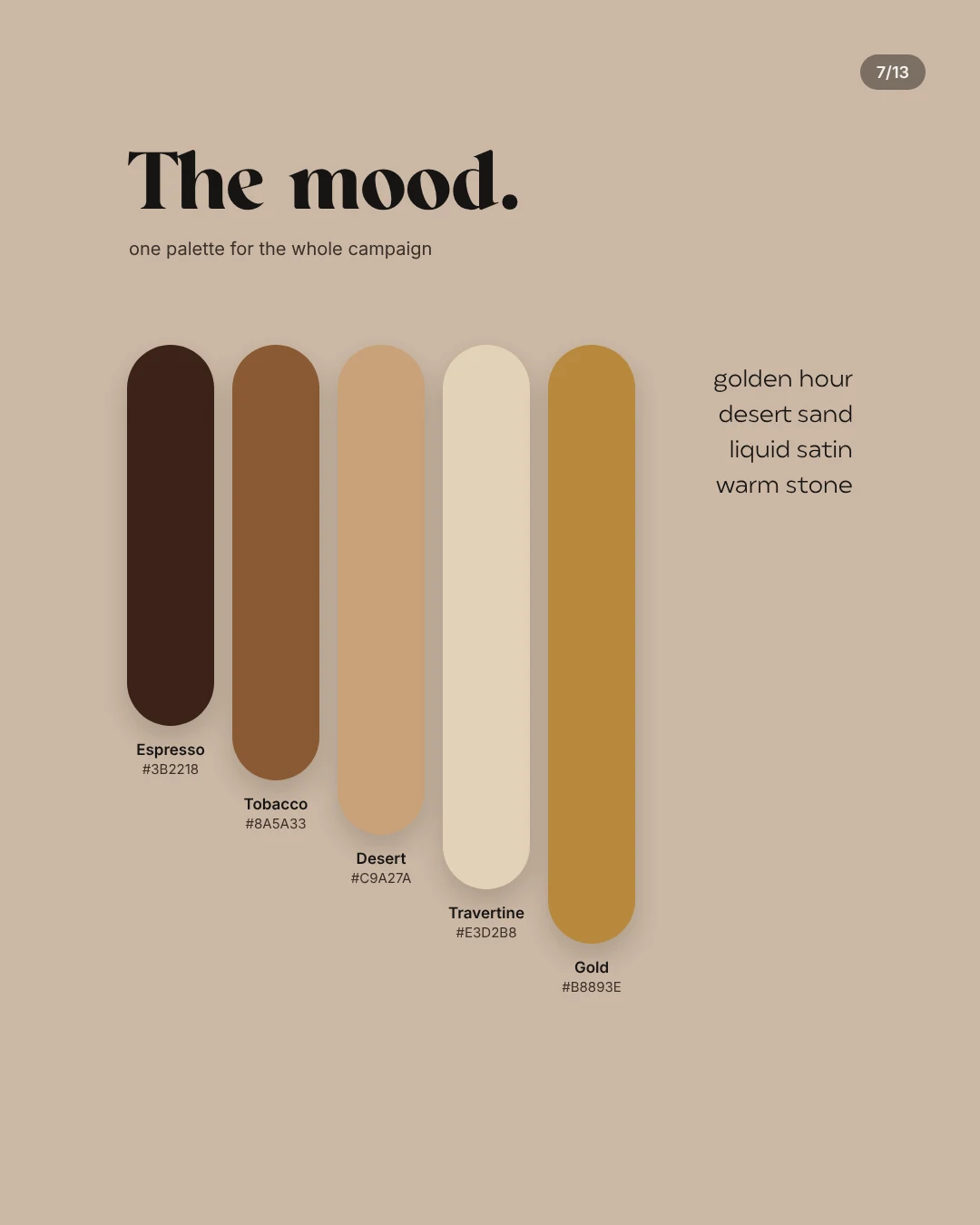
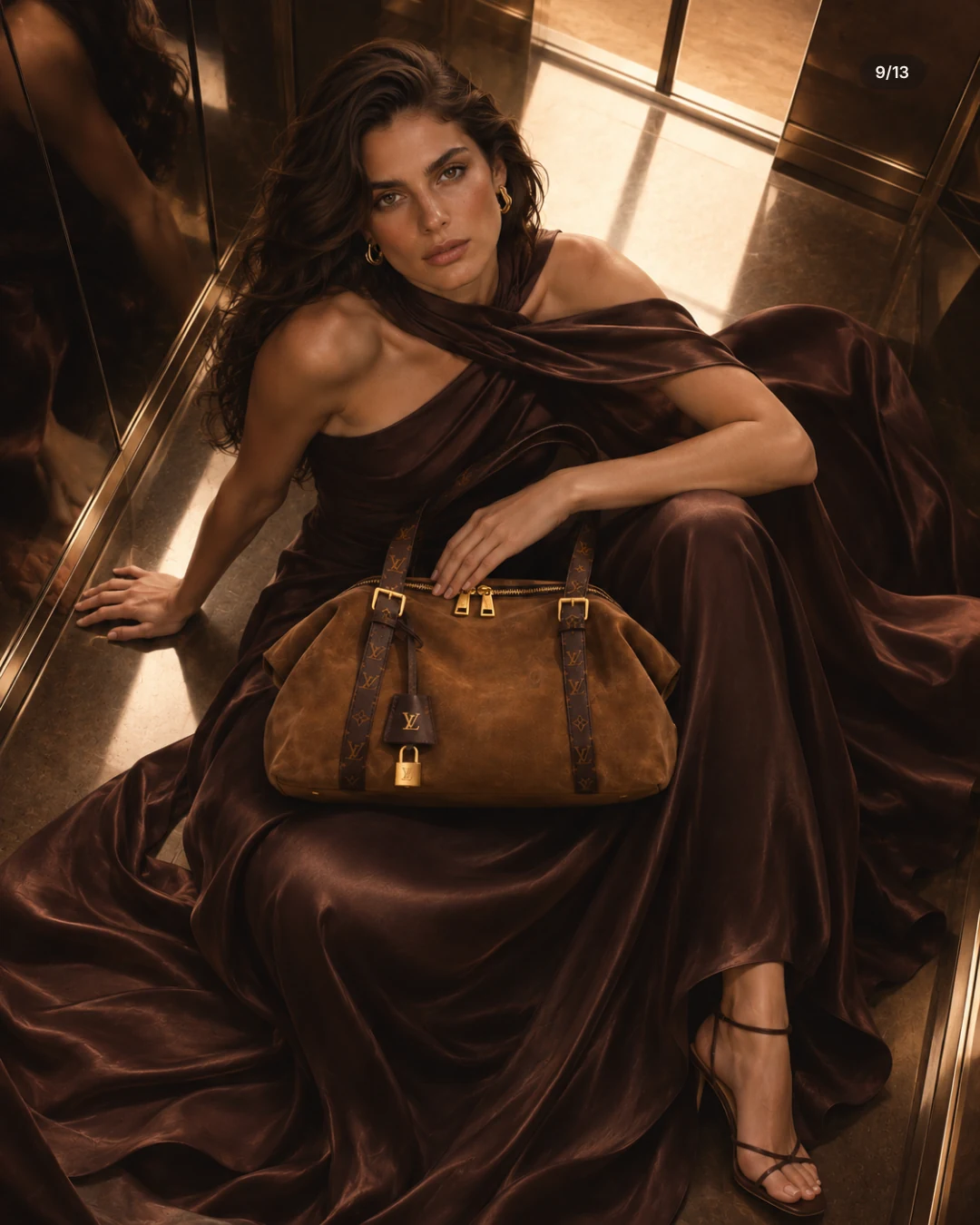
The palette is fixed before the first image exists. Ours had five tones: espresso, tobacco, desert, travertine and gold, plus four mood words: golden hour, desert sand, liquid satin, warm stone. Every colour in the frame has a job. The dress is espresso, the bag tobacco, the stone travertine, the hardware and jewellery gold. If a colour is not in the palette, it does not go into the picture. The rule sounds strict, but it saves endless debate later and turns single images into a campaign. Our guide on how to build a moodboard shows how to collect a direction like this first.
Art direction: places, light and movement
Each location shows a different side of the same world: stairs and curves in travertine, a colonnade, dunes, a lift with mirrored walls, a courtyard with a fountain at dusk. They all come from the same family of stone and sand, so the changes never feel random. The light stays warm and mostly comes from the side. And one motif keeps returning: the long satin scarf caught by the wind. A single repeated movement gives the series rhythm without every image having to shout.
Consistency: same face, same dress, same bag
The hardest part is not the most beautiful image but the tenth one that still matches the first. Face, hair, earrings, the cut of the dress and above all the bag drift from frame to frame unless you pin them down. So before the first prompt we wrote a spec: handles, tobacco suede, gold padlock, espresso satin, gold hoops. Every image was checked against it, and anything that strayed was discarded or retouched. Our guide to consistent AI images explains how this works for products in detail.
The same applies to the model. If one person has to look identical across a whole campaign, you need fixed references and a description that does not shift from image to image. Small deviations go unnoticed in a single Story, but in a grid of nine they jump out at once.
Logos, rights and how we label the study
A luxury brand lives on its marks, and those are protected. Showing a monogram in your own advertising borrows the reputation of someone else's brand, which can cause trade mark trouble even when the images are well meant. We are not lawyers, and this section is no substitute for advice. Our own rules: the study is clearly labelled as unofficial, it does not advertise on the house's behalf, and we name the owners of the trade marks. We show it here in the journal, where the subject is the craft, but not in our portfolio, which is reserved for our own work and invented brands. For your own brand these questions disappear, and the product can take centre stage anyway.
What to take away for your own brand
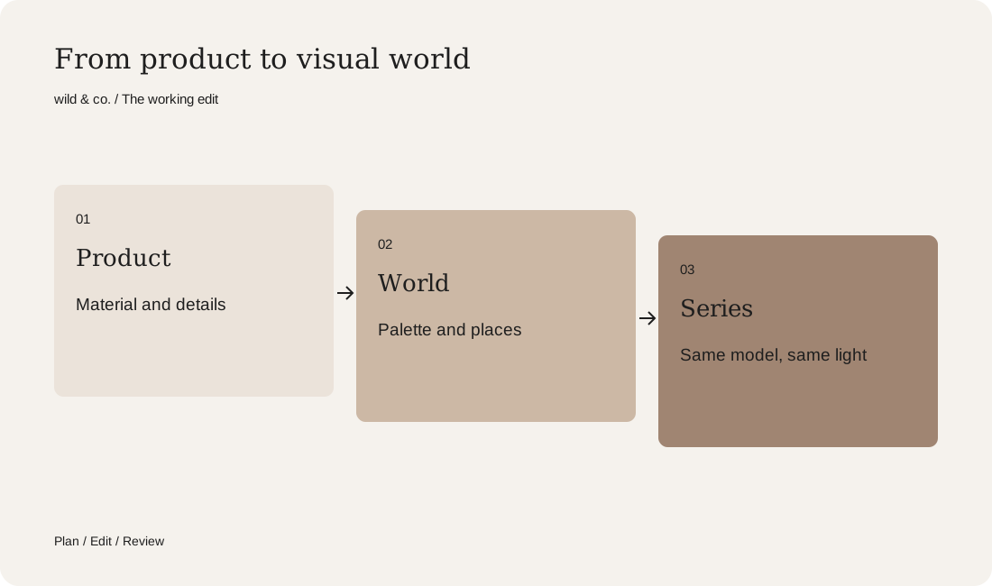
The method works for any brand that should feel premium, whether jewellery, fashion, skincare or a hotel. Start with the material, not the prompt. Fix a palette of a few colours and give each one a job. Choose locations from one family, one recurring motif and a spec for everything that has to stay the same. The worksheet above puts it all on one page. Our service page explains how we create AI imagery and AI campaigns for brands, and the wild lab shows campaigns for brands we invented ourselves.