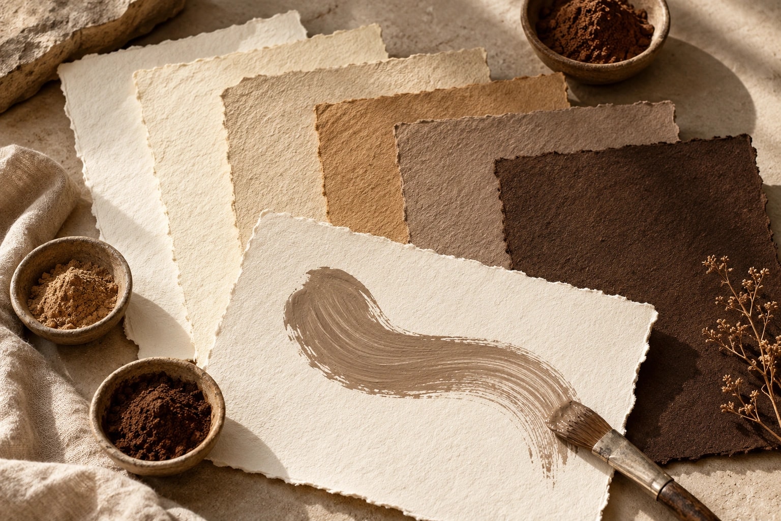
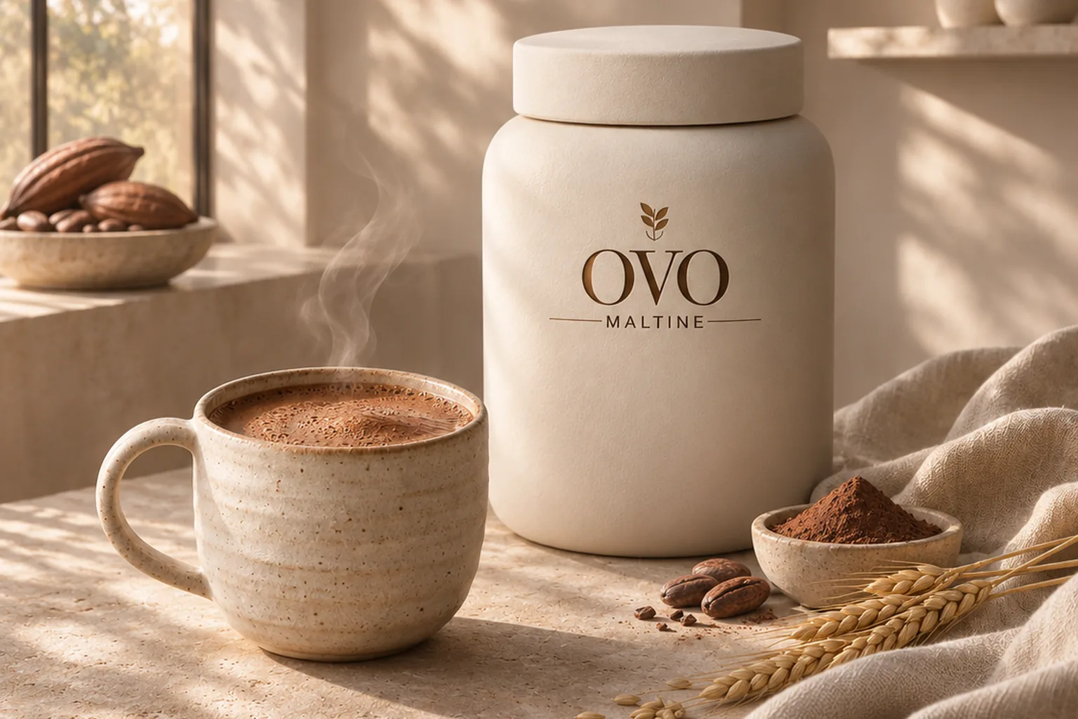
A signature colour is often the first thing people recognise about a brand, and the last thing anyone wants to touch. Still, a colour change can be the right move. Here is how to test it, and how to build the new colour so it does not just look different but feels different too.
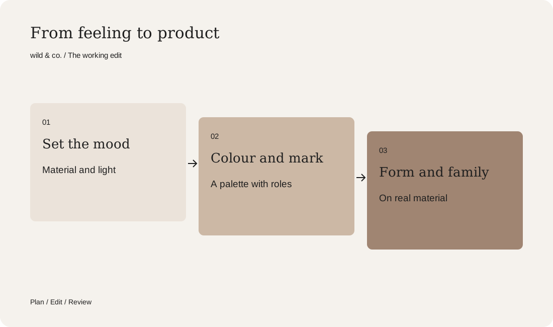
When you change a brand colour, start with the mood, not the colour fan. The mood gives you a palette with clear roles, a mark that works on the new colour and a material that carries it. Products and imagery come after that. And at least one familiar element stays as a bridge.
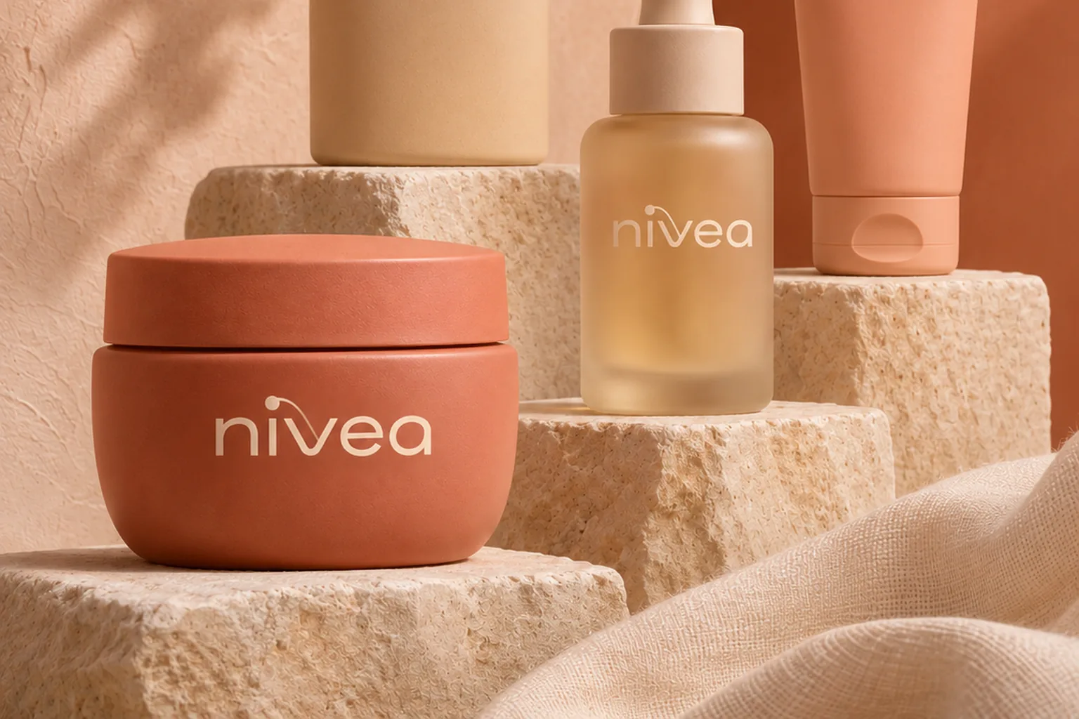
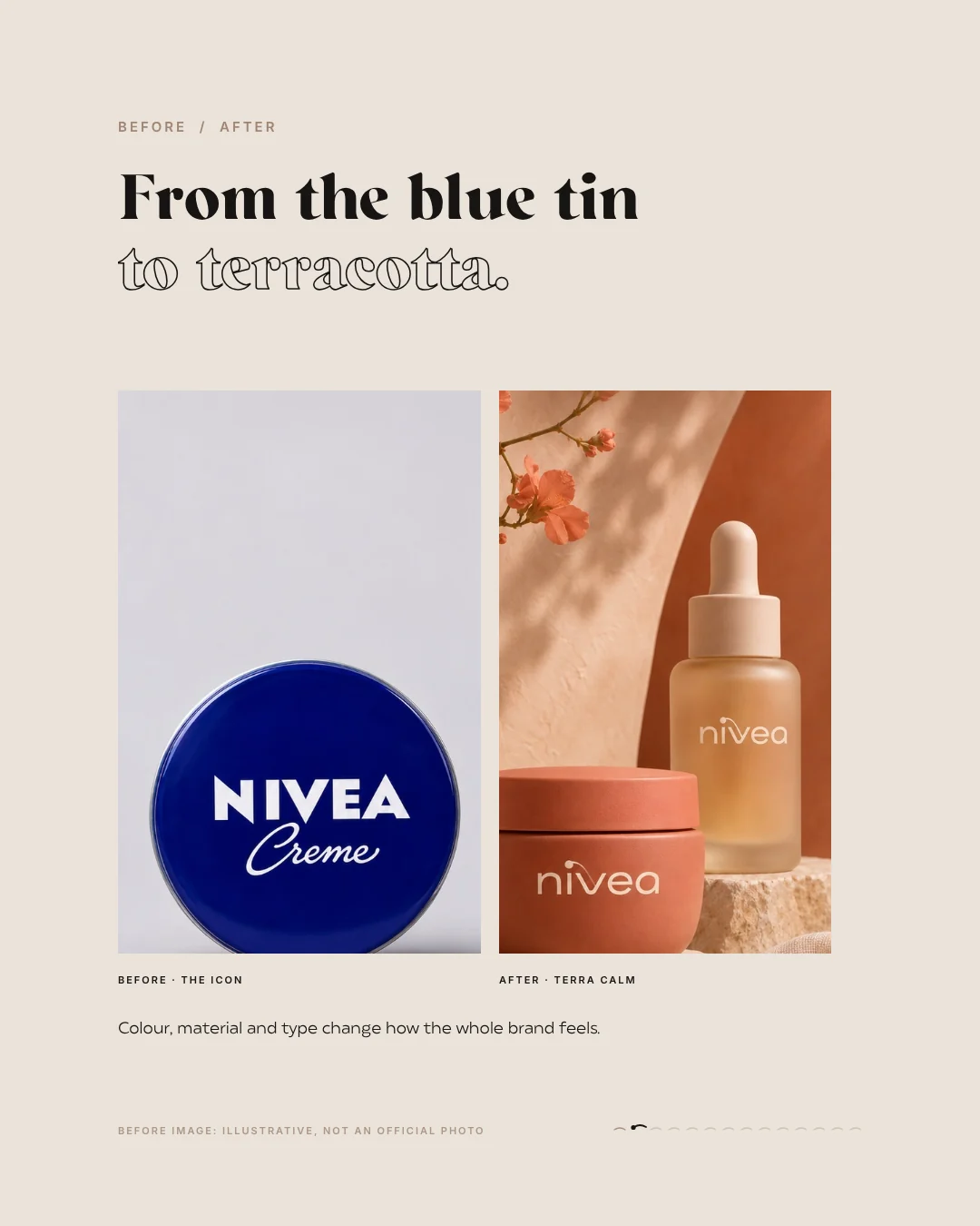
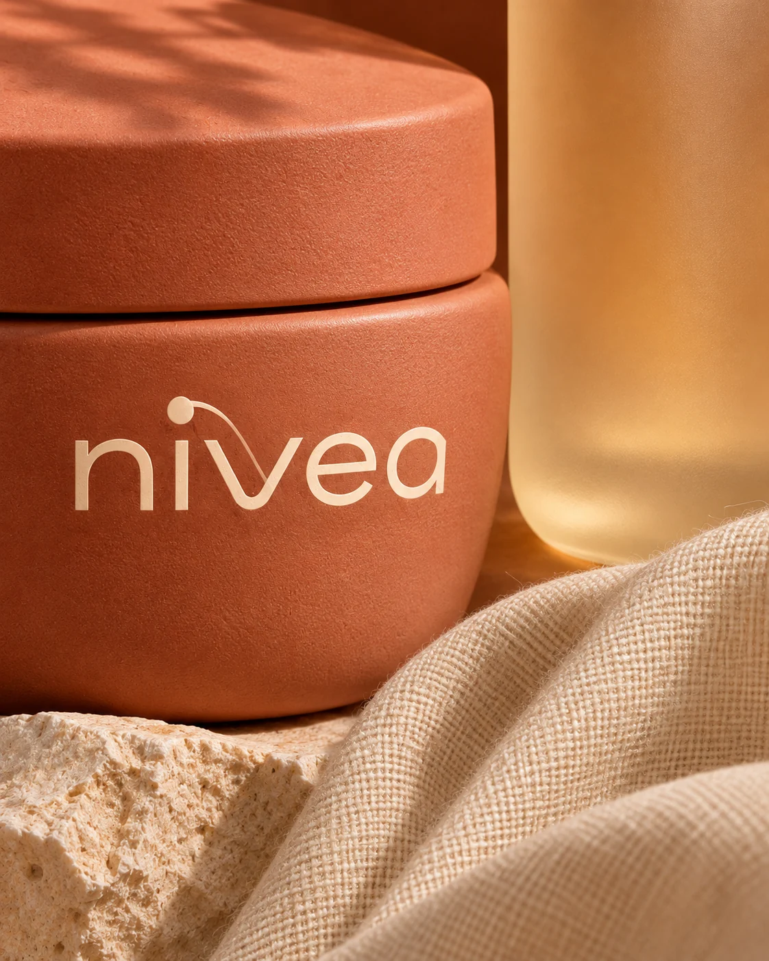
Few things shape a brand as much as its colour. Plenty of people recognise a product on the shelf before they have read its name. That is exactly why a colour change is risky, and sometimes exactly right. To show how much a different colour changes, we made a study: what if the most familiar tin in the bathroom cabinet traded its blue for clay? Our answer is Terra Calm, a quiet, warm take on NIVEA in terracotta. One thing first: this is an unofficial concept study, not affiliated with or commissioned by the brand. It was made by wild & co., and the product and model images were created with AI. Trademarks belong to their respective owners.
Why change a brand colour at all
Most brands do not change colour out of boredom. More often the colour no longer fits what the brand promises today. A shade that once meant fresh and clean can look cold or clinical next to a new product line. Sometimes a colour is so common in a category that nobody stands out any more. And sometimes a brand wants to reach people who never warmed to the old look. These questions help you take an honest look at your own colour:
- Does today's colour still stand for what you sell and promise?
- Does it set you apart, or do you look like everyone around you?
- Does it work on every material, screen and photograph?
- How do people recognise you when the colour is missing?
- Who is attached to the colour, and what would they miss?
Mood first, colour second
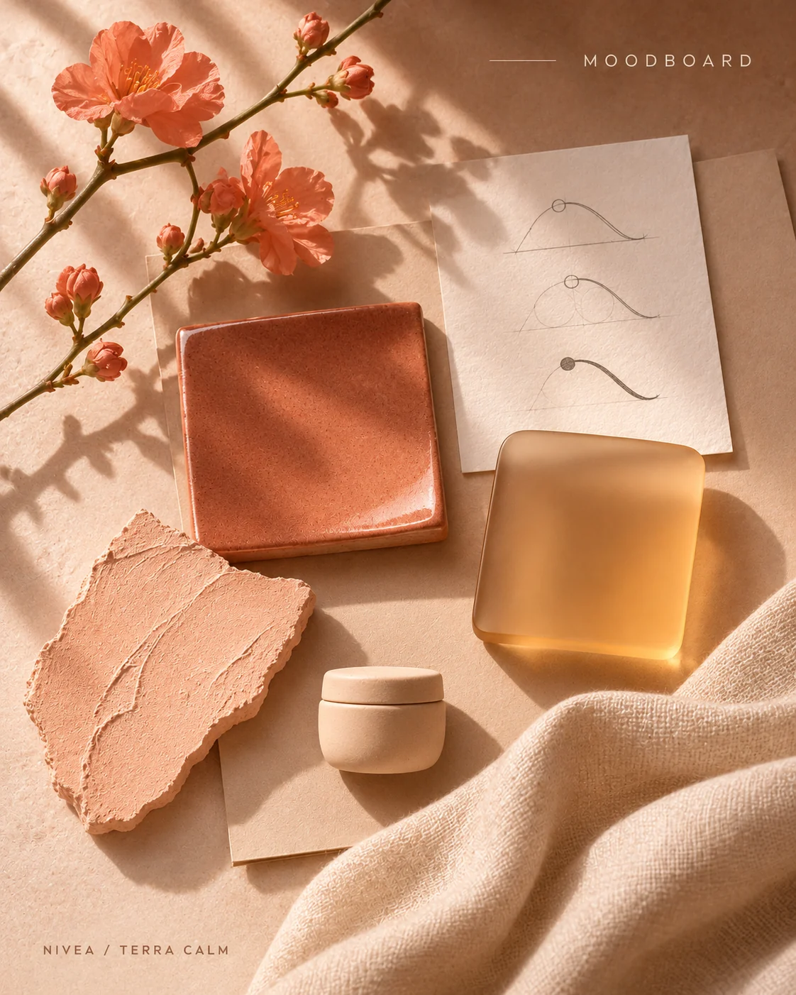
The most common mistake is to go straight to the colour fan. Lots of shades look lovely there, and none of them tells a story. That is why our study did not start with a colour code but with a moodboard: ceramic, satin glass, linen and peach blossom in soft daylight. The mood was set before the first product was drawn, and the colour almost chose itself. Terracotta is warm, earthy and calm, and it suggests clay and craft rather than lab and tube. Our post on how we build a moodboard shows how we put a world like this together.
Your colour change check
A palette with roles, not a favourite colour
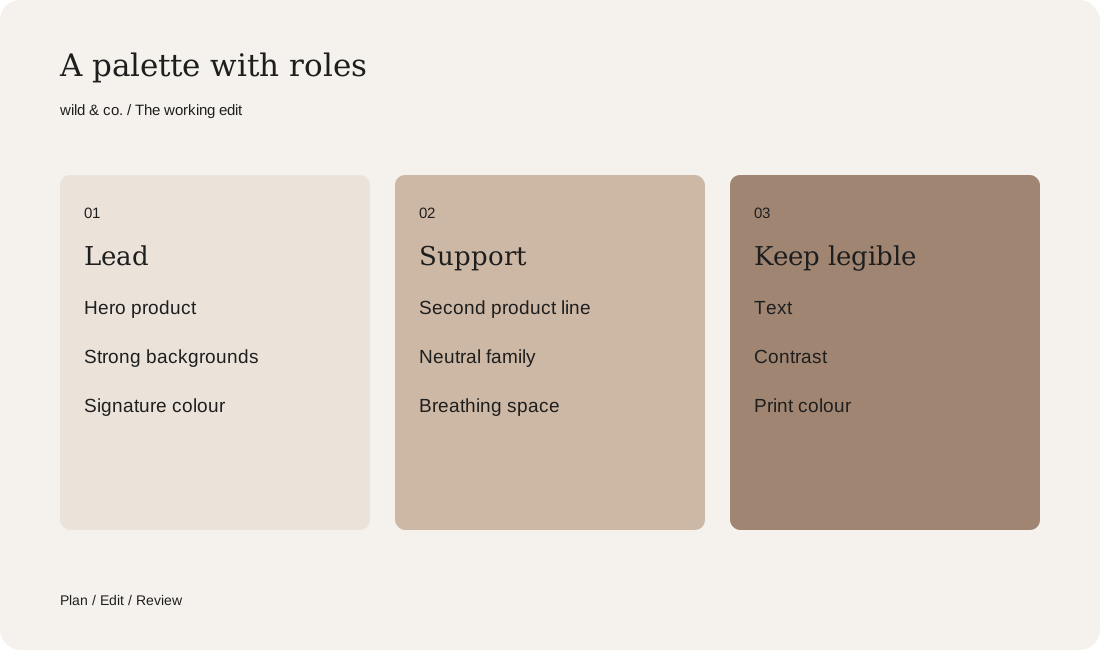
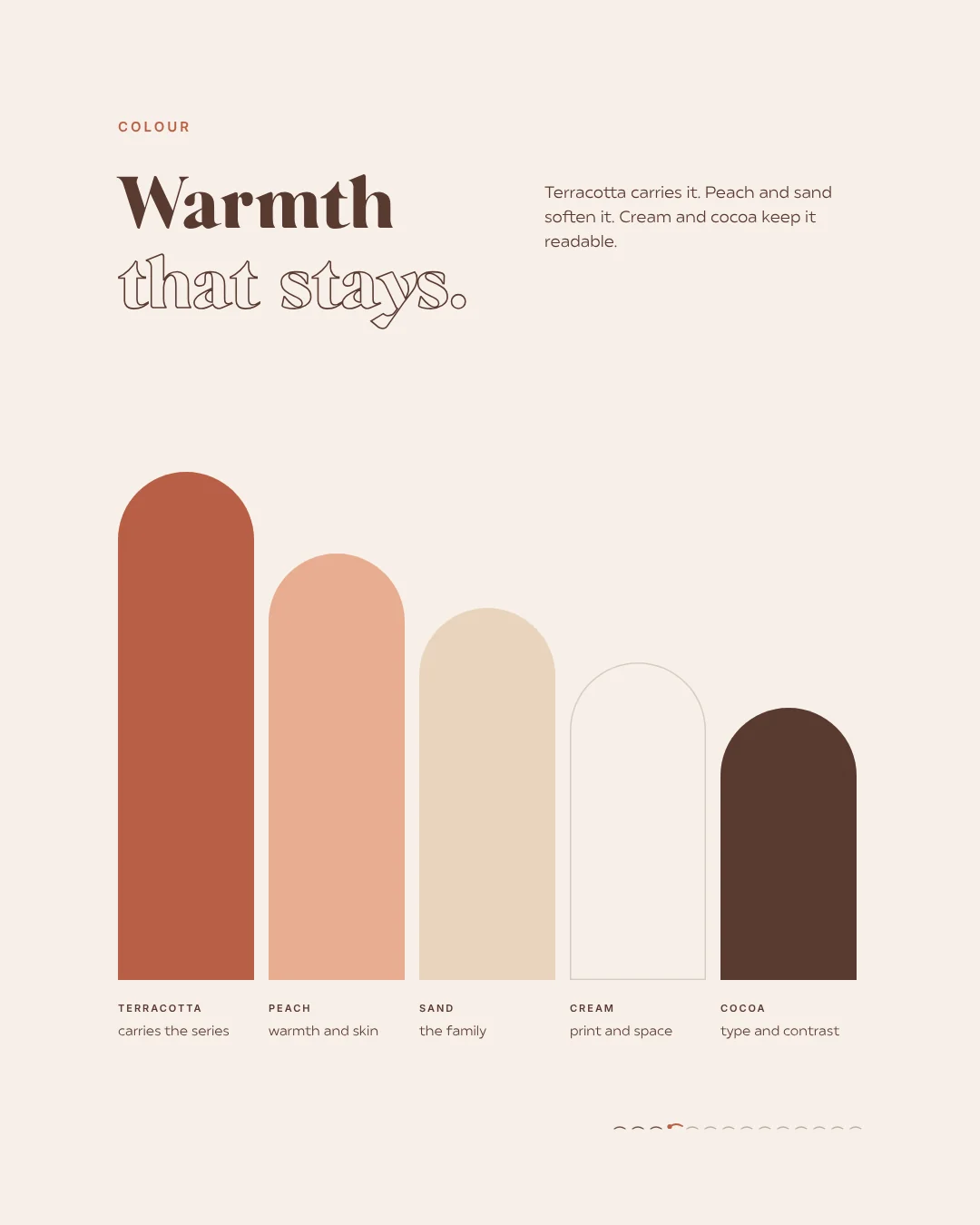
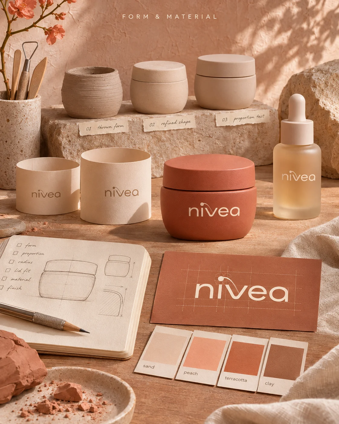
A single colour cannot carry a brand. You need a small palette in which every colour has a job. Terra Calm has five warm tones. Terracotta leads the series, the hero product and the strong backgrounds. Peach softens it and belongs to the second product line. Sand is the neutral shade of the family, cream is the print colour and the breathing space, and cocoa keeps everything legible as the colour for text and contrast. The result is not a random gradient but a system that works on a jar as well as on a website. Our guide to choosing brand colours goes into colour roles in detail.
The mark has to carry the new colour
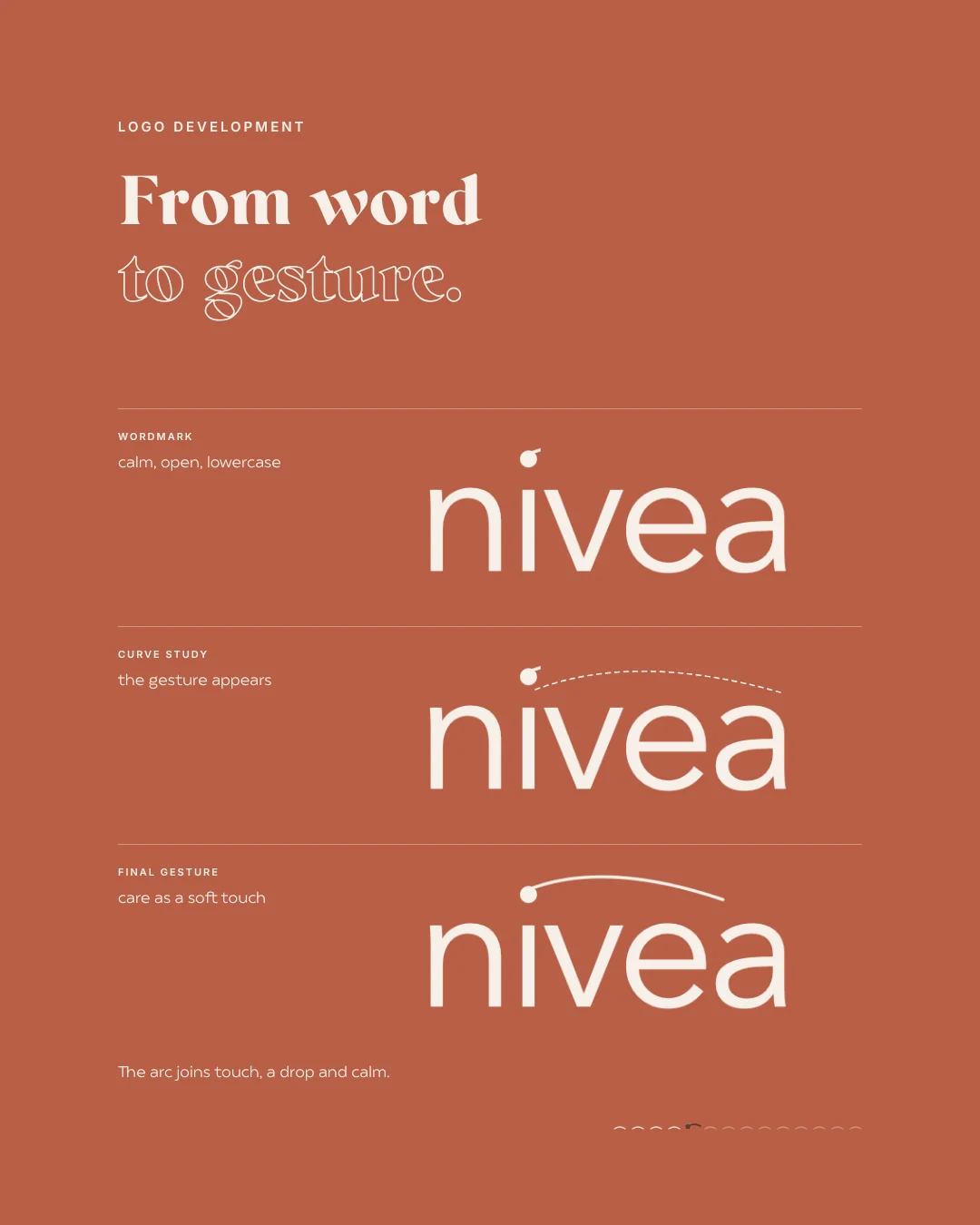
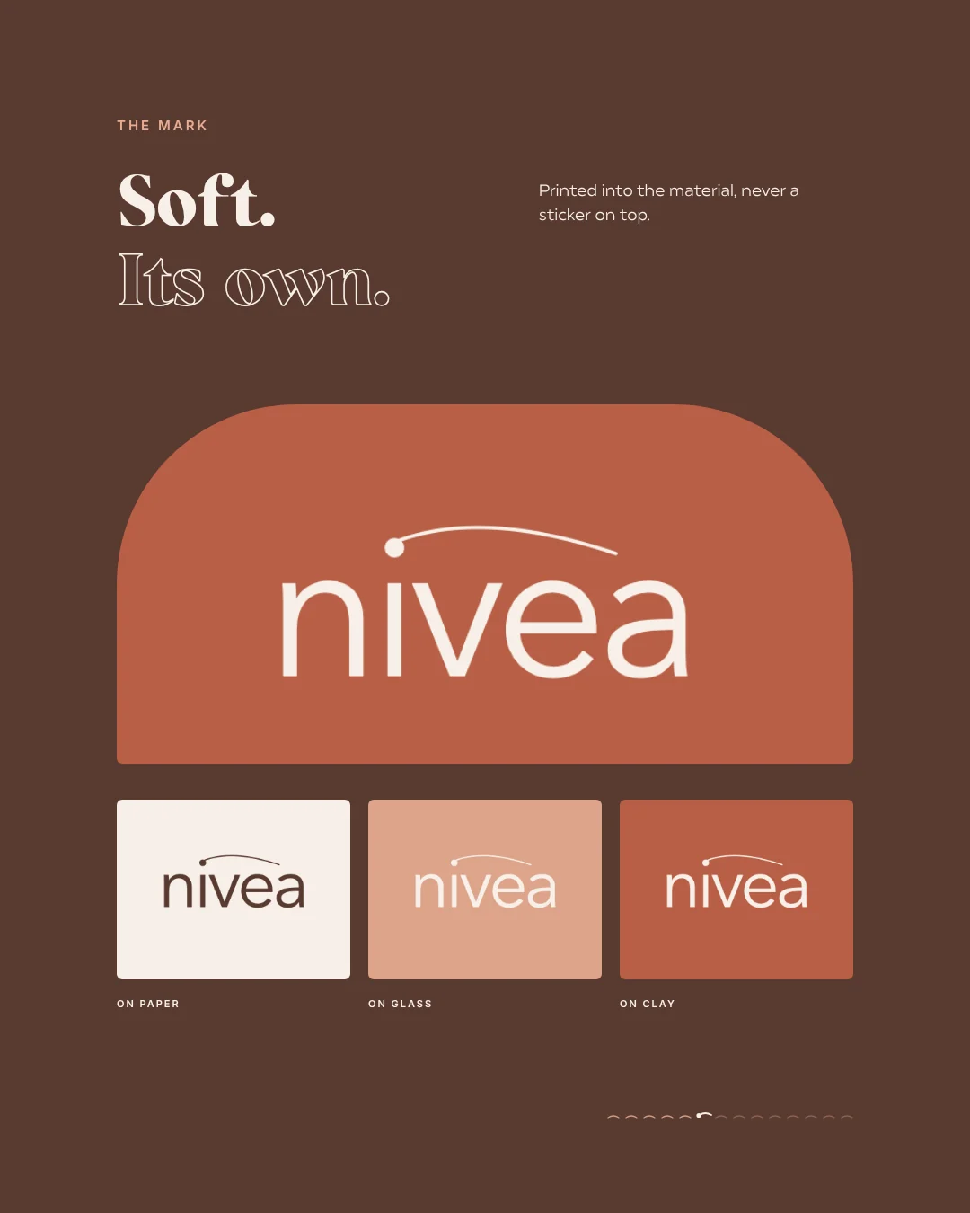
Change the colour and the logo changes too, whether you like it or not. A wordmark that looks strong on dark blue can feel harsh on warm clay. In the study we rethought the wordmark: lowercase, open and calm, crowned with a fine arc and a dot. The arc stands for touch, a drop and calm all at once. The decisive test was on three surfaces: paper, glass and clay. A mark that only looks good on one colour is too weak for a colour change.
Material changes the colour
The same colour looks entirely different on glossy metal and on matte ceramic. If you change a brand colour, you have to rethink shape, lid and surface along with it. For Terra Calm we designed proportion, lid and surface together, so the jar feels in the hand the way it looks. A matte finish and cream print keep the contrast quiet. The rule of thumb: always test your new colour on the real material, never only on screen. A swatch on paper tells you very little about how a tube will look in a bathroom.
Changing colour without losing recognition
To be fair, a brand with such a famous signature colour would hardly drop it overnight. A study is allowed to go further; that is what it is for. For your own brand a more careful route makes sense. Keep at least one familiar element that people recognise at once, such as the name, the shape or a typical gesture. In Terra Calm the name and the basic shape of the cream stayed, while colour, material and type changed. Even that shifts the whole feeling of the brand.
- Switch one product line or an edition first, not everything at once.
- Explain why the colour is changing instead of swapping it quietly.
- Let the old and the new colour live side by side for a while.
- Record colour values for print, screen and material in a short style guide.
What AI can do in a colour change
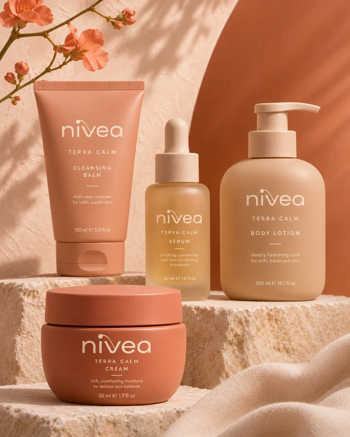
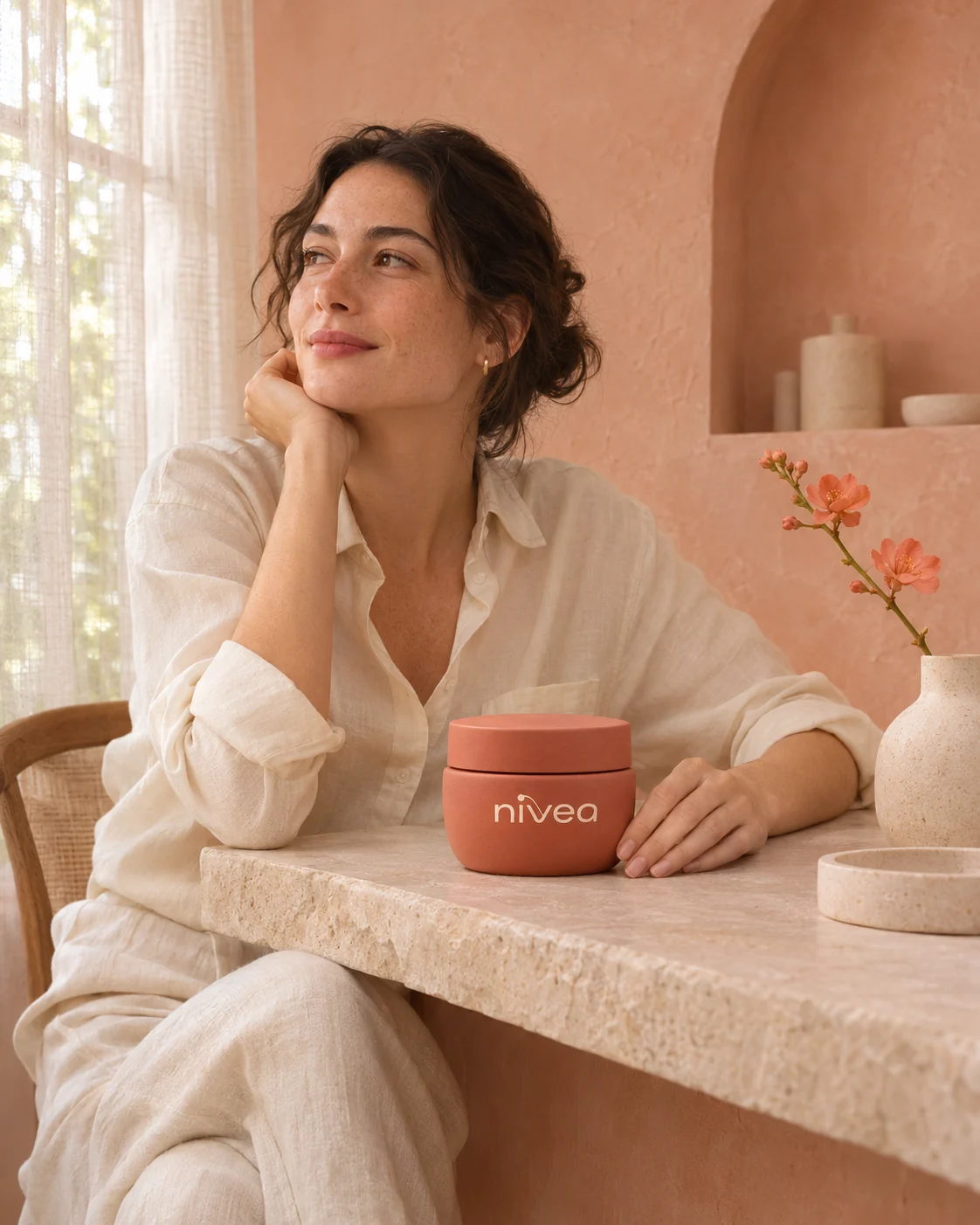
While you are still exploring, AI is a useful tool. You quickly see how products, scenes and people look in a new colour world, without building a prototype or booking a shoot. That is how our study produced the product family of cream, serum, cleanser and body lotion, a scene with natural skin in daylight and close-ups of the surface. AI does not replace real material samples or a trade mark check, though. Lettering on AI images is often inaccurate, so the final mark is drawn as a clean vector file. You will find more studies with invented brands in the wild lab.
Planning your colour change
With the worksheet above you can check in half an hour whether a colour change makes sense for you and what has to stay. After that, an outside view helps. At wild & co. in Zurich we guide branding and rebranding projects from mood, palette and mark to packaging and imagery, for brands across Switzerland, in person or remotely.