Reworking a brand people already know is trickier than inventing a new one. People are attached to things no style guide ever wrote down. Here is how to work out what you must keep, and how to test a new direction before you change anything.
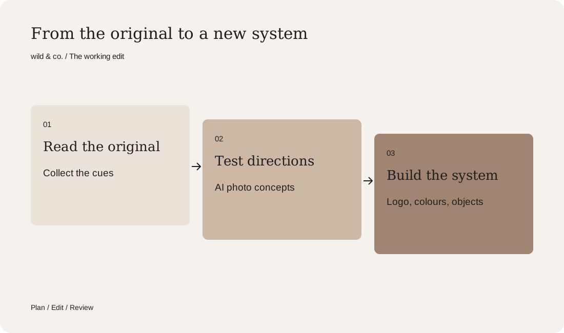
In a rebrand you keep the core and the cues people recognise you by, and renew the feeling around them. Start with an inventory: colour, shape, lines, origin, rituals. Then test several directions in images, with AI for example, and only then build logo, colours and objects into a system.
Every brand that has been around long enough reaches this moment. The packaging suddenly feels loud, the imagery looks dated, and today's customers are not the ones it was made for. A rebrand promises a fresh start. It can also erase exactly what people love about a brand. To show how to tell the difference, we use a study: we asked what Ovomaltine might become if its tin grew up. One thing first: this is an unofficial concept study, not affiliated with or commissioned by the brand. It was made by wild & co. and every image was created with AI. Trademarks belong to their respective owners.
Refresh, rebrand or fresh start?
Not every change is the same size. A refresh keeps almost everything: the type gets finer, the colours calmer, the imagery more current. A rebrand keeps the name but changes the expression noticeably, from logo and palette to tone of voice and perhaps packaging. A fresh start goes further, with a new name or a new promise. Most established brands do not need a fresh start. They need a rebrand with a sense of proportion. If you are not sure whether you need a new logo or more than that, our guide new logo or new branding? helps you decide.
What makes a brand unmistakable
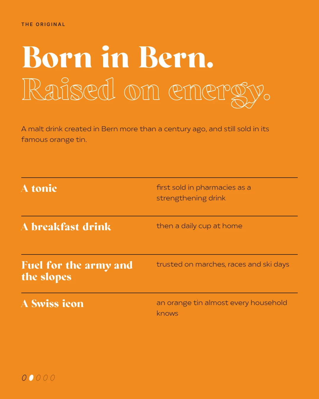
Before you change anything, you need an honest list of the things people recognise you by. Strategists call them distinctive brand assets: a colour, a shape, a line, a character, a sound, a place of origin. For Ovomaltine the list wrote itself: the orange tin, the malt, Bern as its birthplace, ski holidays and sport, and a slogan almost everyone in Switzerland can finish. Cues like these are valuable precisely because they took years to grow. These questions help with your own inventory:
- What would people draw if they had to sketch your brand from memory?
- Which colour do they link to you, even when no logo is visible?
- Which lines, stories or rituals are attached to your brand?
- What is genuine heritage, and what is simply habit?
- What gets in the way today, for customers and for your own team?
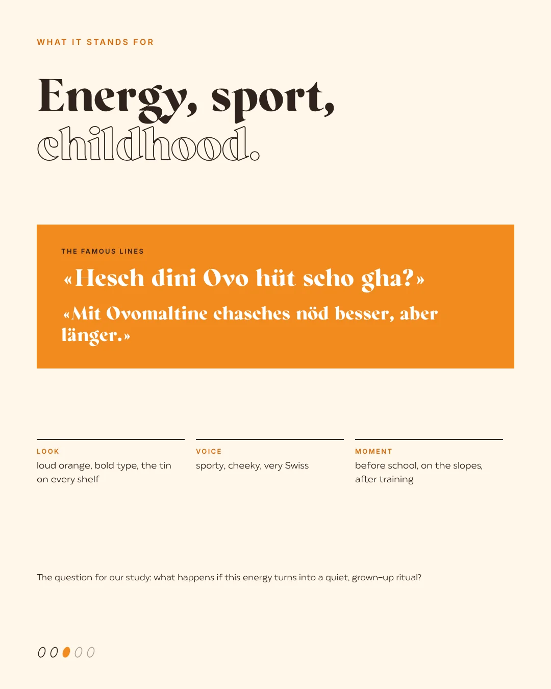
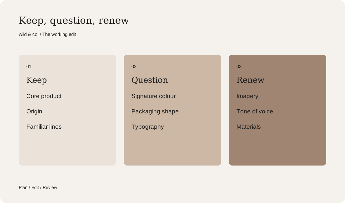
Your rebrand inventory
What should stay and what can change
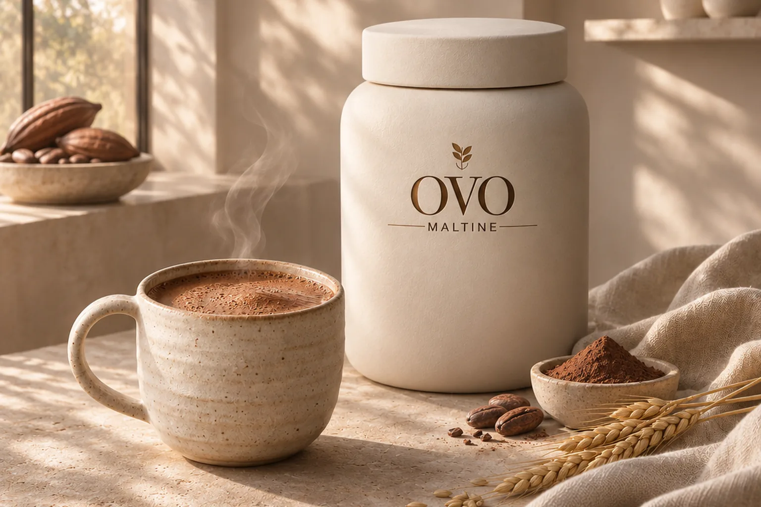
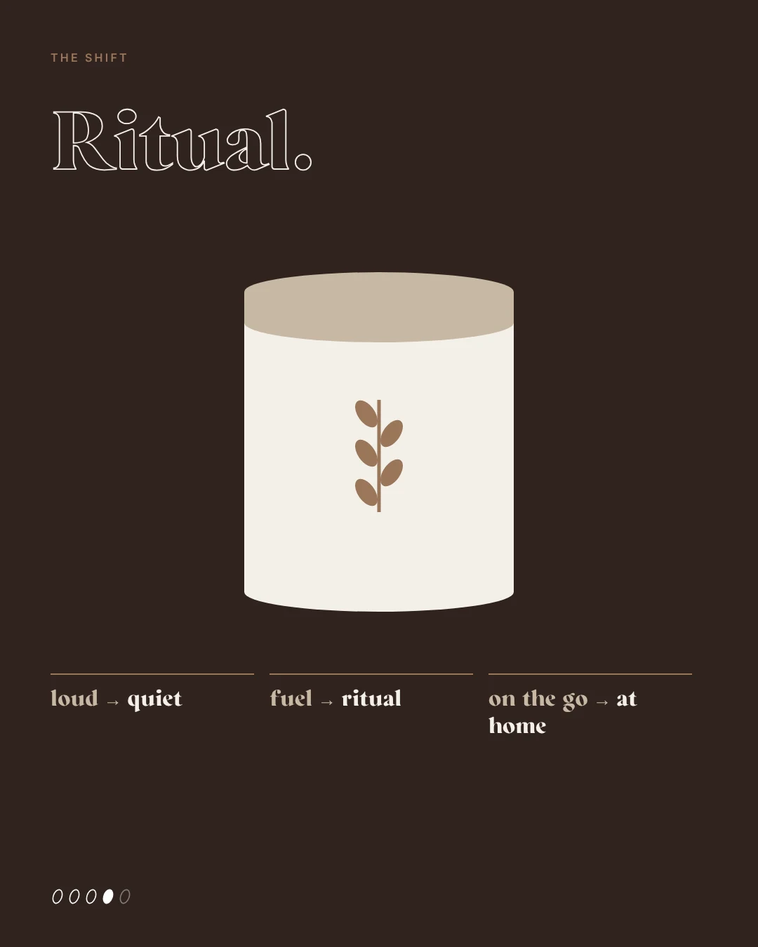
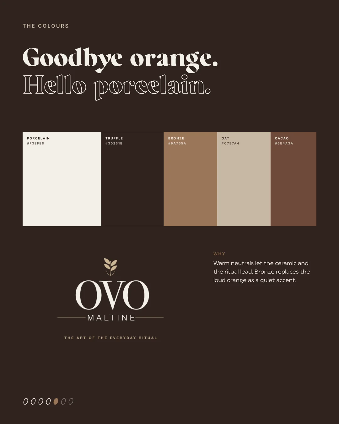
The inventory turns into a decision. In our study the product itself stayed: the same malt, the same origin. The malt ear became the new mark. What we changed was the feeling. Today’s look is loud and sporty: an orange tin, bold type, a drink for on the go, before school or on the slopes. Fuel for sport and days on the slopes turned into a calm, grown-up ritual at home. Our working line was ‘Same malt. New ritual.’ The boldest move was letting the orange go and replacing it with porcelain, truffle and bronze.
To be fair, a real brand would hardly give up such a strong cue, at least not in one go. A study is allowed to go further than reality; that is the point of it. For your own rebrand, a simple rule of thumb helps: one brave, well-argued move beats ten small corrections nobody notices. And keep at least one familiar element as a bridge, so loyal customers can still find you.
Test the direction in pictures first
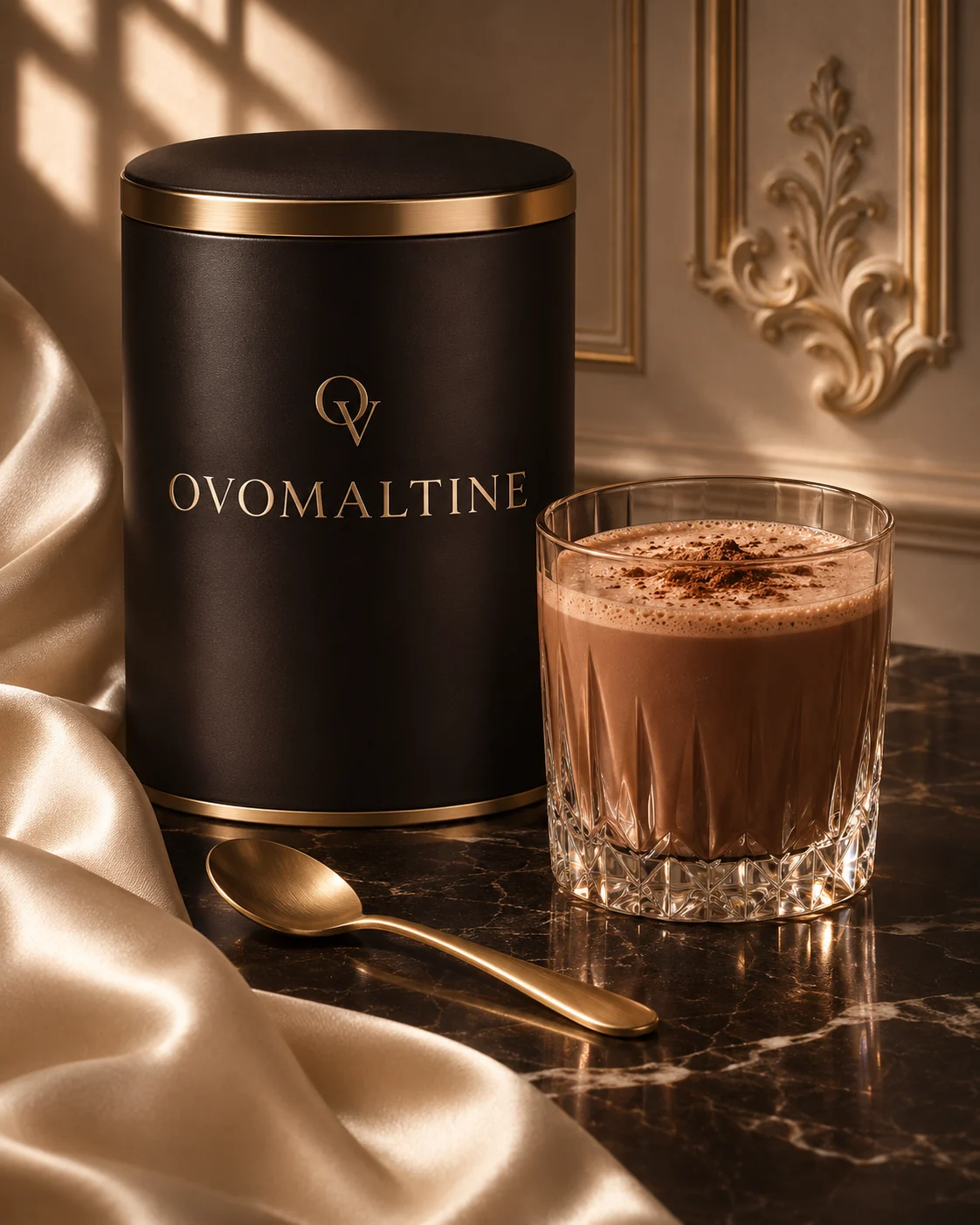
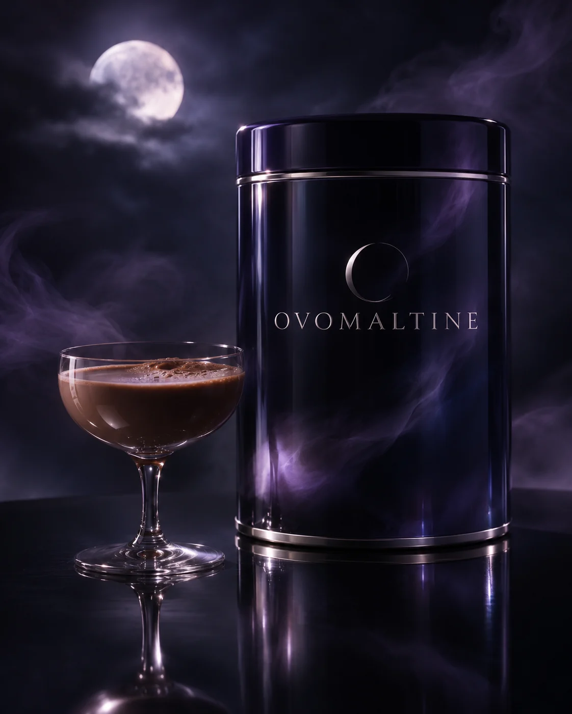
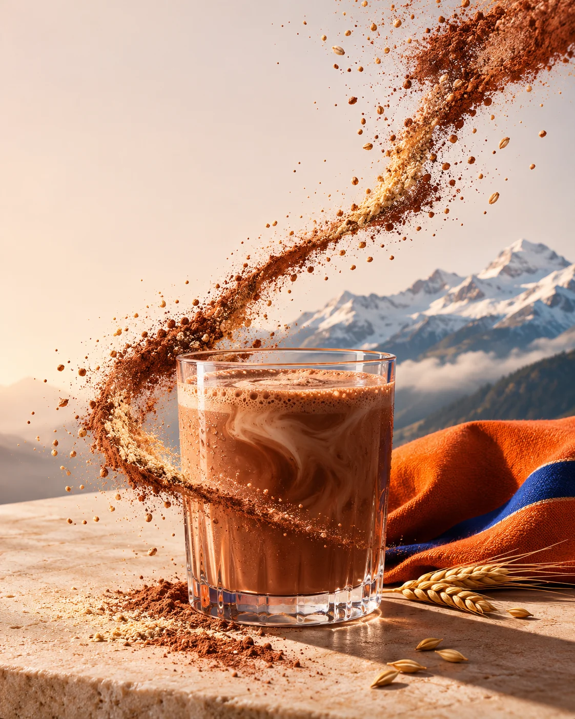
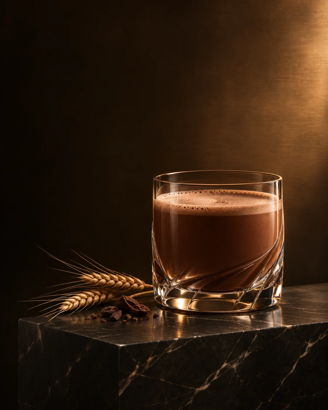
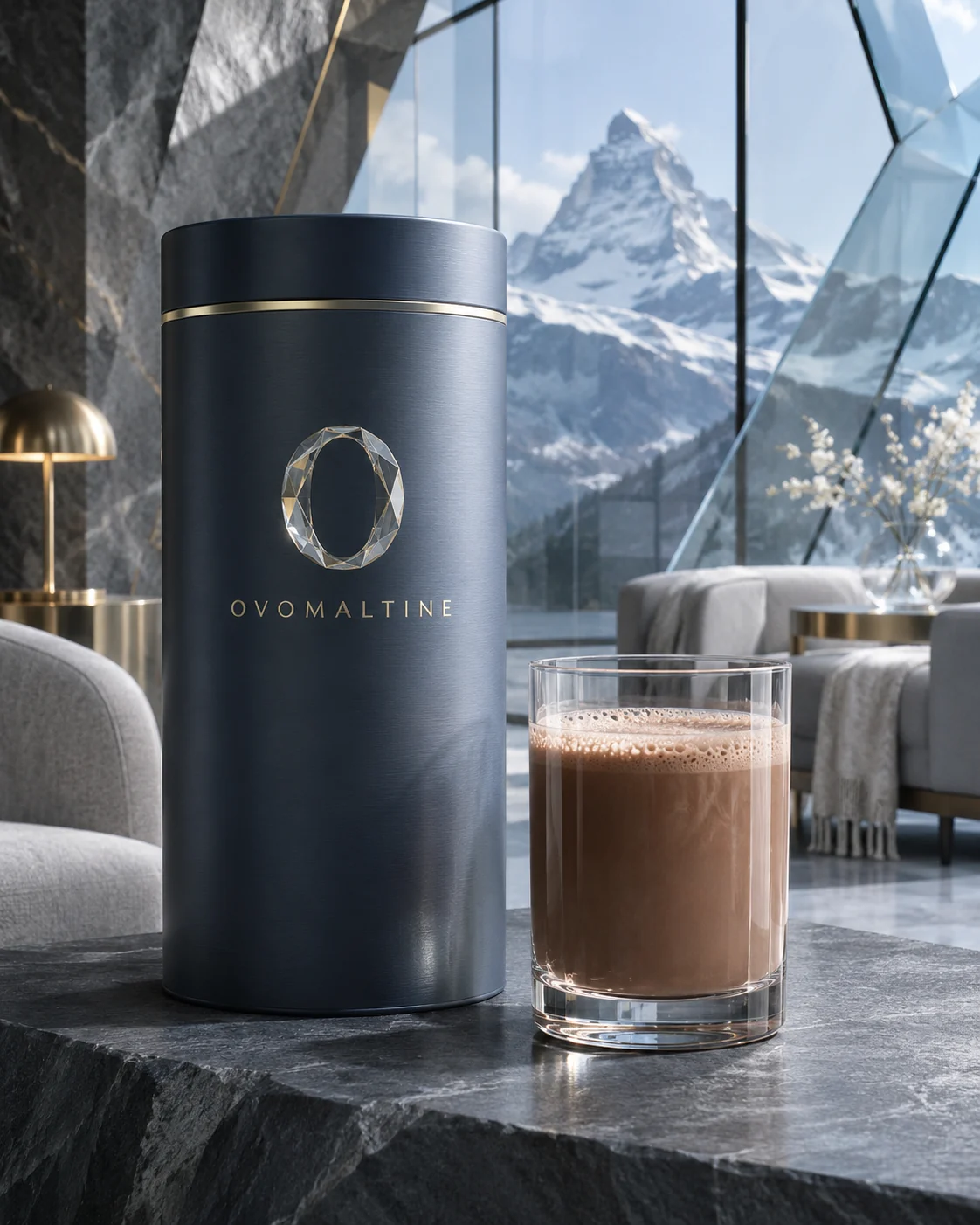
Before we touched a logo, we made ten photo concepts, each with its own promise: a Parisian salon, Swiss modernism in concrete, a dark night edition, a club room in green leather, a cocoa atelier, an alpine edition behind glass and a quiet version in ceramic, linen and stone. With AI this takes very little time, and you see at once which world suits the brand and which looks like fancy dress. Some images looked like whisky, others like perfume. That is not a failure. It is exactly the information you need at this stage.
A handful of directions still felt like Ovomaltine: one that keeps the orange and the Alps and retells the energy, a dark and luxurious one, a cool alpine edition, and the one we developed further, Pure Ritual. The lesson for your brand: do not fall for the first beautiful direction. Put several side by side and ask of each one whether your most loyal customer would still recognise her brand in it.
From direction to system
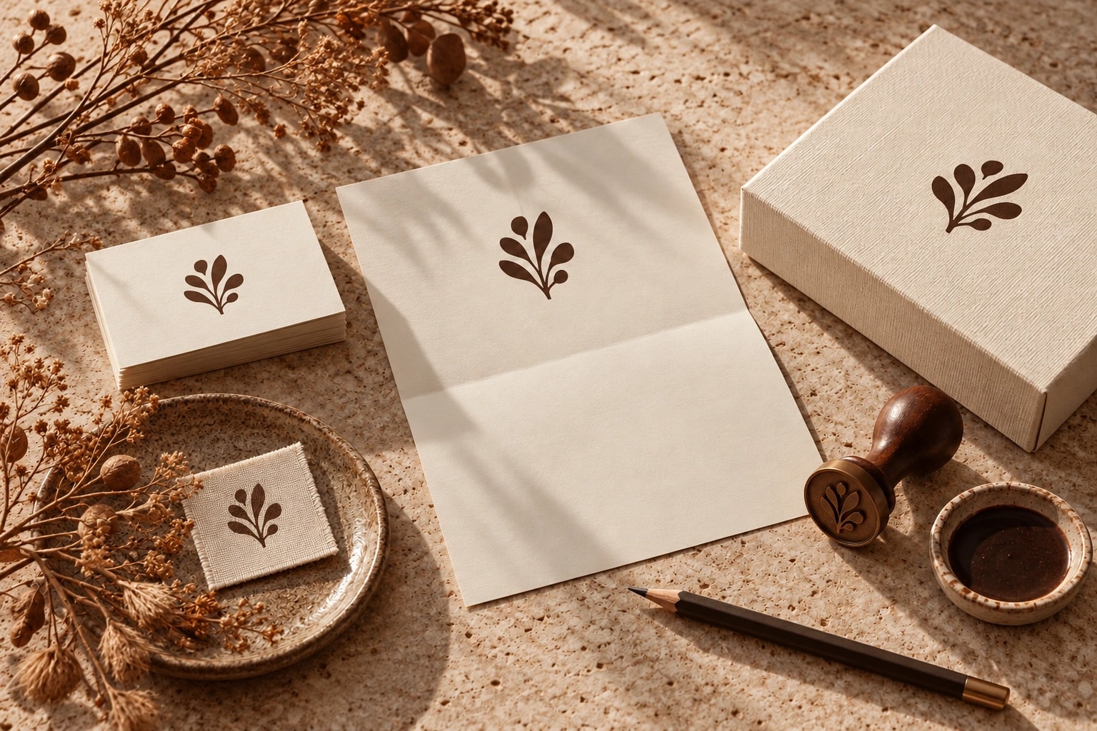
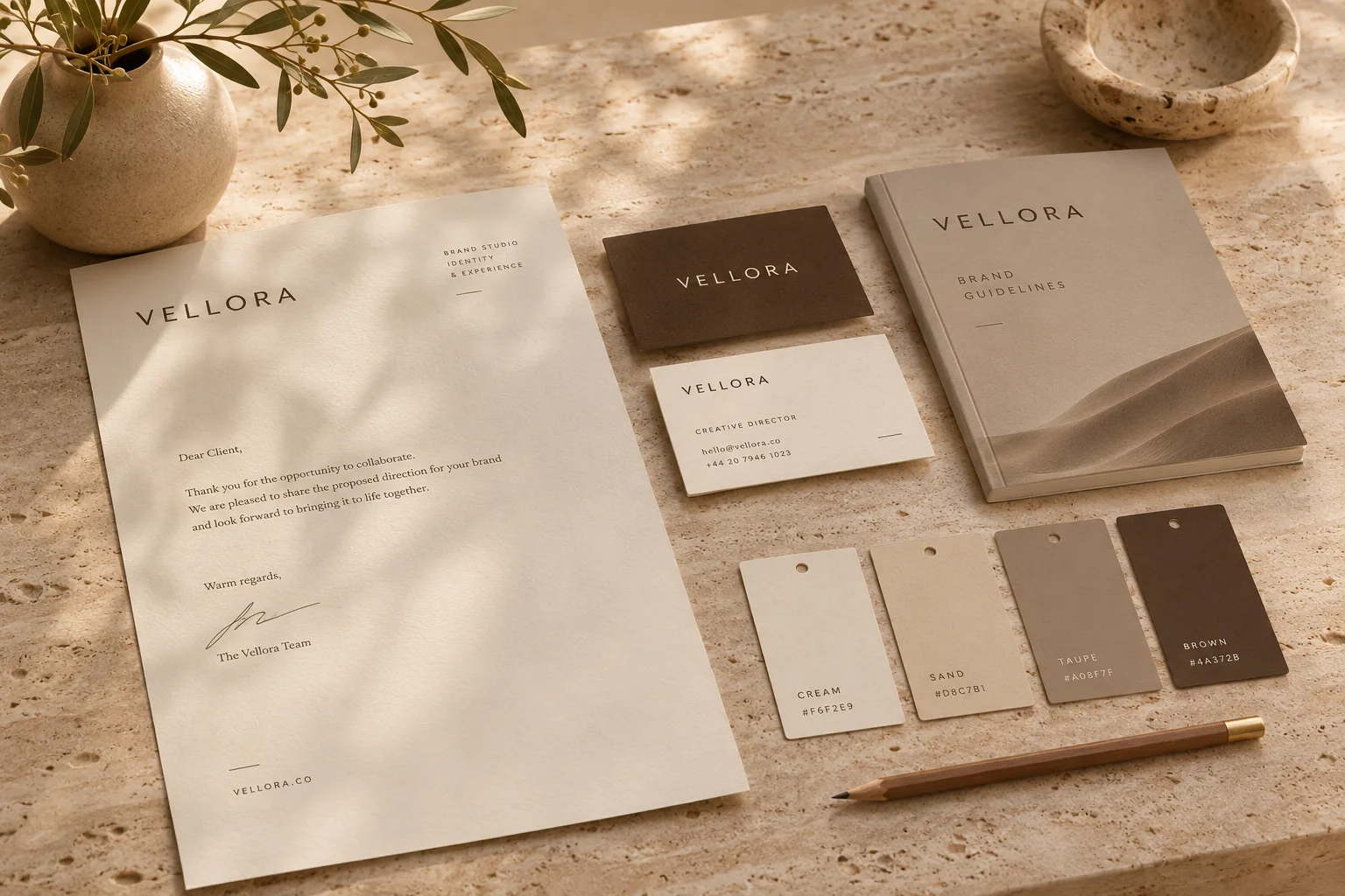
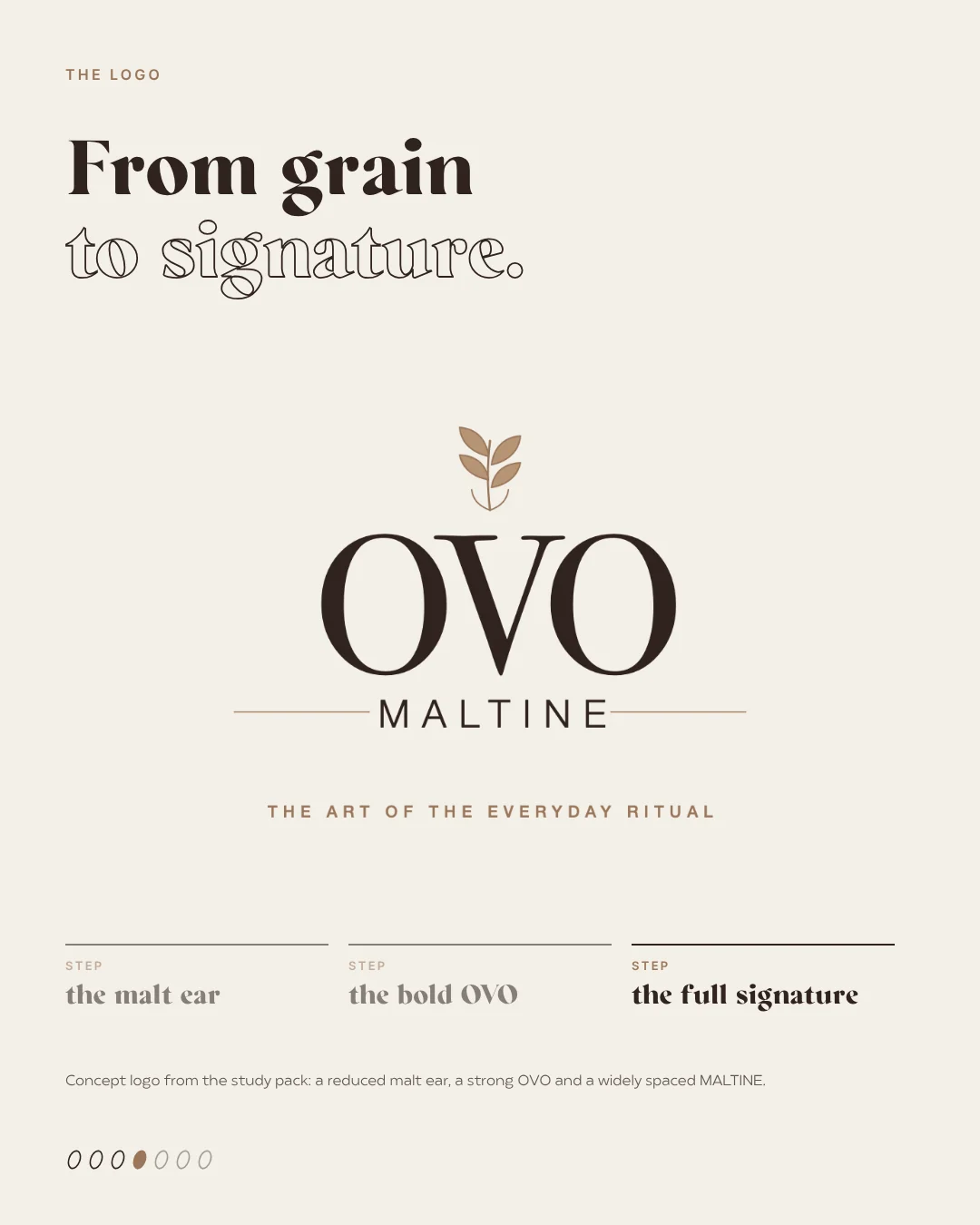
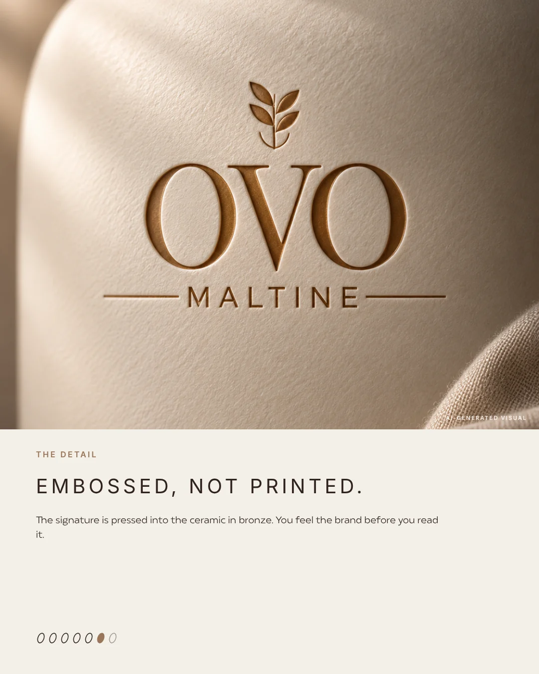
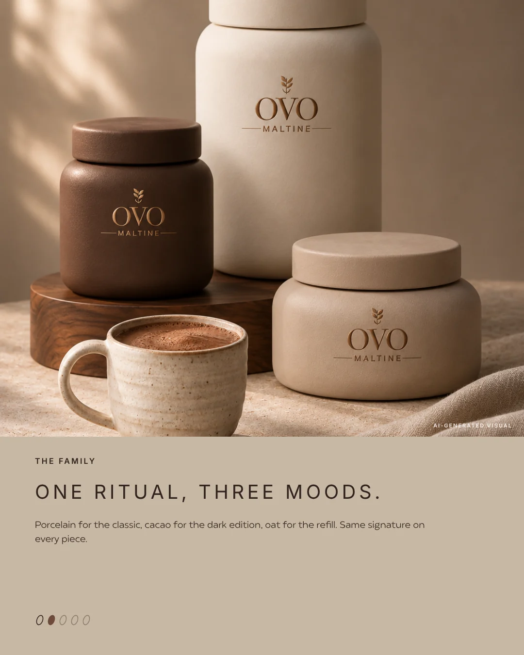
Detailed work only pays off once the direction is set. The logo grew in three steps, from a reduced malt ear to a bold OVO to the full signature. The colours were given roles: porcelain as the lead, truffle for text, bronze instead of orange as a quiet accent, plus oat and cacao. Our guide to choosing brand colours explains how to give each colour a job. The objects came last: a ceramic tin you would not hide in the cupboard, a dark edition, a refill and a gift box. The mark is embossed rather than printed, so you feel the brand before you read it.
Rebranding without losing loyal customers
Rebrands rarely fail because of the design. They fail at the launch. Swap everything overnight and loyal customers are left puzzled in front of the shelf. A transition people can follow works better. We told our study in three parts: the original first, then the new identity, then the objects. The same order works for real brands.
- Explain why things are changing, and show respect for the original.
- Keep at least one familiar element as a bridge between old and new.
- Test the new direction with real customers, not just your team.
- Switch over in stages: social media and website first, packaging and shop later.
- Capture it all in a short style guide, so the new look does not fade after three months.
What AI can and cannot do in a rebrand
At this stage AI is a strong tool for imagery: moodboards, product worlds, scenes and mockups for several directions, without booking a shoot. It does not replace strategy, conversations with your customers or a trade mark check. Logos that AI writes onto packaging are often illegible or crooked, so the final mark is drawn by hand and built as a clean vector file. To see how we invent whole brands with AI, have a look at the wild lab, where every study carries an invented name.
Planning your rebrand
With the worksheet above you can do a first inventory in half an hour: what stays, what you question, what may change. After that, an outside view is worth it. At wild & co. in Zurich we guide branding and rebranding projects from the inventory and the visual direction to the finished style guide, for brands across Switzerland, in person or remotely.