Nachtwendewild lab · What if we branded it?
A rebrand for a lakeside hotel
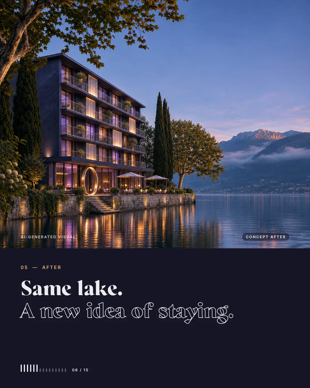
Same lake. A new idea of staying.
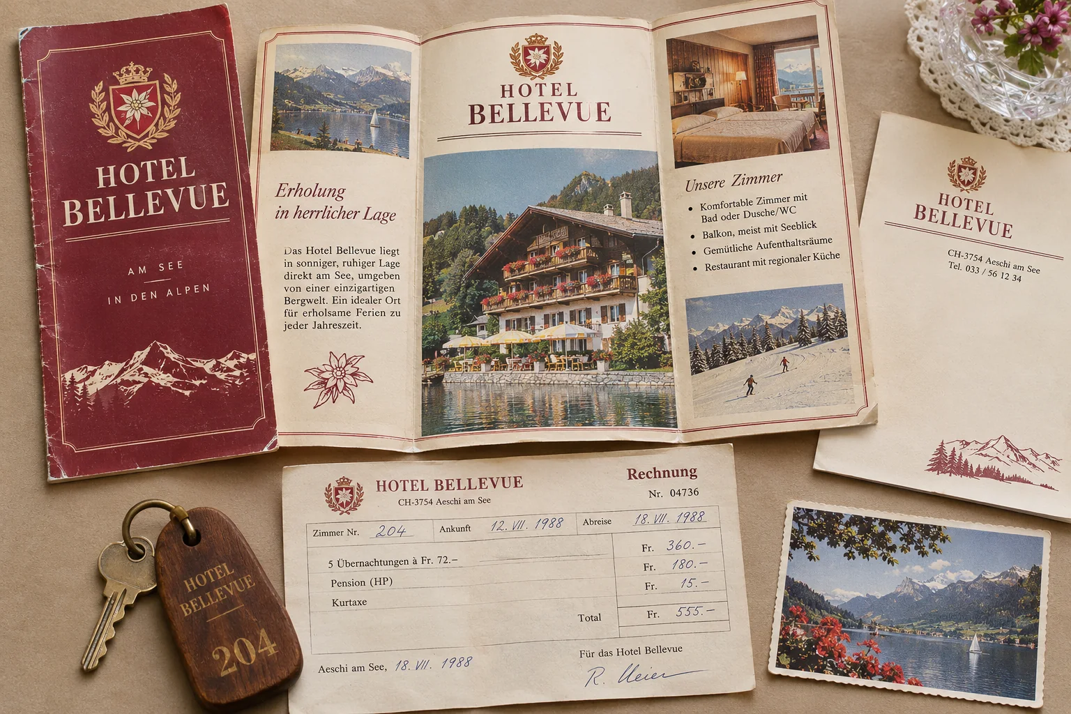
Some places have the best view and the most dated look. Hotel Bellevue is one of them: a chalet, a red carpet, a brochure from another decade. We imagined the house as Nachtwende, a modern ritual hotel for the hours between two chapters of life. Both hotels are fictional, nothing was renovated, and the visuals were made with AI.
Invented brand, made with AI. Concept, branding and art direction by wild & co.
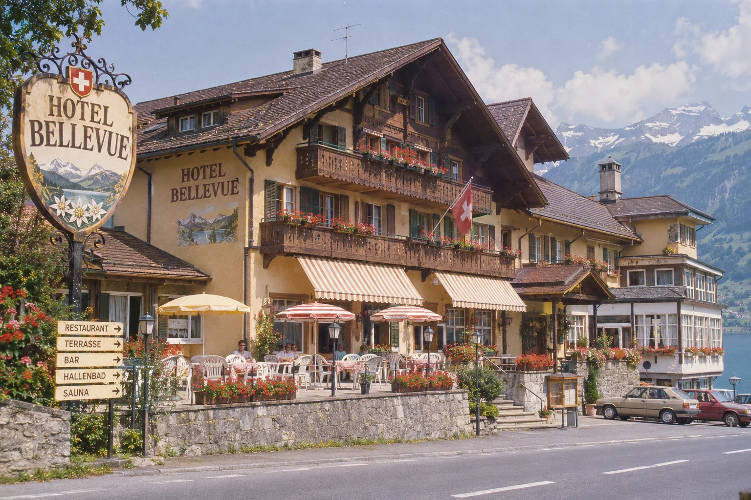

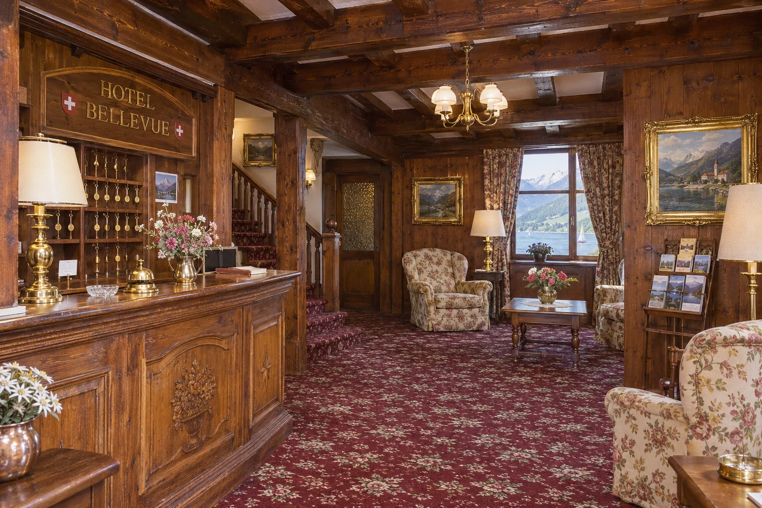
01 · The old brand
Chalet. Carpet. Brochure.
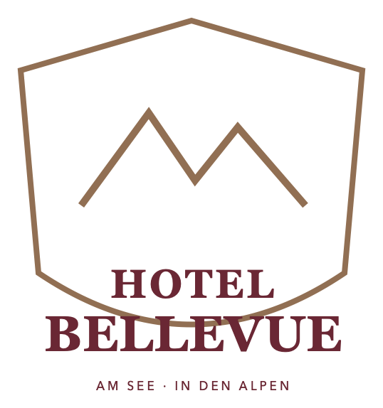
Plenty of tradition, very little story of its own. The spot by the lake is wonderful, yet the identity says nothing about it: a crest with mountains, a floral carpet and a brochure that could have been printed thirty years ago.
- Chalet
- a threshold
- Red carpet
- night blue & iris
- Brochure
- a journal for the night
- Room key 204
- an oval of brushed metal


The brand · Nachtwende
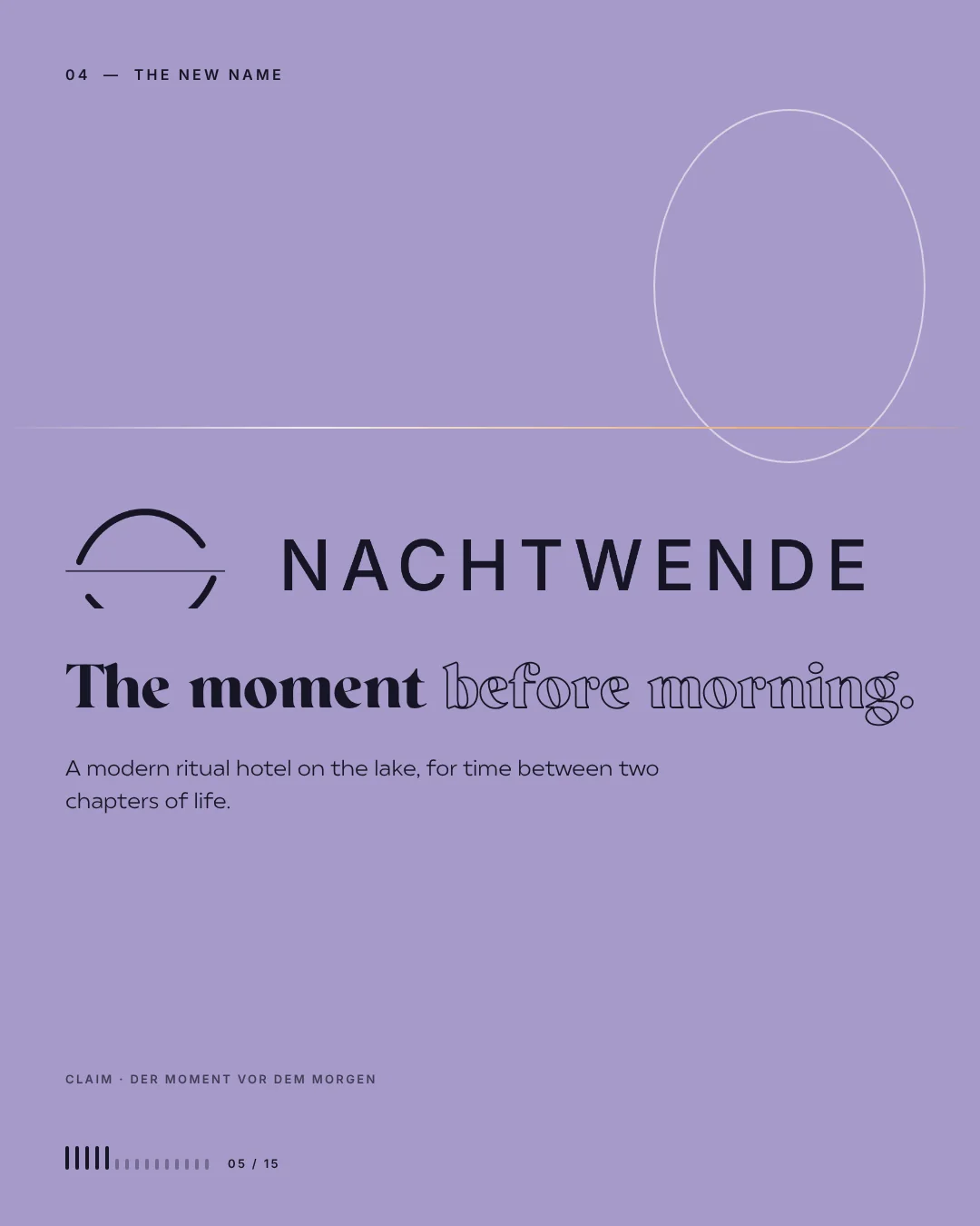
The moment before morning.
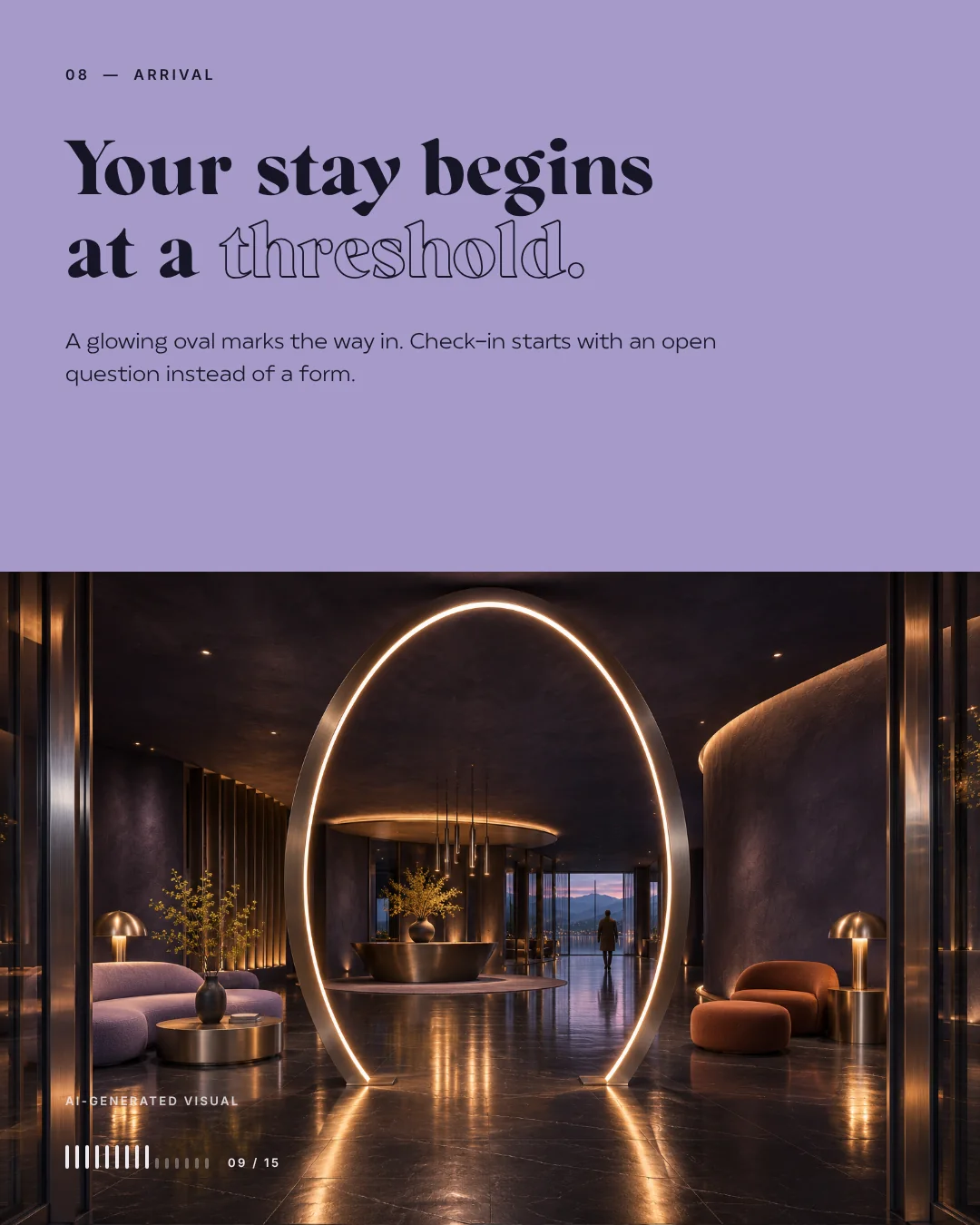
Nachtwende is an invented ritual hotel by the lake for the hours between two chapters of life. A glowing oval marks the way in, check-in starts with an open question instead of a form, and every stay follows the threshold time from dusk to morning.
- Void#151625
- Night#242944
- Metal#9DA5B2
- Iris#A69AC9
- Afterglow#E8AD78
- Mist#EDEAF0
Schwellenzeit · from dusk to morning
For the time between two chapters
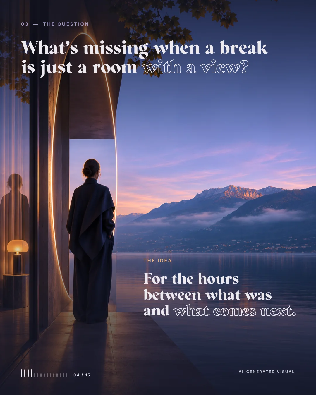
What's missing when a break is just a room with a view? Nachtwende answers with a sequence rather than a list of amenities: arrive, listen, write, move on. Night blue, iris and a warm line of light run through the architecture, the logo, the rooms and the smallest objects. All of it voluntary and self-directed, with no promises of healing.
01 · Dusk
Arrive
A conscious step out of everyday life into the stay. The glowing oval marks the threshold.
02 · Night
Listen
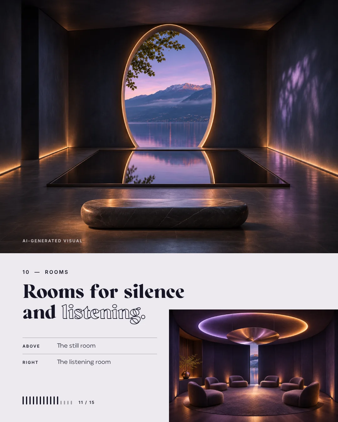
A room for music, silence and focused listening, with a view of the lake.
03 · Late evening
Write
Cards and a journal, an invitation to sort your own thoughts.
04 · Morning
Move on
A closing card you write, seal and take with you.
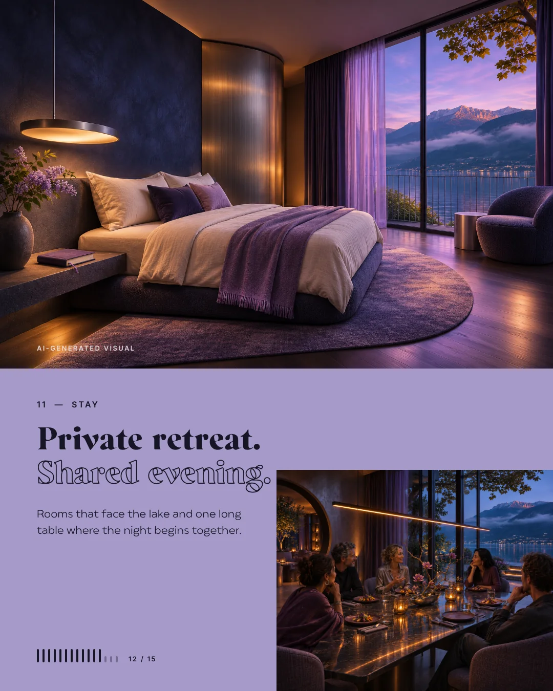
Private retreat · shared evening
Rooms for silence and listening
A lobby that begins with a threshold of light, a still room with an oval window, rooms that face the lake and one long table where the evening begins together. The same warm line of light runs through all of it.
Moodboard, sign and paper
From a question to a brand world
First we took an honest look at the old identity: plenty of tradition, very little story of its own. Then came the strategy, away from the classic holiday hotel towards the time between two chapters, and only then the name. Nachtwende describes the moment the night turns. The sign shows exactly that: two arcs tipping over a horizon line.
- BriefA fictional lake hotel with the best location and a dated look, chalet, carpet and brochure included.
- StrategyFrom a classic holiday hotel to a place for the time between two chapters of life.
- MoodboardNight, threshold, light and reflection, in night blue, iris and a warm line of light.
- DesignThe name Nachtwende, two arcs over a horizon line, a widely spaced wordmark, colours and type.
- ApplicationsArchitecture, lobby, rooms, listening room, journal, cards, key, letterhead and guest folder.
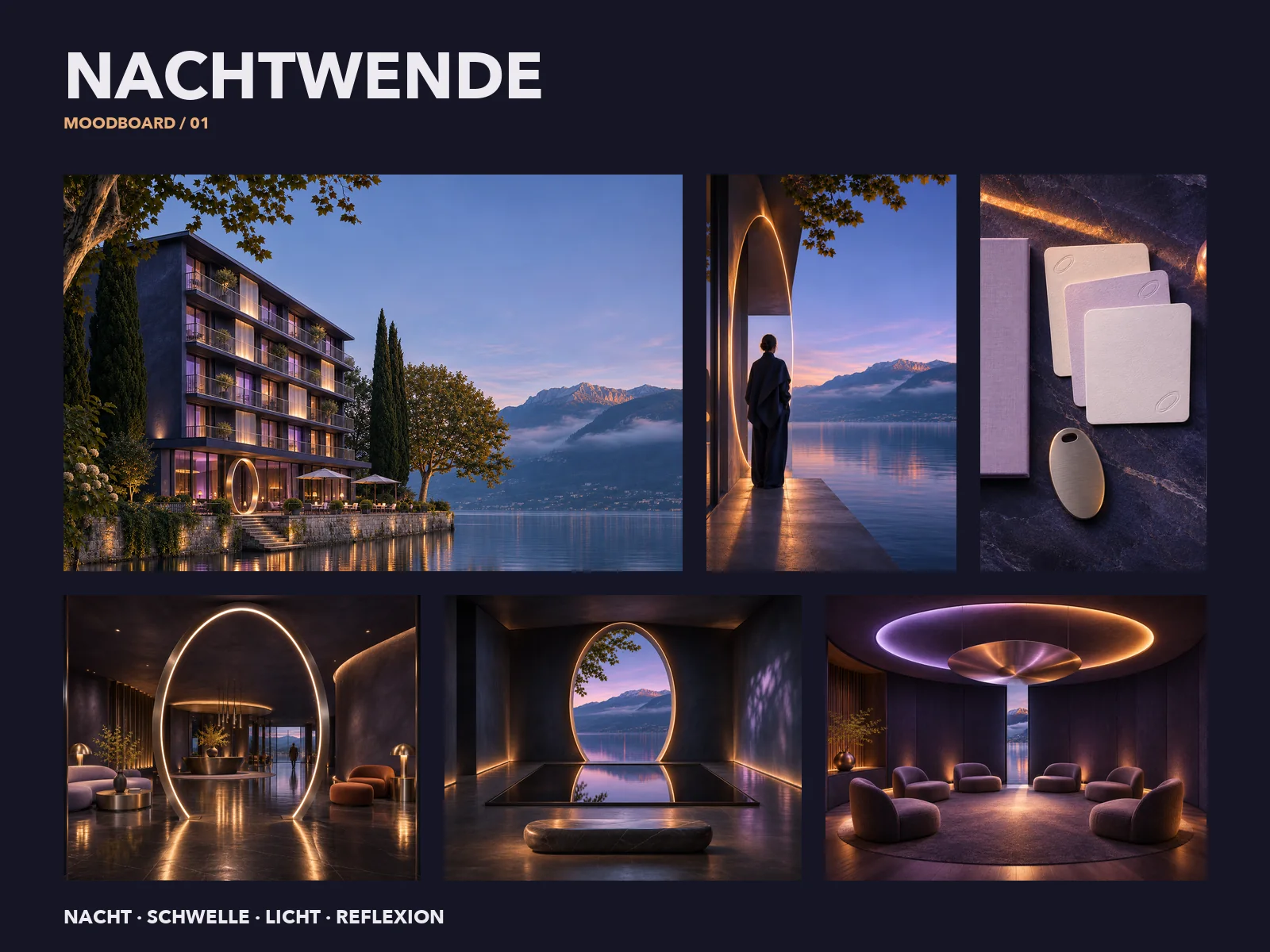
Moodboard · night, threshold, light, reflection 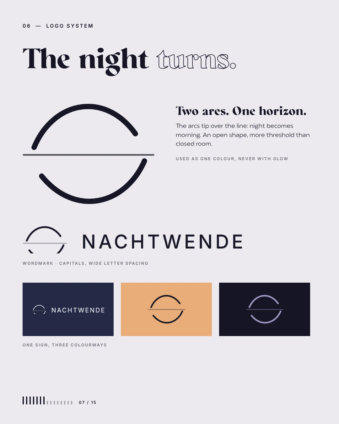
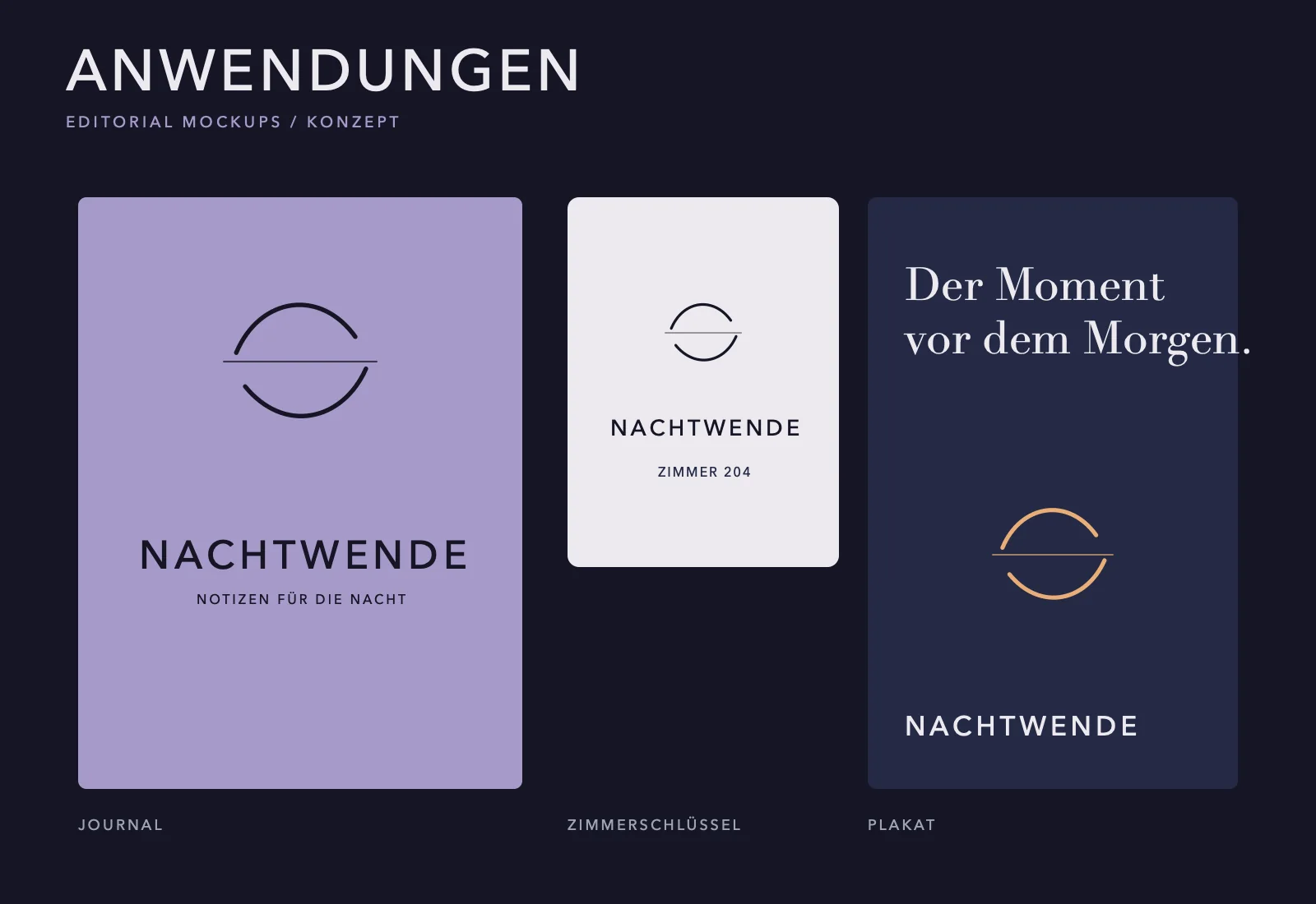
Two arcs, one horizon 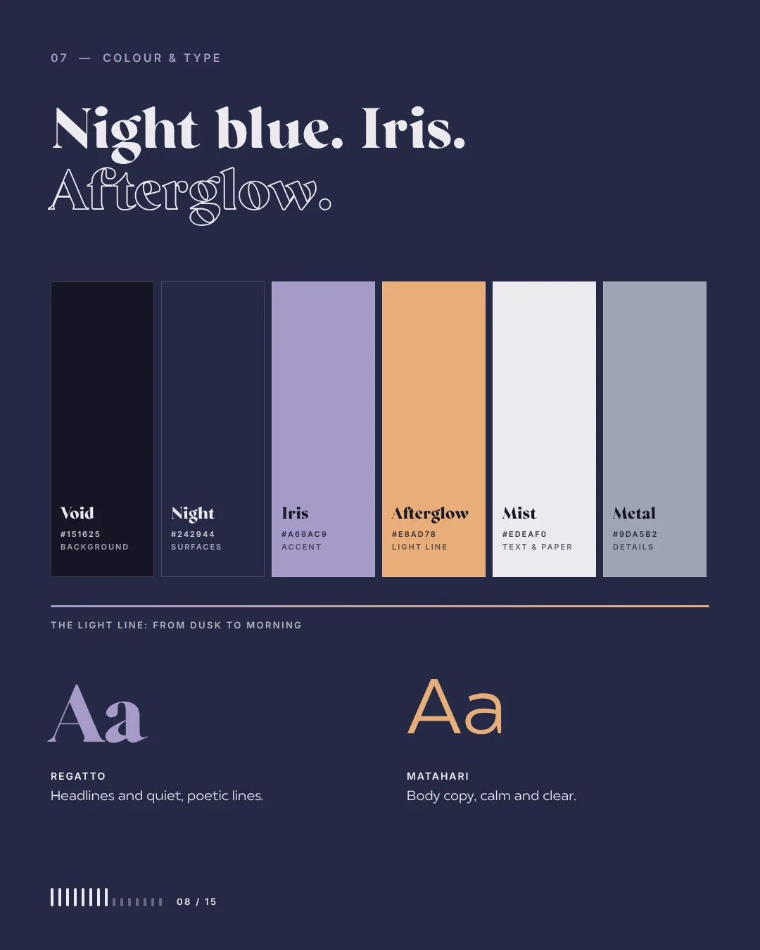
Colour & type 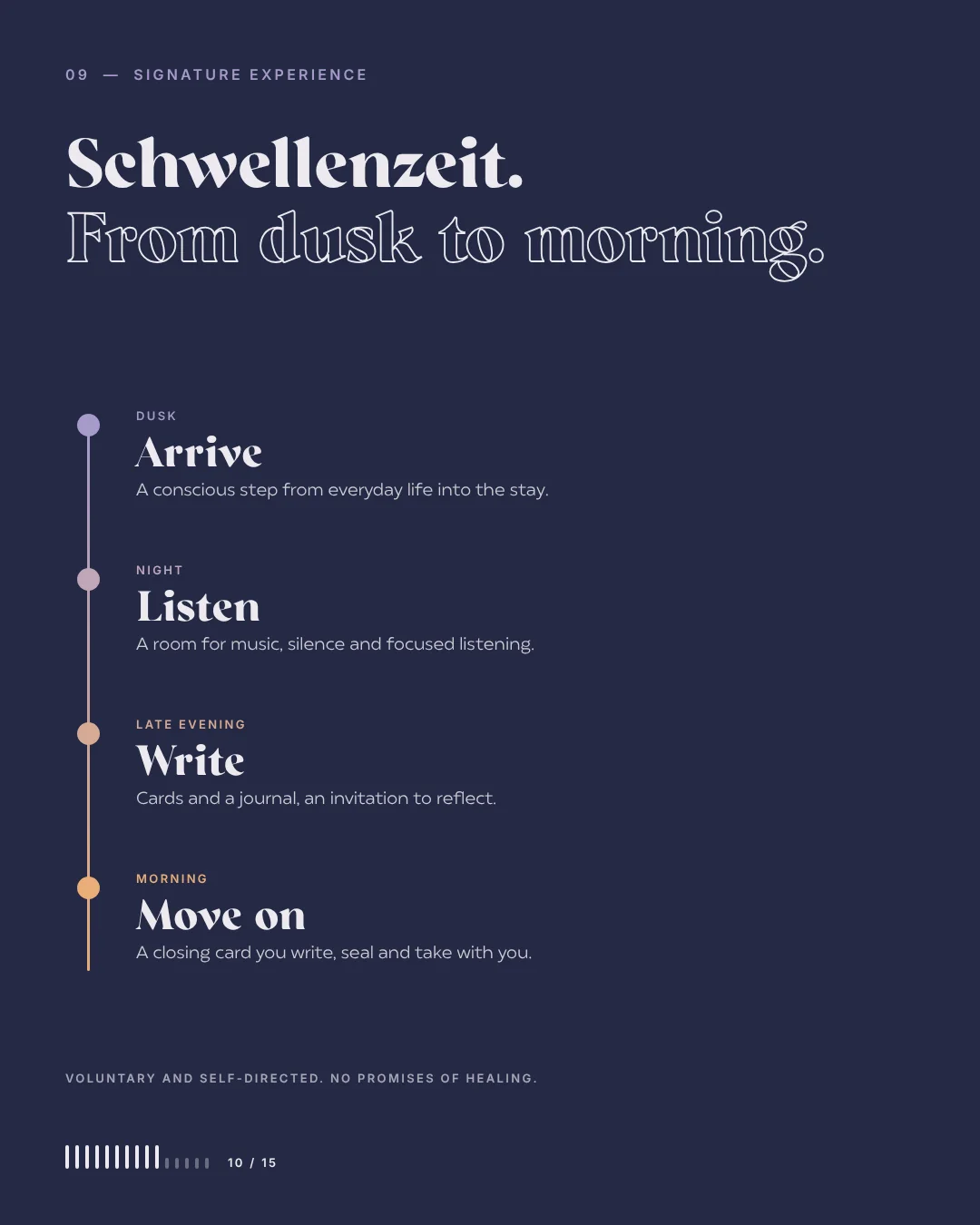
The signature stay
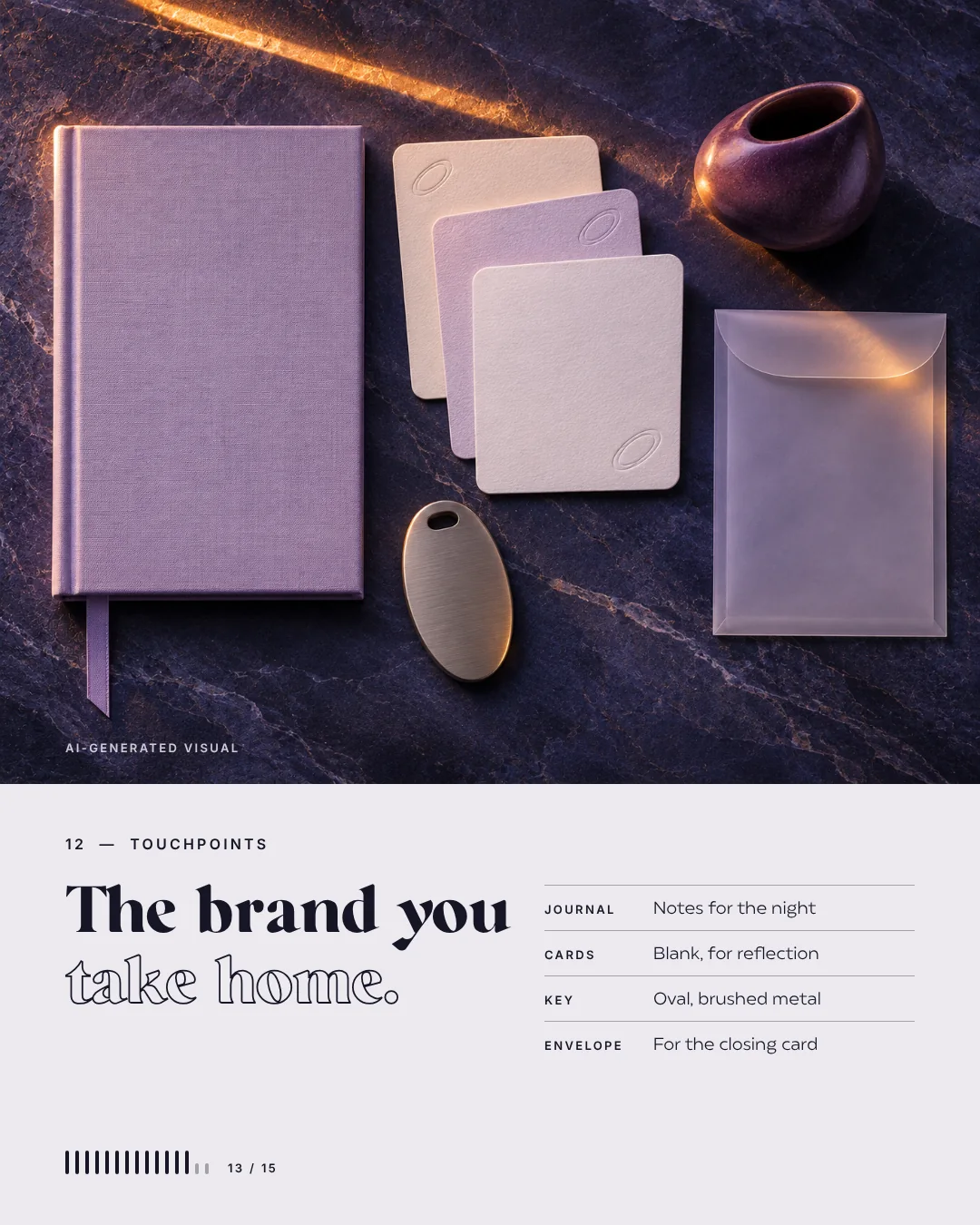
The brand you take home
Journal, key and cards.
The brand doesn't stop at the facade. It sits on the oval room key, in the journal for the night, on blank cards for reflection and on the envelope for the closing card, always with the line of light.
The series · what if we branded it?
From a question to a brand world.
What if an old lake hotel became Nachtwende? In this series we take ordinary services and dated places and rethink them as brands. Here it is the invented Hotel Bellevue: the best spot on the lake, but a look from yesterday.
First the strategy, from a classic holiday to time between two chapters of life. Then the name: Nachtwende, the moment the night turns. After that sign, wordmark, colours and type, one consistent AI world of night, lake and light, and an art direction that tells rooms, objects and touchpoints as one story. Hotel Bellevue and Nachtwende don’t exist; no real hotel was renovated.
- Brand
- Nachtwende, fictional
- Before
- Hotel Bellevue, also fictional
- Series
- What if we branded it?, Vol. 03
- Sequence
- Arrive, listen, write, move on
When a place can do more than it shows
Many hotels, practices and restaurants have a wonderful location and an identity that tells none of it. We look for the story that is already there, give it a name and a sign, and use AI to show how it could look before a single wall is painted. That helps with the decision, with investors and later with the renovation.
AI imagery & AI video for your brand Guide: AI images for business
To your next chapter
Write the next chapter with us.
A hotel, a practice or a product that so far only exists in your head: we write the next chapter with you.
Plan your next chapter